CSS: The Definitive Guide, 3rd Edition (45 page)
Read CSS: The Definitive Guide, 3rd Edition Online
Authors: Eric A. Meyer
Tags: #COMPUTERS / Web / Page Design

An even more interesting question is this: what
happens when a float overlaps content in the normal flow? This can happen if, for
example, a float has a negative margin on the side where content is flowing past
(e.g., a negative left margin on a right-floating element). You've already seen what
happens to the borders and backgrounds of block-level elements. What about inline
elements?
CSS1 and CSS2 were not completely clear about the expected behavior in such cases.
CSS2.1 clarified the subject with the following explicit rules:
An inline box that overlaps with a float has its borders, background, and
content all rendered "on top" of the float.A block box that overlaps with a float has its borders and background
rendered "behind" the float, whereas its content is rendered "on top" of the
float.
To illustrate these rules, consider the following situation:
This paragraph, unremarkable in most ways, does contain an inline element.
This inline contains some strongly emphasized text, which is
so marked to make an important point.  The rest of the element's
content is normal anonymous inline content.


This is a second paragraph.  There's nothing remarkable about it, really.
Please move along.

A Heading!
Apply the following styles to that markup, with the result shown in
Figure 10-20
:
img.sideline {float: left; margin: 10px -15px 10px 10px;}
p.box {border: 1px solid gray; padding: 0.5em;}
p.box strong {border: 3px double black; background: silver; padding: 2px;}
h2#jump-up {margin-top: -15px; background: silver;}
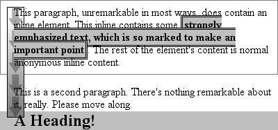
Figure 10-20. Layout behavior when overlapping floats
The inline element (strong) completely overlaps
the floated image—background, border, content, and all. The block elements, on the
other hand, have only their content appear on top of the float. Their backgrounds and
borders are placed behind the float.
The overlapping behavior described here is independent of the document source
order. It does not matter if an element comes before or after a float; the same
behaviors still apply.
We've talked quite a bit about floating behavior,
so there's only one more thing to discuss before we turn to positioning. You won't
always want your content to flow past a floated element—in some cases, you'll
specifically want to prevent it. If you have a document that is grouped into
sections, you might not want the floated elements from one section hanging down into
the next. In that case, you'd want to set the first element of each section to
prohibit floating elements from appearing next to it. If the first element might
otherwise be placed next to a floated element, it will be pushed down until it
appears below the floated image, and all subsequent content will appear after that,
as shown in
Figure 10-21
.
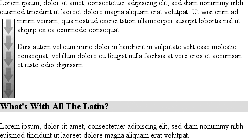
Figure 10-21. Displaying an element in the clear
This is accomplished withclear.
For example, to ensure that allh3elements are
not placed to the right of left-floating elements, you would declareh3 {clear:left;}.
This can be translated as "make sure that the left side of anh3is clear of floating images," and it has an effect
very similar to the HTML constructbrelements generate inline boxes, socleardoesn't apply to them unless you change theirdisplay!) The following rule usesclearto preventh3elements from flowing past floated elements to the left side:
h3 {clear: left;}
clear
- Values:
left|right|both|none|inherit- Initial value:
none- Applies to:
Block-level elements
- Inherited:
No
- Computed value:
As specified
While this will push theh3past any
left-floating elements, it will allow floated elements to appear on the right side ofh3elements, as shown in
Figure 10-22
.
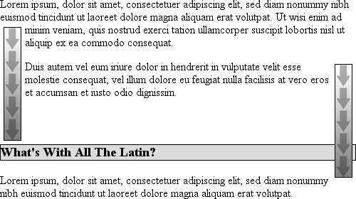
Figure 10-22. Clear to the left, but not the right
To avoid this sort of thing, and to make sure thath3elements do not coexist on a line with any floated elements, use the
valueboth:
h3 {clear: both;}
Understandably enough, this value prevents coexistence with floated elements on
both sides of the cleared element, as demonstrated in
Figure 10-23
.
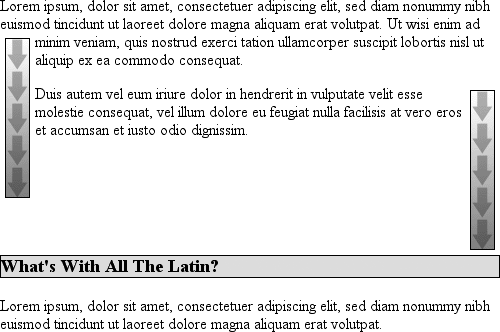
Figure 10-23. Clear on both sides
If, on the other hand, we were only worried abouth3elements being pushed down past floated elements to their right, then
you'd useh3 {clear:right;}.
Finally, there'sclear:none, which allows elements to float to either side of
an element. As withfloat:none, this value exists mostly to allow for normal
document behavior, in which elements will permit floated elements on both sides.nonecan be used to override other styles, of
course, as shown in
Figure 10-24
.
Despite the document-wide rule thath3elements
will not permit floated elements on either side, oneh3in particular has been set so that it does permit such behavior:
h3 {clear: both;}
What's With All The Latin?
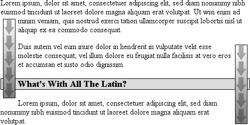
Figure 10-24. Not clear at all
In CSS1 and CSS2,clearworked by increasing
the top margin of an element so that it ended up below a floated element, effectively
ignoring any margin width set for the top of a cleared element. That is, instead of
being1.5em, for example, it would be increased to10em, or25px, or7.133in, or however much was
needed to move the element down far enough so that the content area was below the
bottom edge of a floated element.
In CSS2.1, clearance was introduced.
Clearance
is extra
spacing added above an element's top margin to push it past any floated elements.
This means that the top margin of a cleared element does not change when an element
is cleared. Its downward movement is caused by the clearance instead. Pay close
attention to the placement of the heading's border in
Figure 10-25
, which results from the
following:
img.sider {float: left; margin: 0;}
h3 {border: 1px solid gray; clear: left; margin-top: 15px;}


Why Doubt Salmon?

Figure 10-25. Clearing and its effect on margins
There is no separation between the top border of theh3and the bottom border of the floated image because 25 pixels of
clearance were added above the 15-pixel top margin to push theh3's top border edge just past the bottom edge of the
float. This will be true unless theh3's top
margin calculates to 40 pixels or more, in which case theh3will naturally place itself below the float and theclearvalue will be irrelevant.
In most cases, of course, you can't know how far an element needs to be cleared.
The way to make sure a cleared element has some space between its top and the bottom
of a float is to put a bottom margin on the float itself. So, if you want at least 15
pixels of space below the float in the previous example, you would change the CSS
like this:
img.sider {float: left; margin: 0 0 15px;}
h3 {border: 1px solid gray; clear: left;}
The floated element's bottom margin increases the size of the float box, and thus
the point past which cleared elements must be pushed. This is because, as you've seen
before, the margin edges of a floated element define the edges of the floated
box.
