CSS: The Definitive Guide, 3rd Edition (61 page)
Read CSS: The Definitive Guide, 3rd Edition Online
Authors: Eric A. Meyer
Tags: #COMPUTERS / Web / Page Design

Last, but most intriguing, is the ability to call for a customized
cursor. This is done using a URL value:
a.external {cursor: url(globe.cur), pointer;}
With this rule, the user agent is asked to load the file
globe.cur
and use it as the cursor icon, as illustrated in
Figure 13-9
.

Figure 13-9. Using a custom graphic cursor
Of course, the user agent has to support the file format used to store
globe.cur
. If it does not, then it will fall back to the
valuepointer. Note that in thecursorsyntax definition, any URL must be followed by
a comma and one of the generic keywords. This is different from the propertyfont-family, where you can call for a
specific family and not provide any fallbacks. In effect,cursorrequires fallbacks for any graphical cursors you might try to
employ.
You can even specify multiple cursor files before the fallback keyword. For
example, you might create the same basic cursor in several formats and include
them all in a rule, hoping a user agent will support at least one of them:
a.external {cursor: url(globe.svg#globe), url(globe.cur), url(globe.png),
url(globe.gif), url(globe.xbm), pointer;}
The user agent will go through the different URLs until it finds a file it can
use for the cursor icon. If the user agent can't find anything it supports, it
will fall back to the keyword.
You can actually implement animated cursors
if a user agent supports animated graphic files
for cursor replacements. IE6, for example, supports this ability with
.ani
files.
CSS2 introduces one last major piece of user-interface
styling: outlines.
An outline is sort of like a border, but
there are two very important differences. First, outlines do not participate in the flow
of the document like borders
do, and thus don't
trigger document reflow as they appear and disappear. If you give an element a 50-pixel
outline, the outline will very likely overlap other elements. Second, outlines can be
nonrectangular—but don't start leaping for joy just yet. This does not mean that you can
create circular outlines. Instead, it means that an outline on an inline element may not
act like a border would on that same element. With an outline, a user agent is allowed
to "merge" the pieces of the outline to create a single continuous, but nonrectangular,
shape.
Figure 13-10
shows an example.

Figure 13-10. Outlines can have irregular shapes
User agents are not required to support nonrectangular outlines.
They could instead format outlines on inline
nonreplaced elements the same way they do borders. A conforming user agent must,
however, make sure that outlines do not take up layout space.
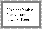
There is one other basic way in which outlines and borders differ: they aren't the
same thing, so they can both exist on the same element. This can lead to some
interesting effects, such as that illustrated in
Figure 13-11
.

Figure 13-11. The coexistence of borders and outlines
The CSS2 specification states the following: "The outline may be drawn starting just
outside the border edge." Note the word
may
in that sentence. User
agents are encouraged to do as the sentence suggests, but it isn't a requirement. A user
agent could decide to draw borders inside the inner border edge or at some small
distance from the border. As of this writing, all browsers that support outlines draw
them just outside the outer border edge, so, thankfully, there is consistency.
Outlines are considered to be part of user-interface styling because they are most
often used to indicate the current focus. If a user is using keyboard navigation to jump
from link to link, then the link that is currently in focus will usually get an outline.
In Internet Explorer for Windows, an outline is applied to any link that has been
selected by the user ("clicked," if she's using a mouse), and tends to persist even when
it isn't wanted. Other browsers apply outlines to text inputs that have the keyboard
focus, thus giving a cue to where input will go if the user starts typing.
As you'll see, outlines are styled a lot like borders, but there are some key
differences besides the ones previously mentioned. We'll just skip quickly over the
similarities and spend time looking at the differences.
As with
a border, the most basic aspect of an outline is its style, which is set usingoutline-style.
outline-style
- Values:
none|dotted|dashed|solid|double|groove|ridge|inset|outset|inherit- Initial value:
none- Applies to:
All elements
- Inherited:
No
- Computed value:
As specified
The list of style keywords is largely the same as the keywords for border styles,
and the visual effects are the same. There is one omission:hiddenis not a valid outline style, and user agents are required to
effectively treat it asnone. This actually makes
sense, given that outlines don't affect layout even when they're visible.
The other difference between outlines and borders is that you can specify only one
keyword for anoutline-stylevalue (compared with
up to four keywords for borders). The practical effect is that outlines must have the
same outline style all the way around an element, whether they're rectangular or not.
This is probably just as well, since trying to figure out how to apply different
styles to the same nonrectangular outline would be a pain.
Once you've brought an outline into being by giving it a style, it's a good idea
to useoutline-widthto define (you guessed it)
the outline's width.
outline-width
- Values:
thin|medium|thick|| inherit- Initial value:
medium- Applies to:
All elements
- Inherited:
No
- Computed value:
Absolute length;
0if the style
of
the border isnoneorhidden
The list of keywords should look very familiar to anyone who's set a border width.
The only real difference betweenoutline-widthandborder-widthis that, as with the style, you
can declare only a single width for the entire outline. Thus, only one keyword is
permitted in a value.
Since you can set style and width,
it makes sense thatoutline-colorexists to let
you give the outline a color.
outline-color
- Values:
| invert|inherit- Initial value:
invert(or user agent-specific; see
text)- Applies to:
All elements
- Inherited:
No
- Computed value:
As specified
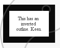
Herein lies the most intriguing difference between borders and outlines: the
keywordinvert, which is the default value. An
inverting outline means that a color inversion is performed for the pixels where the
outline exists. See
Figure 13-12
.

Figure 13-12. Inverting color with an outline
The process of color-inverting pixels "behind" the outline ensures that no matter
what appears behind the outline, it will be visible. If a user agent can't support
color inversion for some reason, it should use instead the computed value ofcolorfor the element.
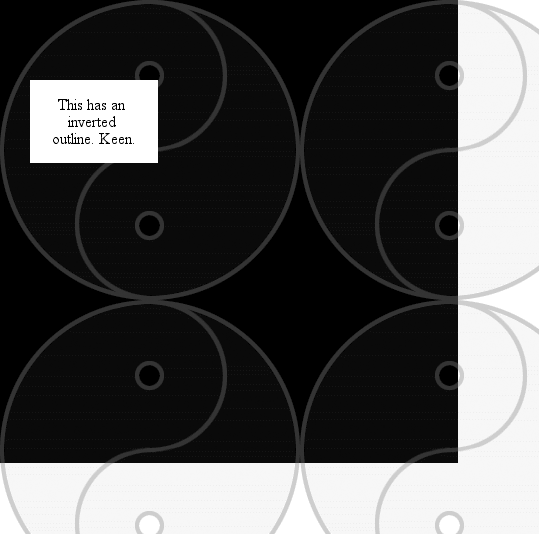
The ability to invert pixels on screen is very interesting, especially since
there's no theoretical limit on the width of an outline. So you could, should you
choose, use an outline to invert large portions of your document. This isn't really
the purpose of outlines, but
Figure
13-13
shows one such result anyway.

Figure 13-13. Massive inversion
Of course, if you'd rather define a specific color for your outline,
just use
any valid color value. The results of the following declarations should be obvious
enough:
outline-color: red;
outline-color: #000;
outline-color: rgb(50%,50%,50%);
The potential drawback here is the possibility that an outline color could closely
match the colors of the pixels around it, in which case the user won't be able to see
it. This is whyinvertwas defined.
As with outline styles and widths, you can define only one color for the entire
outline.
Likeborderfor borders,outlineis the
shorthand property that allows you to set the style, width, and color of an outline
all at once.
outline
- Values:
[
|| || ] | inherit- Initial value:
Not defined for shorthand properties
- Applies to:
All elements
- Inherited:
No
- Computed value:
See individual properties (
outline-color, etc.)
As with other shorthands,outlinebrings
together several properties into a compact notation. It's subject to the same
behaviors as other shorthand notations, which override previously defined values.
Therefore, in the following example, the outline will use the color keywordinvertsince it's implied by the second declaration:
a:focus {outline-color: red; outline: thick solid;}
Because a given outline must be of a uniform style, width, and color,outlineis the only shorthand property related to
outlines. There are no properties such asoutline-toporoutline-right.
In cases where you want to simulate an inversion border, you can set an outline
with a length value for its width, and set the element's margin to an equal or
greater width. Since the outline is drawn "on top" of the margin, it will fill in
some of that space, as illustrated in
Figure
13-14
:
div#callbox {outline: 5px solid invert; margin: 5px;}
input:focus {outline: 1em double gray;}

Figure 13-14. Different outlines
As I mentioned earlier, outlines do not participate in the document's flow. This
prevents forced reflow in cases like link-focus outlines, which will move from link
to link as the focus changes. If an author uses borders to indicate the focus, the
document layout may shift or jump around. Outlines can yield the same effects borders
allow, but without the jumpiness.
Outlines can accomplish this because they are, by definition, drawn above the rest
of the element's box. Since outlines cannot overlap visible portions of their
element's box in CSS2, but can overlap only the margins (which are transparent), this
is not a big issue. If a future version of CSS allows outlines to move inward to
overlap the borders or other visible portions of the element box, then the placement
of outlines will become more important.
The one area of unfortunate vagueness in CSS2 is that it explicitly avoids
defining the behaviors of two outlines overlapping
each
other and what happens to outlines on elements that are partially obscured by other
elements.
You can combine both of these in a single example:
div#one {outline: 1em solid invert;}
div#two {outline: 1em solid invert; margin: -2em -2em 0 2em;
background: white;}
Now supposediv#twoimmediately followsdiv#onein a document. It will overlap the
firstdiv, and its background will overlap
portions of the firstdiv's outline. I haven't
included a figure to accompany this code block because the CSS2 specification doesn't
provide any ideas about what would happen. Should the firstdiv's outline be visible, overlapping the background and contents of
the seconddiv? There will also be places where
the two inversion outlines intersect; what should happen there? Are the pixels
double-inverted, and thus restored to their original state? Or should the pixels be
inverted once and then left unchanged? We don't know. Any illustration here would be
neither right nor wrong, but simply a possible outcome—and not necessarily the one
that user agents end up implementing or that a future version of CSS defines.