CSS: The Definitive Guide, 3rd Edition (57 page)
Read CSS: The Definitive Guide, 3rd Edition Online
Authors: Eric A. Meyer
Tags: #COMPUTERS / Web / Page Design

There is one other thing you can do to influence the
appearance of list items under CSS2.1: decide whether the marker appears outside or
inside the content of the list item. This is accomplished withlist-style-position.
list-style-position
- Values:
inside|outside|inherit- Initial value:
outside- Applies to:
Elements whose
displayvalue islist-item- Inherited:
Yes
- Computed value:
As specified
If a marker's position is set tooutside(the
default), it will appear the way list items always have on the Web. Should you desire
a slightly different appearance, though, you can pull the marker in toward the
content by setting the value toinside. This
causes the marker to be placed "inside" the list item's content. The exact way this
happens is undefined, but
Figure 12-5
shows one possibility:
li.first {list-style-position: inside;}
li.second {list-style-position: outside;}
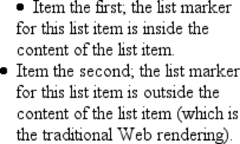
Figure 12-5. Placing the markers inside and outside list items
For brevity's sake, you can combine the three list-style properties into a
convenient single property:list-style.
list-style
- Values:
[
|| || ] | inherit- Initial value:
Refer to individual properties
- Applies to:
Elements whose
displayvalue islist-item- Inherited:
Yes
- Computed value:
See individual properties
For example:
li {list-style: url(ohio.gif) square inside;}
As you can see in
Figure 12-6
, all
three values are applied to the list items.
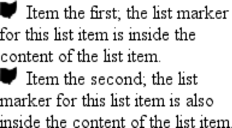
Figure 12-6. Bringing it all together
The values forlist-stylecan be listed in any
order, and any of them can be omitted. As long as one is present, the rest will fill
in their default values. For instance, the following two rules will have the same
visual effect:
li.norm {list-style: url(img42.gif);}
li.odd {list-style: url(img42.gif) disc outside;} /* the same thing */
They will also override any previous rules in the same way. For example:
li {list-style-type: square;}
li.norm {list-style: url(img42.gif);}
li.odd {list-style: url(img42.gif) disc outside;} /* the same thing */
The result will be the same as that in
Figure
12-6
because the impliedlist-style-typevalue ofdiscfor the ruleli.normwill override the previous declared value ofsquare, just as the explicit value ofdiscoverrides it in ruleli.odd.
Now that we've
looked at the basics of styling list markers, let's consider how lists are laid out
in various browsers. We'll start with a set of three list items devoid of any markers
and not yet placed within a list, as shown in
Figure 12-7
.
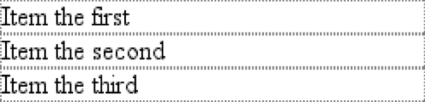
Figure 12-7. Three list items
The border around the list items shows them to be, essentially, like a block-level
element. Indeed, the valuelist-itemis defined to
generate a block box. Now let's add markers, as illustrated in
Figure 12-8
.
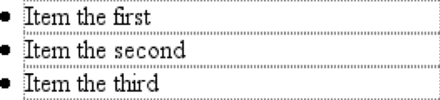
Figure 12-8. Markers are added
The distance between the marker and the list item's content is not defined by CSS,
and CSS2.1 does not provide a way to affect that distance. Interestingly, CSS2 does,
which is a subject briefly covered in the sidebar "
List-Marker Positioning
."
With the markers outside the list items' content, they don't affect the layout of
other elements, nor do they really even affect the layout of the list items
themselves. They just hang a certain distance from the edge of the content, and
wherever the content edge goes, the marker will follow. The behavior of the marker
works much as though the marker were absolutely positioned in relation to the
list-item content, something likeposition:absolute; left:-1.5em;. When the marker is inside, it acts like an inline element at
the beginning of the content.
So far, you have yet to add an actual list container; in other words, there is
neither aulnor anolelement represented in the figures. You can add one to the mix, as
shown in
Figure 12-9
(it's represented by
a dashed border).
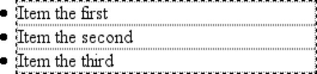
Figure 12-9. Adding a list element
Like the list items, the list element is a block box, one that encompasses its
descendant elements. As you can see, however, the markers are not only placed outside
the list item contents, but also outside the content area of the list element. The
usual "indentation" you expect from lists has not yet been specified.
Most browsers, as of this writing, indent list items by setting either padding or
margins for the containing list element. For example, the user agent might apply a
rule such as:
ul, ol {margin-left: 40px;}
This is the rule employed by Internet Explorer and Opera (see
Figure 12-9
). Most Gecko-based browsers, on
the other hand, use a rule like this:
ul, ol {padding-left: 40px;}
Neither is incorrect, but the discrepancy can lead to problems if you want to
eliminate the indentation of the list items.
Figure 12-10
shows the difference between the two approaches.
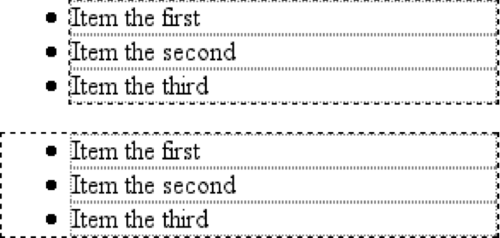
Figure 12-10. Margins and padding as indentation devices
The distance of40pxis a relic of early web
browsers, which indented lists by a pixel amount. A better value would be
something like2.5em, since this scales the
indentation along with changes in the text size.
For authors who want to change the indentation distance of lists, I strongly
recommend that you specify both padding and margins to ensure cross-browser
compatibility. For example, if you want to use padding to indent a list, use this
rule:
ul {margin-left: 0; padding-left: 1em;}
If you prefer margins, write something like this instead:
ul {margin-left: 1em; padding-left: 0;}
In either case, remember that the markers will be placed relative to the contents
of the list items, and may therefore "hang" outside the main text of a document, or
even beyond the edge of the browser window.
CSS2 and CSS2.1 include a new feature called
generated content
.
This is content created by the browser but not represented
either by markup or content.
For example, list markers are generated content. There is nothing in the markup of a
list item that directly represents the markers, and you, the author, do not have to
write the markers into your document's content. The browser simply generates the
appropriate marker automatically. For unordered lists, the marker is a bullet of some
kind, such as a circle, disc, or square. In ordered lists, the marker is a counter that
increments by one for each successive list item.
List-Marker Positioning
One feature many authors request is the ability to control the space between a
marker and the content of a list item. CSS2 defined ways to do this, including a
property calledmarker-offsetand adisplayvalue ofmarker. Implementation experience revealed this to be a clumsy approach,
and these features were removed in CSS2.1
As of this writing, the current working draft of the CSS3 Lists module defines a
new and more compact way to affect marker placement, which is the::markerpseudo-element. Assuming that the module does
not change before becoming a full Recommendation, you may someday be able to write
rules such asli::marker {margin-right:0.125em;}in order to get markers snugly against the
content of list items without actually bringing them inside.
To understand how you can affect list markers and customize the counting of ordered
lists (or anything else!), you must first look at more basic generated
content.
As of this writing, no version of Internet Explorer supports generated
content.
To insert generated content into the document, use
the:beforeand:afterpseudo-elements. These place generated content before or after the
content of an element by way of the content property (described in the next section).
For example, you might want to precede every hyperlink with the text "(link)" to
mark them for printing. This is accomplished with a rule like the following, which
has the effect shown in
Figure 12-11
:
a[href]:before {content: "(link)";}
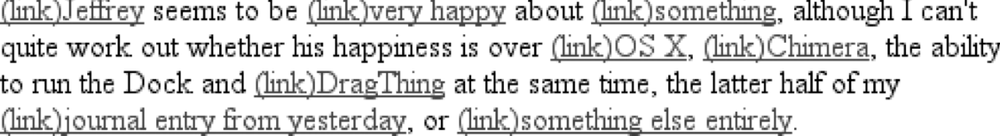
Figure 12-11. Generating text content
Note that there isn't a space between the generated content and the element
content. This is because the value of content in the previous example doesn't include
a space. You could modify the declaration as follows to make sure there's a space
between generated and actual content:
a[href]:before {content: "(link) ";}
It's a small difference but an important one.
In a similar manner, you might choose to insert a small icon at the end of links
to PDF documents. The rule to accomplish this would look something like:
a.pdf-doc:after {content: url(pdf-doc-icon.gif);}
Suppose you want to further style such links by placing a border around them. This
is done with a second rule:
a.pdf-doc {border: 1px solid gray;}
The result of these two rules is illustrated in
Figure 12-12
.
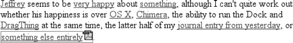
Figure 12-12. Generating icons
Notice how the link border extends around the generated content, just as the link
underline extended under the "(link)" text in
Figure 12-11
. This happens because generated content is placed inside the
element box of the element. As of CSS2.1, there isn't a way to place generated
content outside the element box, other than list markers.
You might think that positioning would do the trick, except CSS2 and CSS2.1
specifically prohibit the floating or positioning of:beforeand:aftercontent. List-style
properties, along with table properties, are similarly prohibited. In addition, the
following restrictions apply:
If the subject of a
:beforeor:afterselector is a block-level element, then the
propertydisplaycan accept only the valuesnone,inline,block, andmarker. Any other value is treated asblock.If the subject of a
:beforeor:afterselector is an inline-level element, then
the propertydisplaycan accept only the
valuesnoneandinline. Any other value is treated asinline.
For example, consider:
em:after {content: " (!) "; display: block;}
Sinceemis an inline element, the generated
content cannot be made block-level. The valueblockis therefore reset toinline. In
this next example, however, the generated content is made block-level because the
target element is also block-level:
h1:before {content: "New Section"; display: block; color: gray;}
The result is illustrated in
Figure
12-13
.
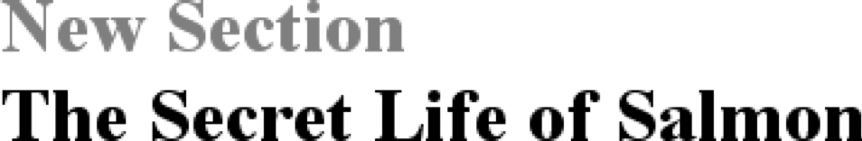
Figure 12-13. Generating block-level content
One interesting aspect of generated content is that it inherits values from the
element to which it's been attached. Thus, given the following rules, the generated
text will be green, the same as the content of the paragraphs:
p {color: green;}
p:before {content: "::: ";}
If you want the generated text to be purple instead, a simple declaration will
suffice:
p:before {content: "::: "; color: purple;}
Such value inheritance happens only with inherited properties, of course. This is
worth noting because it influences how certain effects must be approached. Consider:
h1 {border-top: 3px solid black; padding-top: 0.25em;}
h1:before {content: "New Section"; display: block; color: gray;
border-bottom: 1px dotted black; margin-bottom: 0.5em;}
Since the generated content is placed inside the element box of theh1, it will be placed under the top border of the
element. It would also be placed within any padding, as shown in
Figure 12-14
.
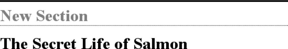
Figure 12-14. Taking placement into account
The bottom margin of the generated content, which has been made block-level,
pushes the actual content of the element downward by half an em. In every sense, the
effect of the generated content in this example is to break up theh1element into two pieces: the generated-content box
and the actual content box. This happens because the generated content hasdisplay:block. If
you were to change it todisplay:inline, the effect would be as shown in
Figure 12-15
:
h1 {border-top: 3px solid black; padding-top: 0.25em;}
h1:before {content: "New Section"; display: inline; color: gray;
border-bottom: 1px dotted black; margin-bottom: 0.5em;}

Figure 12-15. Changing the generated content to be inline
Note how the borders are placed and how the top padding is still honored. So is
the bottom margin on the generated content, but since the generated content is now
inline and margins don't affect line height, the margin has no visible effect.
With the basics of generating content established, let's take a closer look at the
way the actual generated content is specified.
If you're going to generate
content, you need a way to describe the content to be generated. As you've already
seen, this is handled with thecontentproperty,
but there's a great deal more to this property than you've seen thus far.
content
- Values:
normal| [| | | attr()|open-quote|close-quote|no-open-quote|no-close-quote]+ |inherit- Initial value:
normal- Applies to:
:beforeand:afterpseudo-elements- Inherited:
No
- Computed value:
For
values, an absolute URI; for attribute references, the
resulting string; otherwise, as specified
You've already seen string and URI values in action, and counters will be covered
later in this chapter. Let's talk about strings and URIs in a little more detail
before we take a look at theattr( )and quote
values.
String values are presented literally, even if they contain what would otherwise
be markup of some kind. Therefore, the following rule would be inserted verbatim into
the document, as shown in
Figure 12-16
:
h2:before {content: "¶ "; color: gray;}

Figure 12-16. Strings are displayed verbatim
This means that if you want a newline (return) as part of your generated content,
you can't use
string\A, which is the CSS way of representing a
newline (based on the Unicode linefeed character, which is hexadecimal positionA). Conversely, if you have a long string value
and need to break it up over multiple lines, you escape out the linefeeds with the\character. These are both demonstrated by the
following rule and illustrated in
Figure
12-17
:
h2:before {content: "We insert this text before all H2 elements because \
it is a good idea to show how these things work. It may be a bit long \
but the point should be clearly made.  "; color: gray;}
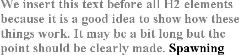
Figure 12-17. Inserting and suppressing newlines
You can also use escapes to refer to hexadecimal Unicode values, such as\00AB.
As of this writing, support for inserting escaped content
such as\Aand\00ABis not very widespread, even among
those browsers that support some generated content.
With URI values, you simply point to an external resource (an image, movie, sound
clip, or anything else the user agent supports), which is then inserted into the
document in the appropriate place. If the user agent can't support the resource you
point it to for any reason—say, you try to insert an SVG image into a browser that
doesn't understand SVG, or try to insert a movie into a document when it's being
printed—then the user agent is required to ignore the resource completely, and
nothing will be inserted.
values
There
are situations where you might want to take the value of an element's attribute
and make it a part of the document display. To pick a simple example, you can
place the value of every link'shrefattribute
immediately after the links, like
this:
a[href] {content: attr(href);}
Again,
this leads to the problem of the generated content running smack into the actual
content. To solve this, add some string values to the declaration, with the result
shown in
Figure
12-18
:
a[href] {content: " [" attr(href) "]";}
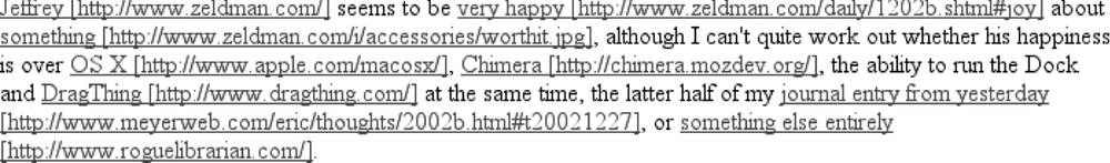
Figure 12-18. Inserting URLs
This can be useful for print style sheets, as an example. Any
attribute value can be inserted as generated content:alttext,classoridvalues—anything. An author might choose to make
the citation information explicit for a block quote, like
this:
blockquote:after {content: "(" attr(cite) ")"; display: block;
text-align: right; font-style: italic;}
For
that matter, a more complicated rule might reveal the text- and link-color values
for a legacy
document:
body:before {content: "Text: " attr(text) " | Link: " attr(link)
" | Visited: " attr(vlink) " | Active: " attr(alink);
display: block; padding: 0.33em;
border: 1px solid black; text-align: center;}
Note
that if an attribute doesn't exist, an empty string is put in its place. This is
what happens in
Figure 12-19
, in
which the previous example is applied to a document whosebodyelement has noalinkattribute.
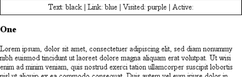
Figure 12-19. Missing attributes are skipped
The text "Active: " (including the trailing space) is inserted into
the document, as you can see, but there is nothing following it. This is
convenient in situations where you want to insert the value of an attribute only
when it exists.
CSS2.x defines the returned value of an attribute reference as an unparsed
string. Therefore, if the value of an attribute contains markup or character
entities, they will be displayed verbatim.
quotes
A specialized form of generated content is the
quotation mark, and CSS2.x provides a powerful way to manage both quotes and their
nesting behavior. This is possible due to the pairing of content values likeopen-quoteand the propertyquotes.
quotes
- Values:
[
]+ | none|inherit- Initial value:
User agent-dependent
- Applies to:
All elements
- Inherited:
Yes
- Computed value:
As specified
Upon studying the value syntax, we find that other than the keywordsnoneandinherit, the only valid value is one or more
pairs
of strings. The first string of the pair defines the open-quote symbol, and the
second defines the close-quote symbol. Therefore, of the following two
declarations, only the first is
valid:
quotes: '"' "'";  /* valid */
quotes: '"';  /* NOT VALID */
The
first rule also illustrates one way to put string quotes around the strings
themselves. The double quotation marks are surrounded by single quotation marks,
and vice versa.
Let's look at a simple example. Suppose you're
creating an XML format to store a list of favorite quotations. Here's one entry in
the
list:
Ralph Waldo Emerson
To
present the data in a useful way, you could employ the following rules, with the
result shown in
Figure
12-20
:
quotation: display: block;}
quote {quotes: '"' '"';}
quote:before {content: open-quote;}
quote:after {content: close-quote;}
quotee:before {content: " (";}
quotee:after {content: ")";}

Figure 12-20. Inserting quotes and other content
The valuesopen-quoteandclose-quoteare used to insert whatever quoting
symbols are appropriate (since different languages have different quotation
marks). They use the value of quotes to determine how they should work. Thus, the
quotation begins and ends with a double quotation mark.
If you want to
use "curly quotes" instead of the plain vertical-line quotation marks, as is
common in most print media, thequoterule
would
read:
quote {quotes: '\201C' '\201D';}
This
uses the hexadecimal Unicode positions for the "curly quote" symbols and, if
applied to the previous quotation, would surround Emerson's quote with curly
quotes instead of the straight quotes in
Figure 12-20
.
Withquotes, you can define quotation patterns to as many nesting levels as
you like. In English, for example, a common practice is to start out with a double
quotation mark, and a quotation nested inside the first one gets single quotation
marks. This can be recreated with "curly" quotation marks using the following
rules:
quotation: display: block;}
quote {quotes: '\201C' '\201D' '\2018' '\2019';}
quote:before, q:before{content: open-quote;}
quote:after, q:after {content: close-quote;}
When
applied to the following markup, these rules will have the effect shown in
Figure
12-21
:
be light!

Figure 12-21. Nested curly quotes
In a case where the nested level of quotation marks is greater than
the number of defined pairs, the last pair is reused for the deeper levels. Thus,
if you had applied the following rule to the markup shown in
Figure 12-21
, the inner quote would have
had double quotation marks, the same as the outer
quote:
quote {quotes: '\201C' '\201D';}
Generated
quotes make possible one other common typographic effect. In situations where
there are several paragraphs of quoted text, theclose-quoteof each paragraph is often omitted; only the opening
quote marks are shown, with the exception of the last paragraph. This can be
recreated using theno-close-quotevalue:
blockquote {quotes: '"' '"' "'" "'" '"' '"';}
blockquote p:before   {content: open-quote;}
blockquote p:after  {content: no-close-quote;}
This
will start each paragraph with a double quotation mark but no closing mark. This
is true of the last paragraph as well, so if you need to add a closing quote mark,
you'd need to class the final paragraph and declare aclose-quotefor its:aftercontent.
This value is important because it decrements the quotation
nesting level without actually generating a symbol. This is why each paragraph
starts with a double quotation mark, instead of alternating between double and
single marks until the third paragraph is reached.no-close-quotecloses the quotation nesting at the end of each
paragraph, and thus every paragraph starts at the same nesting
level.
This is significant because, as the CSS2.1 specification notes,
"Quoting depth is independent of the nesting of the source document or the
formatting structure." In other words, when you start a quotation level, it
persists across elements until aclose-quoteis
encountered, and the quote nesting level is decremented.
For the sake
of completeness, there is ano-open-quotekeyword, which has a symmetrical effect tono-close-quote. This keyword increments the quotation nesting level by
one but does not generate a symbol.