Keith Haring Journals (38 page)
Read Keith Haring Journals Online
Authors: Keith Haring

1988
JANUARY 3, 1988I just left the Frank Stella retrospective (his second) at MoMA.
A few observations:
The big square geometrical paintings (about 12 feet square) look more “pop” than anything else.
They look like stereotype “modern” paintings.
Pure modern, abstract painting, but more than that they seem to be a summation of this kind of flat, color-field, abstract, geometrical painting.
Almost a joke about this kind of painting . . . The viewer is overwhelmed and consumed by the scale alone.
Colors geometrically, mathematically chosen. A kind of “making fun” of the painting process.
The space in these paintings is completely flat, but available to “move” inside of . . . it beckons. Optical illusion (science) makes the painting move and the space penetrates the surface and the wall it hangs on.
It seems more of a concrete, conceptually sound comment on “itself” than even Jasper Johns.
A painting of a painting.
A modern joke.
Literary joke?
And now the constructions.
I can’t help wondering what is going through his mind.
I can’t help doubting.
Wondering if this is a joke, too.
Making fun of the surface of all paintings. Making fun of the way paintings rest on the wall. Making fun of the status of painting in 1987.
The choice of color combinations seems deliberately “bad.”
Almost seems as if he had a need to be “bad” to be “new.” The schlocky paint job and horrible color combinations seem to be an attempt to surpass the Abstract Expressionists again.
Proving he can do it.
Proving it doesn’t matter how meaningless the marks look and how haphazard the choice of colors is.
Proving that at this point, for him, his task is more conceptual than tactile. He puts all the “right” elements together with all the “wrong” parts and succeeds because of scale and the strength of the market and his “ugliness.”
His “ugliness” assures his “newness.” If it appears ugly now, we think perhaps it is only too “new” and will grow beautiful in time. He knows there is no more “risk” for him, so he tries to create “risk.”
This is truly scribbling. Compared to Tobey, Pollock, Warhol, de Kooning, everyone, everyone . . . it looks “bad.” Wrong colors. Uninspired gestures. You can see the difference immediately. He’s not dumb. This had to be intentional!
But what does that mean? Glitter paint and muddy, childish art-school color combinations . . . on purpose.
Technically well-produced. Expensive-looking production. Large scale, expensive materials.
Particularly unskillful scribbles. Makes Dubuffet’s late work look elegant and masterful.
So, why? To prove a point? To reiterate the joke? Making fun of the art world that worships him?
A well-planned practical joke? Actually “practical” joke is perfect.
It is “practical” in that it follows all the right rules and breaks all the right rules. The choices are wise and pre-planned.
Maybe even something profound.
But it is infuriating for assholes like Robert Hughes to say things about how Stella was the only artist capable of translating the “graffiti-like” use of garish colors and gestures into a successful art work. That is
so
tacky. Stella is making a “mess” on purpose and still getting credit for using things (ideas) that this critic doesn’t understand. He uses Stella to dismiss all the possible “quality” of an entire “stereotyped” misunderstanding. If this is what Stella got from what Hughes calls “graffiti,” then “graffiti” really is bullshit.
They’ve both missed the point completely. Stella is making jokes about quality. Quality of seeing, quality of life, money, money, money . . .
He’s playing games with the art world and making practical jokes about the art market. I don’t think he thinks his things have anything to do with “graffiti,” and if he does, he’s a fool.
Robert Hughes (Robert Who Cares) is another story and not worth thinking about for too long.
Many of the constructions are really beautiful. I enjoy looking at them. I just can’t figure out why. Obviously scale and form and “space” are intricately “worked out” with great results, but why the “bad” paint job?
Will these colors look as good in ten years as Pollock’s do now? Did Pollock’s colors look this bad when they were new?
I guess I’m just too obsessed with lines and color and have too much respect for what I’ve seen and done to just throw it all away to look at this shit. I refuse to be forced to believe that this is “quality” and I am not.
I love paintings too much, love color too much, love seeing too much, love feeling too much, love art too much, love too much . . .
I can’t help thinking he’s laughing while he does these. He’s making fun of everybody. Especially me.
I’ll grant him that he knows about constructions and shapes and space and the surface. And I can’t deny that the overall “look” of the thing is still very “right” and fits in perfectly in the scheme of things, especially in the market-generated concept of history. “All the right moves!”
But this doesn’t cancel out all the things he dabbles in and makes jokes about. His misuse of overall pattern and colorization does
not
mean that he did it the “right” way and others’ use is only “halfway.” Painting like this can be successful and interesting. It doesn’t have to be “bad” and “ugly” to be “new.” There are several pieces that seem to “make fun” of my patterned surfaces. The museum world, some critics, and a blind faith in the “market-directed” art world would like to believe Robert Hughes and dismiss others’ investigations to make a clear, simple “reading” of art history. Yes, this is Frank Stella’s second retrospective at MOMA. They have not even shown one of my pieces yet. In their eyes I don’t exist.
To add insult to injury, upstairs in the “collection” they have Barbara Kruger, Robin Winters, Mark Inerst, Judy Pfaff, Eric Fischl, etc., etc.
I wonder how many people visit MOMA looking for their Keith Haring.
Well, a New York museum with only one Warhol hanging can’t be expected to be too informative.
At the end of the exhibit, with the works from 1987, Stella comes so far off the wall that it looks like a sculpture leaning against the wall. Some are attached at only one small point. They are completely three-dimensional, with cones and geodesic “balls.” It seems a continuation of the perfect “joke” about modern “painting,” about “painting” in general, and the “surface” and materials and the function of “painting space.”
Looking at a 1987 piece, owned by the Stedelijk, I am wondering if the museum world will ever embrace me like this, or if I will disappear with my generation.
A man walks up to me and says, “Keith, in my opinion it is you, in the early 1980s, who gave him the freedom to do this.”
Unfortunately, of course, this man doesn’t work at the museum.
POP SHOP OPENING TRIP WEDNESDAY, JANUARY 20, 1988Wake up late, pack, stop at Dr. Goldberg’s for a blood test and rush to the airport. Smoke a joint on the way, knowing it’s the last one for three weeks. We buy rings (silver and turquoise) at an airport shop that sells American Indian stuff. Are these wedding rings? Airplane ride is uneventful. We have seats on the upper deck. Three Valiums to help make the 14-hour flight go quickly. On the plane I picked up a copy of
Der Spiegel
to browse through and found a full-page picture of me in a chair, that I had “posed” for in Switzerland in October. It is a kind of advertisement for an expensive furniture maker. The stewardess saw the picture I had ripped out and tried to find me another copy of the magazine on the plane, but couldn’t.
FRIDAY, JANUARY 22Der Spiegel
to browse through and found a full-page picture of me in a chair, that I had “posed” for in Switzerland in October. It is a kind of advertisement for an expensive furniture maker. The stewardess saw the picture I had ripped out and tried to find me another copy of the magazine on the plane, but couldn’t.
We woke up at 8:00 AM to find a postcard under our door from two “Japan boys,” who said they are staying at the hotel and want to meet us. We called them and invited them to our room, hoping for the best, but of course they were not cute. But still very nice. I signed their cards and explained we had to eat breakfast and go to “work.” They were thrilled and went away quite happy after a few photographs.
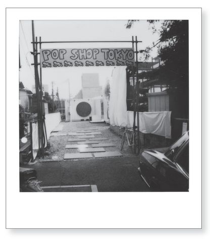
10:00 AM: We met Pop Shop people to take us to buy lanterns, a lucky cat, and an outdoor sign box for the Shop. First they took us to see the “containers” that will house the Pop Shop. They looked as I imagined them, except still very “raw,” and were in the process of being “finished.” Hard to believe they’ll be ready in two more days. We found great lanterns and a nice sign box to paint in the wholesale kitchen-supply neighborhood similar to the Bowery in New York. Kwong Chi had fun looking at all the display plastic food and stuff.
The meeting with Sato at four o’clock was exciting and frustrating at the same time. A lot of the merchandise is really great, but miscommunication caused a lot of small problems. Kwong and Juan return with a copy of the magazine that Kwong has been taking “dinner” pictures for that had three pages of my Paris birthday dinner at Le Train Bleu. Juan also brought an issue of
Popeye
with one of my jackets in it from New York Pop Shop, listed at $600. Also the staff showed me about six magazines with “advance press” mentions and photos for Tokyo Pop Shop. It looked pretty good. The most disturbing thing was problems with plans for the Pop Shop party next Tuesday. Junior’s name is not even on the invitation, and the cost of the party is 3,500 yen. The club will hold only 500 people, they say. I’m allowed 50 comp invitations. Much of the confusion is due to the last-minute change of location for the party, since the disaster at Turia (the original party location) last week.
SATURDAY, JANUARY 23Popeye
with one of my jackets in it from New York Pop Shop, listed at $600. Also the staff showed me about six magazines with “advance press” mentions and photos for Tokyo Pop Shop. It looked pretty good. The most disturbing thing was problems with plans for the Pop Shop party next Tuesday. Junior’s name is not even on the invitation, and the cost of the party is 3,500 yen. The club will hold only 500 people, they say. I’m allowed 50 comp invitations. Much of the confusion is due to the last-minute change of location for the party, since the disaster at Turia (the original party location) last week.
Woke up and read Julia’s fax. Tony has finally gotten paid by Hans Mayer for the paintings he bought three months ago at a big discount. The amount of payment doesn’t sound right to me, but I’ll have to wait to return to New York to check it out. The gallery shit is just as much of a pain in the ass as the Shop is. Sometimes I’d rather not deal with the “art market” at all and just do my own work. There isn’t much difference between the people I have to deal with in the art market and in the commercial world. Once the artwork becomes a “product” or a “commodity,” the compromising position is basically the same in both worlds. Some “artists” think they are “above” this situation because they are “pure” and outside of the “commercialization” of pop culture, because they don’t do advertising or create products specifically for a mass market. But they sell things in galleries and have “dealers” who manipulate them and their work the same way. In fact, I think it is even more deceptive to pretend you are outside of this system instead of admitting it and actually participating in it in a “real” way. There is no more “purity” in the art world than on Madison Avenue. In fact, it is even more corrupt. The Big Lie.
SUNDAY, JANUARY 24Wake up and go to buy a brush at Tokyu Hands and look at chalk. Trying to find a big piece (or pieces) to draw with on the street in Harajuku for photos for
Friday
magazine. I could only find regular size chalks, so I bought an entire box. We had to meet the photographers from
Friday
at 1:00 at the container. I painted the first coat on the red circle and then we all headed toward Harajuku. Underneath an overpass for pedestrians I did several chalk drawings using the existing street markings as a starting point. I added bodies to “rectangular” white markings on the street and added bodies to paint boxes indicating parking positions. Almost immediately a huge crowd gathered. A policeman tried to make us stop, calling my drawings “vulgar.” I found this amusing, considering I was drawing skateboarders and a large “mother and child” image, etc. After the photographer explained and persuaded him, he left us alone. We got great pictures and I handed out buttons and did autographs. When we left to head up to the main part of Harajuku, where the dancers are concentrated, a crowd of kids followed us for autographs. Kind of a procession, like the Pied Piper . . .
Friday
magazine. I could only find regular size chalks, so I bought an entire box. We had to meet the photographers from
Friday
at 1:00 at the container. I painted the first coat on the red circle and then we all headed toward Harajuku. Underneath an overpass for pedestrians I did several chalk drawings using the existing street markings as a starting point. I added bodies to “rectangular” white markings on the street and added bodies to paint boxes indicating parking positions. Almost immediately a huge crowd gathered. A policeman tried to make us stop, calling my drawings “vulgar.” I found this amusing, considering I was drawing skateboarders and a large “mother and child” image, etc. After the photographer explained and persuaded him, he left us alone. We got great pictures and I handed out buttons and did autographs. When we left to head up to the main part of Harajuku, where the dancers are concentrated, a crowd of kids followed us for autographs. Kind of a procession, like the Pied Piper . . .
I returned to the hotel and showered quickly and met Kwong and his friend Yoshi to go to the movies. We went to see Ann Magnuson in
Jimmy Reardon
with River Phoenix. It was cool to be watching Ann in a movie in a theatre in Tokyo. It wasn’t a very good movie, but it had some funny parts and River Phoenix is pretty hot. After the movie we went to eat at a fun restaurant that only served one thing, and then went home to the hotel.
MONDAY, JANUARY 25, 1988Jimmy Reardon
with River Phoenix. It was cool to be watching Ann in a movie in a theatre in Tokyo. It wasn’t a very good movie, but it had some funny parts and River Phoenix is pretty hot. After the movie we went to eat at a fun restaurant that only served one thing, and then went home to the hotel.
Woke up at 8:30 to the sound of a brass marching band playing in the street outside the hotel. I’ve heard this sound in the morning before in this hotel, but have never heard an explanation of why or what it is. We fell back asleep and woke up at 9:45 to a phone call from Tacey asking me if I could come to the container [the Tokyo Pop Shop was constructed out of two shipping containers joined in an “L” formation] and meet about fixing the floor. I thought I had already explained my feelings about this, but I wanted to make sure, so I agreed to meet there at 10:30.
Other books
After Mind by Wolf, Spencer
Burning Chrome by William Gibson
The Grub-And-Stakers Pinch a Poke by Alisa Craig, Charlotte MacLeod
Extracted by Sherry Ficklin, Tyler Jolley
Instant Family by Elisabeth Rose
The Lost Steersman (Steerswoman Series) by Rosemary Kirstein
Sorry Please Thank You by Charles Yu
Flirting With Forever by Kim Boykin
What Once Was Lost by Kim Vogel Sawyer
Percy Jackson and the Olympians: the lightning thief by Rick Riordan