B0041VYHGW EBOK (58 page)
Authors: David Bordwell,Kristin Thompson

When several moving elements appear on the screen, as in a ballroom dance, we are likely to shift our attention among them, according to other cues or depending on our expectations about which one is most salient to the narrative action. In
4.129
, from John Ford’s
Young Mr. Lincoln,
Lincoln is moving much less than the dancers we see in front of him. Yet he is framed centrally, as the major character, and the dancers pass rapidly through the frame. As a result, we are likely to concentrate on his gestures and facial expressions, however slight they might be compared to the energetic action in the foreground.
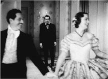
4.129 Emphasizing a background figure in
Young Mr. Lincoln.
Looking at a film image as a two-dimensional picture helps us appreciate the artistry of filmmakers, but it requires some effort. We find it easier to immediately see the edges and masses on the screen as a three-dimensional space, like the one we live in. The elements of the image that create this impression are called
depth cues.
Depth cues are what enabled us to understand the encounter of Sandro and Claudia as taking place in a realistic space, with layers and volume. We develop our understanding of depth cues from our experience of real locales and from our earlier experience with pictorial media. In cinema, depth cues are provided by lighting, setting, costumes, and staging—that is, by all the aspects of mise-en-scene.
Depth cues suggest that a space has both
volume
and several distinct
planes.
When we speak of an object as having volume, we mean that it is solid and occupies a three-dimensional area. A film suggests volume by shape, shading, and movement. In
4.106
and
4.130
, we do not think of the actors’ faces as flat cutouts, like paper dolls. The shapes of those heads and shoulders suggest solid people. The attached shadows on the faces suggest the curves and recesses of the actors’ features and give a modeling effect. We assume that if Jean Seberg in
4.106
turned her head, we would see a profile. Thus we use our knowledge of objects in the world to discern volume in filmic space.
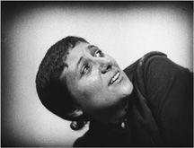
4.130 Shading and shape suggest volume in Dreyer’s
La Passion de Jeanne d’Arc.
An abstract film, because it can use shapes that are not everyday objects, can create compositions without a sense of volume. The shapes in
4.131
give us no depth cues for volume—they are unshaded, do not have a recognizable shape, and do not move in such a way as to reveal new views that suggest roundness.
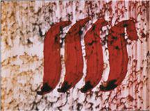
4.131 A flat composition in Norman McLaren’s
Begone, Dull Care.
Depth cues also pick out
planes
within the image. Planes are the layers of space occupied by persons or objects. Planes are described according to how close to or far away from the camera they are: foreground, middle ground, background.
CONNECT TO THE BLOG
Whether you see
Coraline
in a 3D or a 2D version, it has some fascinating use of depth cues to differentiate the heroine’s real life and the alternative life she finds behind a door in her room. We take a look at these in “Coraline, cornered.”
Only a completely blank screen has a single plane. Whenever a shape—even an abstract one—appears, we will perceive it as being in front of a background. In
4.131
, the four red S shapes are actually painted right on the frame surface, as is the lighter, textured area. Yet the textured area seems to lie behind the four shapes. The space here has only two planes, as in an abstract painting. This example, like our
L’Avventura
scene, suggests that one of the most basic depth cues is
overlap
. The curling S shapes have edges that overlap the background plane, block our vision of it, and thus seem to be closer to us.
Through overlap, a great many planes can be defined. In
4.56
, from Jean-Luc Godard’s
La Chinoise,
three distinct planes are displayed: the background of fashion cutouts, the woman’s face that overlaps that background, and her hand, which overlaps her lower face. In the three-point lighting approach, edge-lighting accentuates the overlap of planes by emphasizing the contour of the object, thus sharply distinguishing it from the background. (See again
4.59
,
4.64
, and
4.66
.)
Color differences also create overlapping planes. Because cool or pale colors tend to recede, filmmakers commonly use them for background planes such as setting. Similarly, because warm or saturated colors tend to come forward, such hues are often employed for costumes or other foreground elements, as in Sarah Maldoror’s
Sambizanga
(
4.132
).
(See also
4.29
,
4.34
, and
4.126
.)

4.132 In
Sambizanga,
the heroine’s dress has very warm and fairly saturated colors, making it stand out distinctly against the pale background.
Animated films can achieve brighter and more saturated color than most live-action filming, so depth effects can be correspondingly more vivid. In Chuck Jones’s
One Froggy Evening
(
4.133
),
the luminous yellow of the umbrella and the frog’s brilliant green skin make him stand out against the darker red of the curtain and the earth tones of the stage floor.
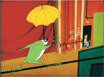
4.133 Vivid colors emphasize the sense of extreme depth in
One Froggy Evening.
Because of the eye’s sensitivity to differences, even quite muted color contrasts can suggest three-dimensional space. In
L’Argent
(
4.21
–
4.23
), Robert Bresson uses a limited, cool palette and relatively flat lighting. Yet the compositions pick out several planes by means of overlapping slightly different masses of black, tan, and light blue. Our shot from
Casanova
(
4.39
) articulates planes by means of slightly differing shades of red. By contrast, a filmmaker may want to minimize color differences and depth cues in order to create a flatter, more abstract composition
(
4.134
).
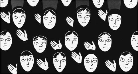
4.134 Marjane Satrapi and Vincent Paronnaud’s animated film
Persepolis
doesn’t differentiate the schoolgirls’ costumes by edge lighting or color differences. The result is a mass of black, and combined with the students’ repetitive hand gestures, the image suggests that the school system demands conformity.
In cinema,
movement
is one of the most important depth cues, since it strongly suggests both planes and volumes (
4.129
).
Aerial perspective
, or the hazing of more distant planes, is yet another depth cue. Typically, our visual system assumes that sharper outlines, clearer textures, and purer colors belong to foreground elements. In landscape shots, the blurring and graying of distant planes can be caused by actual atmospheric haze, as in Güney’s
The Wall
(
4.135
).
Even when such haze is a minor factor, our vision typically assigns strong color contrasts to the foreground, as in the
Sambizanga
shot (
4.130
). In addition, very often lighting is manipulated in conjunction with lens focus to blur the background planes
(
4.136
).
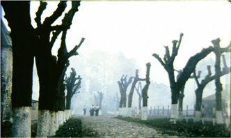
4.135 Fog emphasizes the distance between the foreground and background trees in
The Wall.