B0041VYHGW EBOK (60 page)
Authors: David Bordwell,Kristin Thompson

Similar processes are at work in color films. In one shot of Yasujiro Ozu’s
An Autumn Afternoon
(
4.142
),
our attention is concentrated on the bride in the center foreground. Here many depth cues are at work. Overlap locates the two figures in two foreground planes, setting them against a series of more distant planes. Aerial perspective makes the tree foliage somewhat out of focus. Movement creates depth when the bride lowers her head. Perspective diminution makes the more distant objects smaller. The figure and the bright silver, red, and gold bridal costume stand out strikingly against the muted, cool colors of the background planes. Moreover, the colors bring back a red-and-silver motif that began in the very first shot of the film
(
4.143
).
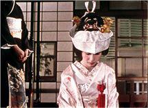
4.142 A simple shot from
An Autumn Afternoon
employs several depth cues.

4.143 The striped smokestacks establish a color motif for
An Autumn Afternoon.
In all these cases, compositional elements and depth cues have functioned to focus our attention on the narrative elements. But this need not always be the case. Bresson’s
Lancelot du Lac
uses a limited palette of dark and metallic hues, and warmer colors tend to stand out
(
4.144
).
Such a distracting use of color becomes a stylistic motif in the film.
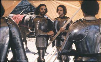
4.144 In
Lancelot du Lac,
a group of conversing knights is centered and balanced in the foreground planes, yet a pinkish-purple saddle blanket on a passing horse momentarily draws our eyes away from the action.
Cinema is an art of time as well as space. So we shouldn’t be surprised to find that many of our examples of two-dimensional composition and three-dimensional scenic space have unfolded over time. The director’s control over mise-en-scene governs not only
what
we see but
when
we see it and for how long. In our
L’Avventura
scene between Sandro and Claudia on the rooftop, the timing of the characters’ movements—Sandro turning away just as Claudia turns toward us—contributes to the effect of a sudden, sharp revelation of her anxiety.
The director shapes the speed and direction of movement within the shot. Since our eyes are attuned to noticing changes, we can pick up the slightest cues. In
4.145
, from Chantal Akerman’s
Jeanne Dielman, 23 quai du Commerce, 1080 Bruxelles,
the protagonist simply peels potatoes. This feminist film traces, in painstaking detail, the everyday routines of a Belgian housewife. The composition of this shot strongly centers Jeanne, and no competing movements distract us from her steady and efficient preparation of a meal. The same rhythm is carried throughout the film, so that when she does start to vary her habits, we are prepared to notice even the slight errors she makes under emotional pressure.
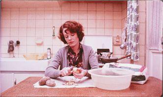
4.145 Slow, quiet movement in
Jeanne Dielman, 23 quai du Commerce, 1080 Bruxelles.
A far busier shot is
4.146
, from Busby Berkeley’s
42nd Street.
This overhead view presents strongly opposed movements. The central and outer rings of dancers circle in one direction, while the second ring turns in a contrary direction. The dancers also swing strips of shiny cloth back and forth. The result is a partially abstract composition, but it’s easy to grasp because the movement of the wheels within wheels has a geometrical clarity.
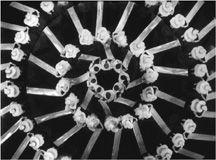
4.146 Synchronized rhythm in
42nd Street.
The dancers in
42nd Street
are synchronized to a considerable degree, but
4.147
, from Jacques Tati’s
Play Time,
contains movements of differing speeds, with different visual accents. Moreover, they occur on different planes and follow contrasting trajectories. These diverse movements accord with Tati’s tendency to cram his compositions with gags that compete for our attention.
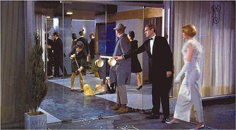
4.147 Competing rhythms of movement in a busy shot from
Play Time.
As we have already seen, we scan any film frame for information. This scanning brings time sharply into play. Only a very short shot forces us to try to take in the image all at once. In most shots, we get an initial overall impression that creates formal expectations. These expectations are quickly modified as our eye roams around the frame.
As we’d expect, our scanning of the shot is strongly affected by the presence of movement. A static composition, such as our first shot from
Day of Wrath
(
4.140
), may keep pulling our attention back to a single element (here, Anne’s face). In contrast, a composition emphasizing movement becomes more time-bound because our glance may be directed from place to place by various speeds, directions, and rhythms of movements. In the second image from
Day of Wrath
(
4.141
), Anne and Martin are turned from us (so that expression and gesture are minimized), and they are standing still. Thus the single movement in the frame—the cart—catches our attention. But when Martin speaks and turns, we look back at the couple, then back at the cart, and so on, in a shuttling, dynamic shift of attention.
Our time-bound process of scanning involves not only looking to and fro across the screen but also, in a sense, looking into its depths. A deep-space composition will often use background events to create expectations about what is about to happen in the foreground. “Composing in depth isn’t simply a matter of pictorial richness,” British director Alexander Mackendrick has remarked. “It has value in the narrative of the action, the pacing of the scene. Within the same frame, the director can organize the action so that preparation for what will happen next is seen in the background of what is happening now.”
Our example from
The Dying Swan
(
4.118
-
4.121
) illustrates MacKendrick’s point. The same principle is used in
4.148
–
4.150
, from
Three Kings.
Here the frame starts off unbalanced, and the fact that it includes a background doorway prepares us for the scene’s dramatic development. In addition, any movement from background to foreground is a strong attention-getter. At moments like these, the mise-en-scene is preparing us for what will happen, and by arousing our expectations, the style engages us with the unfolding action.

4.148 In this shot from
Three Kings,
Chief Elgin comes in to tell the partying GIs that their superior is coming. Normally, when a character is looking offscreen left, he or she is set a little off center toward the right. But Elgin is set to the left, leaving the tent flap behind him prominent. Without being aware of it, we expect some action to develop there.