Building Web Sites All-in-One For Dummies® (61 page)
Read Building Web Sites All-in-One For Dummies® Online
Authors: Claudia Snell

â¢
Client:
This is the main folder for all files pertaining to the Web site. The folder bears the client's name.
â¢
Client Supplied Assets:
You can lump all assets supplied by the client into this folder. If the assets are of several different types, subdivide the folder keeping all text files in one subfolder, images in another subfolder, multimedia assets such as video in yet another folder, and so on.
â¢
Assets:
Store all the assets you create in this folder. This folder might also be subdivided. For example, you could keep all Fireworks and Photoshop files in a subfolder named Images, and keep Flash and video content in a folder named Multimedia.
â¢
Site:
This folder contains all the files that you'll upload to the site server. In the main folder, keep all the files that will be in the root folder on the server. Keep a separate folder for images. If the site needs to be subdivided into different folders on the server, create those folders on your local computer as well.
A Doodle to a Working Page: Concept to Completion
When your client first contacts you, he gives you an idea of the concept behind his Web site. If the first meeting is by phone, jot down as much information as you can and then arrange to meet the client. The meeting can be at his office or your office. Sometimes neither is convenient, and you end up meeting in a coffee shop. Bring your notes from the original phone consultation, a legal pad, and a few writing implements. Bringing a few pens with different color inks to create sketches helps ensure that you and the client are on the same page. (The strangest client consultation Doug ever held occurred when he was introduced to a potential client in a restaurant. Instead of arranging a meeting for the next day, the client cut right to the chase, and Doug ended up using paper napkins to jot down ideas that he later transferred to a legal pad.)
Mind mapping
You can do mind mapping by using an application like Fireworks or by using a very large sheet of paper. In a nutshell, the exercise amounts to creating shapes that define the major parts of the Web design. For example, you create a rectangular shape at the top of the document for the banner, another rectangular shape for the menu, and other rectangular shapes for the text and image components of the page. Feel free to experiment with different sizes and locations for the elements that will eventually be incorporated into your design. The next step is to provide the client with a mockup of the Web site â or, as some Web designers call it, a
comp.
Creating a client mockup
After your mind-mapping session, you're ready to create something for your client to approve. You can easily create several versions of a client mockup in Fireworks. If you used Fireworks to do your mind mapping, use that document as the basis for your client mockup. Flesh out the shapes with actual content. If you have assets already created, you can incorporate them into the design. Add link titles to the shapes you created for the navigation menu. Then you're ready to create alternative versions of the mockup. To create alternative versions of your mockup in Fireworks, just follow these steps:
1.
Open the States panel.
2.
Select the first frame and then click the New/Duplicate State icon (refer to Figure 3-6).
Fireworks creates a carbon copy of the first state.
3.
Create a variation of the first state.
This is the second design you present to the client. You can change the manner how the menu is displayed, the placement of objects, choice of colors, and so on.
4.
Create additional states to create different variations of the design.
5.
After creating different variations of your design, choose File
â
Export.
Fireworks displays the Export dialog box.
6.
Choose the desired file format in which to save the images. Then from the Export drop-down menu, choose States to Files.
7.
Name the document and then click Save.
After you export the states, you have multiple files with the same filename, appended by the number of the state. You can now send the individual versions to your client for consideration.
Optimizing Artwork in Fireworks
When you
optimize
artwork in Fireworks, you choose the file format for export and then specify other parameters. The file format in which you export the document depends on the type of artwork you're creating. When you export the document, you specify other parameters, such as the amount of compression applied to a JPEG file or the number of colors and the palette for a GIF image file.
Optimizing GIF artwork
If your design has large areas of solid color and other elements, such as a client logo, the GIF file format is the ideal format in which to optimize your design. Banners and navigation menus are other candidates for the GIF format. To find out more about the GIF format, see Chapter 1 of this minibook. To optimize an image for export in the GIF format, follow these steps:
1.
Click the 2-Up icon at the top of the document window.
Fireworks displays two versions of the image: the original and a copy with the current optimization settings applied. Comparing the original with the optimized version lets you decide the best setting for optimizing the document.
2.
Choose Window
â
Optimize.
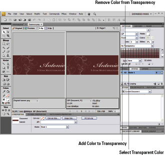
The Optimize panel is displayed. Figure 3-20 shows the document window in 2-Up display and the Optimize panel. The right side of the window displays the image with the current optimization settings applied. Below the image is the file size, number of colors in the palette, and the estimated time to download the file with an Internet connection speed of 56 Kbps.
Figure 3-20:
Please optimize me â set me free.

3.
Choose a preset from the Saved Settings drop-down menu (in the upper right of Figure 3-20).
Preview each setting and pay attention to the right pane of the document window. Choose the preset that's the best compromise between image quality and file size. Your choices are
⢠GIF Web 216:
Converts all colors to Web-safe colors. The color palette contains up to 216 colors.
⢠GIF WebSnap 256:
Converts nonâWeb-safe colors to their closest Web-safe colors, creating a color palette that contains up to a maximum of 256 colors.
⢠GIF WebSnap 128:
Converts nonâWeb-safe colors to their closest Web-safe colors creating a color palette that contains up to 128 colors.
⢠GIF Adaptive 256:
This color palette contains only the actual colors used in the document up to a maximum of 256 colors.
4.
Modify the preset to suit your document.
At this stage, you can experiment with reducing the number of colors in the Indexed palette. You can either enter a value in the Colors text field, or choose a preset from the Colors drop-down menu. If you notice image degradation, you went too far. When this occurs, choose the next highest value from the Colors menu.
To export an image with transparency, follow these steps:
1.
Choose Index Transparency from the Transparency drop-down menu.
The default is No Transparency, as shown in Figure 3-20. When you choose a transparent color, the background of the HTML document shows through. This is a useful option when you have an image as a background on the HTML page on which the graphic will appear.
2.
Click the Select Transparent Color eyedropper and click inside the document to sample the transparent color.
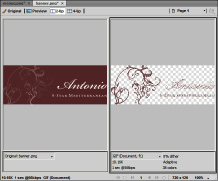
Fireworks displays the transparent area as a checkerboard in the right pane of the document pane when displayed in 2-Up mode. (See Figure 3-21.)
3.
You can modify the transparent colors as follows:
⢠Click the Add Color to Transparency eyedropper (refer to Figure 3-20). Then, inside the right pane of the 2-Up window, click the color you want to be transparent.
⢠Select the Remove Color from Transparency eyedropper. Then, inside the right pane of the 2-Up window, click a transparent area. The associated color will no longer be transparent.
Figure 3-21:
Now you see me; now you don't.

 You can also find the option for Alpha Transparency, which is only supported by images optimized in the PNG format â and is not widely used by Web designers.
Optimizing JPEG artwork
The JPEG format is best suited for artwork that is photorealistic in nature. The JPEG format compresses the file by losing color data; therefore, JPEG is known as a
lossy
format. Your goal is to export the image at the smallest possible file size without noticeable degradation. To optimize a document using the JPEG format, follow these steps:
1.
Click the 2-Up icon at the top of the document window.
Fireworks displays two versions of the image: the original and a copy with the current optimization settings applied. Comparing the original with the optimized version lets you determine the best setting for optimizing the document.
2.
Choose Window
â
Optimize.
The Optimize panel is displayed. When you optimize a document, you can click the 2-Up button to display two versions of the image. The right side of the window displays the image with the current optimization settings applied, and the left side shows the original image. Below the image is the file size, number of colors in the palette, and the estimated time to download the file with an Internet connection speed of 56 Kbps. Make sure you have image magnification set at 100 percent so you see the pixels at their actual size.
3.
Choose an option from the Saved Presets drop-down menu.
We recommend starting with the JPEG-Better Quality option. The theory is to start with a high quality and apply compression until noticeable degradation occurs.
4.
Gradually apply more compression to the image by specifying a lower image quality.
You can enter a value in the Quality text box or drag the Quality slider. When you see noticeable degradation in the image, gradually bump up the image quality until the end result looks good to you.
 If you have to apply heavy levels of compression to get the desired file size, choose an option from the Smoothing drop-down menu in the Optimize panel to smooth out the jagged edges caused by heavy compression.