Emotional Design (11 page)
Authors: Donald A. Norman

Even after the need for cup holders seemed obvious, German automobile manufacturers resisted them, explaining that automobiles were for driving, not drinking. (I suspect that this attitude reflects the oldfashioned German automobile design culture, which proclaims that the engineer knows best, and considers studies of real people driving their
vehicles irrelevant. But if the automobile is only for driving, why do Germans provide ashtrays, cigarette lighters, and radios?) The Germans reconsidered only when decreases in sales in the United States were attributed to the lack of cup holders. Engineers and designers who believe they do not need to watch the people who use their products are a major source of the many poor designs that confront us.
vehicles irrelevant. But if the automobile is only for driving, why do Germans provide ashtrays, cigarette lighters, and radios?) The Germans reconsidered only when decreases in sales in the United States were attributed to the lack of cup holders. Engineers and designers who believe they do not need to watch the people who use their products are a major source of the many poor designs that confront us.
My friends at the industrial design firm of Herbst LaZar Bell told me that they had been asked by a company to redesign their floor-cleaning machine to satisfy a long list of requirements. Cup holders were not on the list, but perhaps they should have been. When the designers visited maintenance workers in the middle of the night to observe just how they cleaned the floors of large commercial buildings, they discovered that workers had difficulty drinking coffee while manipulating the huge cleaning and waxing machines. As a result, the designers added cup holders. The new design had numerous major enhancements to the product in both appearance and behaviorâvisceral and behavioral designâand has proven to be a market success. How important was the cup holder to the success of the new design? Probably not much, except that it is symptomatic of the attention to true customer needs that signifies quality products. As Herbst LaZar Bell properly emphasizes, the real challenge to product design is “understanding end-user unmet and unarticulated needs.” That's the design challengeâto discover real needs that even the people who need them cannot yet articulate.
How does one discover “unarticulated needs”? Certainly not by asking, not by focus groups, not by surveys or questionnaires. Who would have thought to mention the need for cup holders in a car, or on a stepladder, or on a cleaning machine? After all, coffee drinking doesn't seem to be a requirement for cleaning any more than for driving in an automobile. It is only after such enhancements are made that everyone believes them to be obvious and necessary. Because most people are unaware of their true needs, discovering them requires careful observations in their natural environment. The trained observer
can often spot difficulties and solutions that even the person experiencing them does not consciously recognize. But once an issue has been pointed out, it is easy to tell when you have hit the target. The response of the people who actually use the product is apt to be something like, “Oh, yeah, you're right, that's a real pain. Can you solve that? That would be wonderful.”
can often spot difficulties and solutions that even the person experiencing them does not consciously recognize. But once an issue has been pointed out, it is easy to tell when you have hit the target. The response of the people who actually use the product is apt to be something like, “Oh, yeah, you're right, that's a real pain. Can you solve that? That would be wonderful.”
After function comes understanding. If you can't understand a product, you can't use itâat least not very well. Oh, sure, you could memorize the basic operating steps, but you probably will have to be reminded over and over again what they are. With a good understanding, once an operation is explained, you are apt to say, “Oh, yes, I see,” and from then on require no further explanation or reminding. “Learn once, remember forever,” ought to be the design mantra.
Without understanding, people have no idea what to do when things go wrongâand things always go wrong. The secret to good understanding is to establish a proper conceptual model. In
The Design of Everyday Things
, I pointed out that there are three different mental images of any object. First is the image in the head of the designerâcall that the “designer's model.” Then the image that the person using the device has of it and the way it works: call this the “user's model.” In an ideal world, the designer's model and the user's model should be identical and, as a result, the user understands and uses the item properly. Alas, designers don't talk to the final users; they only specify the product. People form their models entirely from their observations of the productâfrom its appearance, how it operates, what feedback it provides, and perhaps, any accompanying written material, such as the advertising and manuals. (But most people don't read the manuals.) I called the image conveyed by the product and written material the “system image.”
As
Figure 3.4
indicates, designers can communicate with the eventual users only through the system image of a product. Thus, a good designer will make sure that the system image of the final design conveys the proper user model. The only way to find this out is through testing: develop early prototypes, then watch as people try to use
them. What is something with a good system image? Almost any design that makes apparent its operation. The rulers and margin setting in the word processor I use as I type this is one excellent example. The seat adjustment control shown in
Figure 3.5
is another. Notice how the arrangement of the controls automatically refers to the operation each performs. Lift on the bottom seat control and the seat rises. Push forward on the vertical control and the seat back leans forward. That's good conceptual design.
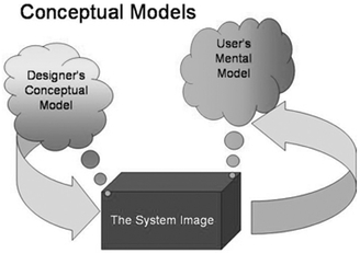
The designer's model, the system image, and the user's model.
For someone to use a product successfully, they must have the same mental model (the user's model) as that of the designer (the designer's model). But the designer only talks to the user via the product itself, so the entire communication must take place through the “system image”: the information conveyed by the physical product itself.
An important component of understanding comes from feedback: a device has to give continual feedback so that a user knows that it is working, that any commands, button presses, or other requests have actually been received. This feedback can be as simple as the feel of the brake pedal when you depress it and the resultant slowing of the automobile, or a brief flash of light or sound when you push something. It is amazing, though, how many products still give inadequate
feedback. Most computer systems now display a clock face or an hourglass to indicate that they are responding, if slowly. If the delay is short, this indicator suffices, but it is completely inadequate if the delay lengthens. To be effective, feedback must enhance the conceptual model, indicating precisely what is happening and what yet remains to be done. Negative emotions kick in when there is a lack of understanding, when people feel frustrated and out of controlâfirst uneasiness, then irritation, and, if the lack of control and understanding persists, even anger.
feedback. Most computer systems now display a clock face or an hourglass to indicate that they are responding, if slowly. If the delay is short, this indicator suffices, but it is completely inadequate if the delay lengthens. To be effective, feedback must enhance the conceptual model, indicating precisely what is happening and what yet remains to be done. Negative emotions kick in when there is a lack of understanding, when people feel frustrated and out of controlâfirst uneasiness, then irritation, and, if the lack of control and understanding persists, even anger.

Seat controlsâan excellent system image.
These seat controls explain themselves: the conceptual model is provided by the positioning of the controls to look just like the item being controlled. Want to change the seat adjustment? Push or pull, lift or depress the corresponding control and the corresponding part of the seat moves accordingly.
(Mercedes Benz seat controls; photograph by the author.)
(Mercedes Benz seat controls; photograph by the author.)
Usability is a complex topic. A product that does what is required, and is understandable, may still not be usable. Thus, guitars and violins do their assigned tasks well (that is, create music), they are quite simple to understand, but they are very difficult to use. The same is true of the piano, a deceptively simple-looking instrument. Musical instruments take years of dedicated practice to be used properly, and
even then, errors and poor performance are common among nonprofessionals. The relative unusability of musical instruments is accepted, in part because we know of no other alternative, in part because the results are so worthwhile.
even then, errors and poor performance are common among nonprofessionals. The relative unusability of musical instruments is accepted, in part because we know of no other alternative, in part because the results are so worthwhile.
But most of the things you use in everyday life should not require years of dedicated practice. New items appear every week, but who has the time or energy to spend the time required to learn each one? Bad design is a frequent cause of error, often unfairly blamed on users rather than on designers. Errors can lead to accidents that not only are financially expensive but can cause injury or death. There is no excuse for such flaws, for we understand how to build functional, understandable, and usable things. Moreover, everyday things have to be used by a wide variety of people: short and tall, athletic and not, who speak and read different languages, who may be deaf or blind, or lack physical mobility or agilityâor even hands. Younger people have different skills and abilities than older ones.
Usage is the critical test of a product: Here is where it stands alone, unsupported by advertising or merchandising material. All that matters is how well the product performs, how comfortable the person using it feels with the operation. A frustrated user is not a happy one, so it is at the behavioral stage of design that applying the principles of human-centered design pay off.
Universal design, designing for everyone, is a challenge, but one well worth the effort. Indeed, the “Universal Design” philosophy argues persuasively that designing for the handicapped, the hard of hearing or seeing, or those less agile than average invariably makes an object better for everyone. There is no excuse not to design usable products that everyone can use.
Â
Â
“HERE , TRY this.” I am visiting IDEO, the industrial design company. I am being shown their “Tech Box,” a big cabinet with an apparently endless set of small drawers and boxes, loaded with an eclectic combination of toys, textures, knobs, clever mechanical mechanisms,
and objects that I cannot classify. I peer into the boxes, trying to figure out what they are for, what purpose they serve. “Just turn the knob,” I'm told, as something is thrust into my hands. I find the knob and rotate it. It feels good: smooth, silky. I try a different knob: it doesn't feel as precise. There are dead regions where I turn and nothing seems to happen. Why the difference? Same mechanism, I am told: the difference is the addition of a special, very viscous oil. “Feel matters,” a designer explains, and from the “Tech Box” appear yet more examples: silky cloth, microfiber textiles, sticky rubber, squeezable ballsâmore than I can assimilate at one experience.
and objects that I cannot classify. I peer into the boxes, trying to figure out what they are for, what purpose they serve. “Just turn the knob,” I'm told, as something is thrust into my hands. I find the knob and rotate it. It feels good: smooth, silky. I try a different knob: it doesn't feel as precise. There are dead regions where I turn and nothing seems to happen. Why the difference? Same mechanism, I am told: the difference is the addition of a special, very viscous oil. “Feel matters,” a designer explains, and from the “Tech Box” appear yet more examples: silky cloth, microfiber textiles, sticky rubber, squeezable ballsâmore than I can assimilate at one experience.
Good designers worry a lot about the physical feel of their products. Physical touch and feel can make a huge difference in your appreciation of their creations. Consider the delights of smooth, polished metal, or soft leather, or a solid, mechanical knob that moves precisely from position to position, with no backlash or dead zones, no wobbling or wiggling. No wonder IDEO designers love their “Tech Box,” their collection of toys and textures, mechanisms and controls. Many design professionals focus on visual appearance, in part because this is what can be appreciated from a distance and, of course, all that can be experienced in an advertising or marketing photograph or printed illustration. Touch and feel, however, are critical to our behavioral assessment of a product. Recall the shower of
figure 3.3
.
figure 3.3
.
Physical objects have weight, texture, and surface. The design term for this is “tangibility.” Far too many high-technology creations have moved from real physical controls and products to ones that reside on computer screens, to be operated by touching the screen or manipulating a mouse. All the pleasure of manipulating a physical object is gone and, with it, a sense of control. Physical feel matters. We are, after all, biological creatures, with physical bodies, arms, and legs. A huge amount of the brain is taken up by the sensory systems, continually probing and interacting with the environment. The best of products make full use of this interaction. Just imagine cooking, feeling the comfort of a balanced, high-quality knife, hearing the sound of cutting on the chopping board or the sizzle when you drop food into the
skillet, smelling the odors released from the fresh-cut food. Or imagine gardening, feeling the tenderness of a plant, the grittiness of the earth. Or playing tennis, hearing the twang of the ball against the racket's strings, its feel in your hands. Touch, vibration, feel, smell, sound, visual appearance. And now imagine doing all this on a computer screen, where what you see may look real, but with no feel, no scent, no vibrations, no sound.
skillet, smelling the odors released from the fresh-cut food. Or imagine gardening, feeling the tenderness of a plant, the grittiness of the earth. Or playing tennis, hearing the twang of the ball against the racket's strings, its feel in your hands. Touch, vibration, feel, smell, sound, visual appearance. And now imagine doing all this on a computer screen, where what you see may look real, but with no feel, no scent, no vibrations, no sound.
Other books
Gray Lensman by E. E. Smith
Olympus Mons by William Walling
Finished Off (A Bellehaven House Mystery Book 2) by Kate Kingsbury
Mick (The A'rouk Brothers Book 1) by Serena Simpson
Katie and the Mustang #1 by Kathleen Duey
When Johnny Came Marching Home by William Heffernan
The Storytellers by Robert Mercer-Nairne
Silhouette by Thalia Kalkipsakis
Shark Bait (The Grab Your Pole Series) by Cooksey, Jenn
Freakling by Lana Krumwiede