Emotional Design (9 page)
Authors: Donald A. Norman

The very existence of the terms f
ashion, style, mode,
and
vogue
demonstrates the fragility of the reflective side of design. What is liked today may not be tomorrow. Indeed, the reason for the change is the very fact that something was once liked: When too many people like something, then it is no longer deemed appropriate for the leaders of a society to partake of it. After all, goes the thinking, how can one be a leader unless one is different, doing today what others will do tomorrow, and doing tomorrow what they will be doing after that? Even the rebellious have to change continually, carefully noticing what is in fashion so as not to be following it, carefully creating their own fashion of counterfashion.
How does a designer cope with popular taste if it has little to do with substance? Well, it depends upon the nature of the product and the intentions of the company producing it. If the product is something fundamental to life and well-being, then the proper response is to ignore continual shifts in popular sentiment and aim for long-lasting value. Yes, the product must be attractive. Yes, it should be pleasurable and fun. But it must also be effective, understandable, and appropriately priced. In other words, it must strive for balance among the three levels of design.
In the long run, simple style with quality construction and effective performance still wins. So a business that manufactures office machines, or basic home appliances, or web sites for shipping, commerce, or information, would be wise to stick to the fundamentals. In these cases, the task dictates the design: make the design fit the task, and the product works more smoothly and is bound to be more effective across a wide range of users and uses. Here is where the number of different products is determined by the nature of particular tasks and the economics.
There is a set of products, however, whose goals are entertainment, or style, or perhaps enhancement of a person's image. Here is where fashion comes into play. Here is where the huge individual differences in people and cultures are important. Here the person and market segment dictate the design. Make the design appropriate to the market segment that forms the target audience. It is probably necessary to have multiple versions of the design for different market segments. And it is probably necessary to do rapid changes in style and appearance as the market dictates.
Designing for the whims of fashion is tricky. Some designers may see it as a difficult challenge, others, as an opportunity. In some sense, the division often breaks between large and small companies, or between market leaders and the competition. To the market leader, the continual changes in people's fashion, and the wide variety of preferences for the same product across the world, are huge challenges. How can the company ever keep up? How does it track all the changes and even anticipate them? How does it keep the many necessary product lines effective? To the competitive companies, however, the same issues represent an opportunity. Small companies can be nimble, moving rapidly into areas and using approaches that the more conservative larger companies hesitate to try. Small companies can be outrageous, different, and experimental. They can exploit the public's interests, even if the product is initially purchased by only a few. Large companies attempt to experiment by spinning off smaller, more nimble divisions, sometimes with unique names that make them appear to be independent of their parent. All in all, this is the ever-changing, continual battleground of the consumer marketplace, where fashion can be as important as substance.
Â
Â
IN THE world of products, a brand is an identifying mark, the symbol that represents a company and its products. Particular brands produce an emotional response that draws the consumer toward the product or away from it. Brands have taken on the emotional representation.
They carry with them an emotional response that guides us toward a product or away from it. Sergio Zyman, former chief marketing officer of Coca-Cola, has said that “emotional branding is about building relationships; it is about giving a brand and a product long-term value.” But it is more: it involves the entire relationship of the product to the individual. Again, in Zyman's words: “Emotional branding is based on that unique trust that is established with an audience. It elevates purchases based on need to the realm of desire. The commitment to a product or an institution, the pride we feel upon receiving a wonderful gift of a brand we love or having a positive shopping experience in an inspiring environment where someone knows our name or brings an unexpected gift of coffeeâthese feelings are at the core of Emotional Branding.”
They carry with them an emotional response that guides us toward a product or away from it. Sergio Zyman, former chief marketing officer of Coca-Cola, has said that “emotional branding is about building relationships; it is about giving a brand and a product long-term value.” But it is more: it involves the entire relationship of the product to the individual. Again, in Zyman's words: “Emotional branding is based on that unique trust that is established with an audience. It elevates purchases based on need to the realm of desire. The commitment to a product or an institution, the pride we feel upon receiving a wonderful gift of a brand we love or having a positive shopping experience in an inspiring environment where someone knows our name or brings an unexpected gift of coffeeâthese feelings are at the core of Emotional Branding.”
Some brands are simply informative, essentially naming a company or its product. But on the whole, the brand name is a symbol that represents one's entire experience with a product and the company that produces it. Some brands represent quality and high prices. Some represent a focus upon service. Some represent value for money. And some brands stand for shoddy products, for indifferent service, or for inconvenience at best. And, of course, most brand names are meaningless, carrying no emotional power at all.
Brands are all about emotions. And emotions are all about judgment. Brands are signifiers of our emotional responses, which is why they are so important in the world of commerce.
Â
Â
THIS CONCLUDES part I of the book: the basic tools of emotional design. Attractive things do work betterâtheir attractiveness produces positive emotions, causing mental processes to be more creative, more tolerant of minor difficulties. The three levels of processing lead to three corresponding forms of design: visceral, behavioral, and reflective. Each plays a critical role in human behavior, each an equally critical role in the design, marketing, and use of products. Now it is time to explore how this knowledge is put to work.
PART TWO
Design in Practice
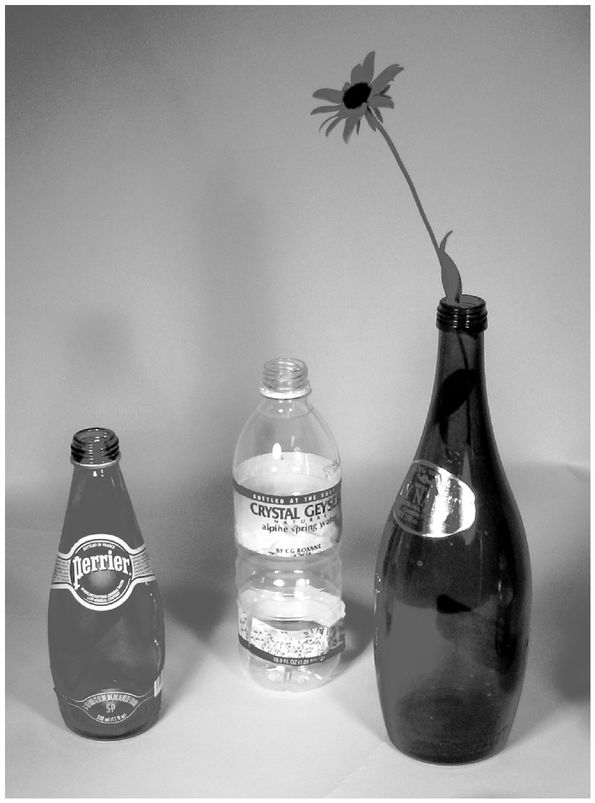
Water bottles.
The ones on the left and the right are clearly aimed to please at the visceral level; the middle one, well, it is efficient, it is inexpensive, and it works. The bottle on the left, for
Perrier
water, has become so well known that the shape and its green color are the brand. The bottle on the right is by
TyNant,
a bottle of such a pleasant shape coupled with its deep, cobalt blue color that people save the empty ones to use as vases. The clear plastic bottle is by
Crystal Geyser:
simple, utilitarian, effective when you need to carry water with you.
(Author's collection.)
CHAPTER THREE
Three Levels of Design: Visceral, Behavioral, and Reflective
I remember deciding to buy Apollinaris, a German mineral water, sim-
ply because I thought it would look so good on my shelves. As it
turned out, it was a very good water. But I think I would have bought
it even though it was not all that great.
The nice interplay between the bottle's green and the label's beige
and red as well as the font used for the brand turned this product of
mass consumption into a decoration accessory for your kitchen.
âHugues Belanger email, 2002
Â
IT WAS LUNCHTIME. My friends and I were in downtown Chicago, and we decided to try Café des Architectes in the Sofitel Hotel. As we entered the bar area, a beautiful display greeted us: water bottles, the sort you can buy in a food market, set out as works of art.
The entire rear wall of the bar was like an art gallery: frosted glass, subtly lit from behind, from floor to ceiling; shelves in front of the glass, each shelf dedicated to a different type of water. Blue, green, amberâall the wonderful hues, the glass gracefully illuminating them from behind, shaping the play of color. Water bottles as art. I resolved to find out more about this phenomenon. How did the packaging of water become an art form?
The entire rear wall of the bar was like an art gallery: frosted glass, subtly lit from behind, from floor to ceiling; shelves in front of the glass, each shelf dedicated to a different type of water. Blue, green, amberâall the wonderful hues, the glass gracefully illuminating them from behind, shaping the play of color. Water bottles as art. I resolved to find out more about this phenomenon. How did the packaging of water become an art form?
“Walk down a grocery aisle in any town in the U.S., Canada, Europe, or Asia and there is a virtual tidal wave of bottled water brands,” is how one web site that I consulted put it. Another web site emphasized the role of emotion: “Package designers and brand managers are looking beyond graphic elements or even the design as a whole to forge an emotional link between consumers and brands.” The selling of premium bottled water in major cities of the world, where the tap water is perfectly healthful, has become a big business. Water sold in this way is more expensive than gasoline. Indeed, the cost is part of the attraction where the reflective side of the mind says, “If it is this expensive, it must be special.”
And some of the bottles are special, sensuous, and colorful. People keep the empty bottles, sometimes refilling them with tap water, which, of course, demonstrates that the entire success of the product lies in its package, not its contents. Thus, like wine bottles, water bottles serve as decorative additions to rooms long after they have fulfilled their primary purpose. Witness another web site: “almost everyone who enjoys TyNant Natural Mineral Water admits to keeping one or two around the home or office as an ornament, vase or the like. Photographers positively delight in the bottles' photogenic appeal.” (In
figure 3.1
, the bottle with the flower in it is TyNant.)
figure 3.1
, the bottle with the flower in it is TyNant.)
How does one brand of water distinguish itself from another? Packaging is one answer, distinctive packaging that, in the case of water, means bottle design. Glass, plastic, whatever the material, the design becomes the product. This is bottling that appeals to the powerful visceral level of emotion, that causes an immediate visceral reaction:
“Wow, yes, I like it, I want it.” It is, as one designer explained to me, the “wow” factor.
“Wow, yes, I like it, I want it.” It is, as one designer explained to me, the “wow” factor.
The reflective side of emotion is involved as well, for the saved bottles can serve as reminders of the occasion when the beverage was ordered or consumed. Because both wine and expensive water are sometimes purchased for special occasions, the bottles serve as mementos of those occasions, taking on a special emotional value, becoming meaningful objects, not because of the objects themselves, but because of the memories they produce, and, as I noted in chapter 2, memories can trigger the powerful, long-lasting emotions.
What are the design factors in play here, where pure appearance is the issue, beauty that is all on the surface? This is where those genetic, hard-wired biological processes play their role. Here the designs are apt to be “eye candy,” as sweet to the eye as the taste of candy to the mouth. Yet just as sweet-tasting candy is empty of nutritional value, so, too, is appearance empty beneath the surface.
Human responses to the everyday things of the world are complex, determined by a wide variety of factors. Some of these are outside the person, controlled by designer and manufacturer, or by advertising and such things as brand image. And some come from within, from your own, private experiences. Each of the three levels of designâvisceral, behavioral, and reflectiveâplays its part in shaping your experience. Each is as important as the others, but each requires a different approach by the designer.
Visceral DesignVisceral design is what nature does. We humans evolved to coexist in the environment of other humans, animals, plants, landscapes, weather, and other natural phenomena. As a result, we are exquisitely tuned to receive powerful emotional signals from the environment that get interpreted automatically at the visceral level. This is where the lists of features in chapter 1 came from. Thus, the colorful plumage on male
birds was selectively enhanced through the evolutionary process to be maximally attractive to female birdsâas, in turn, were the preferences of female birds so as to discriminate better among male plumages. It's an iterative, co-adaptive process, each animal adapting over many generations to serve the other. A similar process occurs between males and females of other species, between co-adaptive life forms across species, and even between animals and plants.
birds was selectively enhanced through the evolutionary process to be maximally attractive to female birdsâas, in turn, were the preferences of female birds so as to discriminate better among male plumages. It's an iterative, co-adaptive process, each animal adapting over many generations to serve the other. A similar process occurs between males and females of other species, between co-adaptive life forms across species, and even between animals and plants.
Fruits and flowers provide an excellent example of the co-evolution of plants and animals. Nature's evolutionary process made flowers to be attractive to birds and bees, the better to spread their pollen, and fruits to be attractive to primates and other animals, the better to spread their seeds. Fruits and flowers tend to be symmetrical, rounded, smooth, pleasant to the touch, and colorful. Flowers have pleasant odors, and most fruits taste sweet, the better to attract animals and people who will eat them and then spread the seeds, whether by spitting or defecation. In this co-evolution of design, the plants change so as to attract animals, while the animals change so as to become attracted to the plants and fruits. The human love of sweet tastes and smells and of bright, highly saturated colors probably derives from this coevolution of mutual dependence between people and plants.
The human preference for faces and bodies that are symmetrical presumably reflects selection of the fittest; non-symmetrical bodies probably are the result of some deficiency in the genes or the maturation process. Humans select for size, color, and appearance, and what you are biologically disposed to think of as attractive derives from these considerations. Sure, culture plays a role, so that, for example, some cultures prefer fat people, others thin; but even within those cultures, there is agreement on what is and is not attractive, even if too thin or too fat for specific likes.
Other books
No Escape by Josephine Bell
Casa Azul by Laban Carrick Hill
Resolution: Evan Warner Book 1 by Nick Adams, Shawn Underhill
Aston's Story (Vanish #2) by Elle Michaels
Maddy Collated: The Complete Trilogy by Ava Lore
Destino by Sienna Mynx
Spoiled Secrets by Ebony N. Donahue
Ardores de agosto by Andrea Camilleri
Tides of Passion by Sumner, Tracy
Fractions by Ken MacLeod