HTML The Definitive Guide (104 page)
Read HTML The Definitive Guide Online
Authors: Chuck Musciano Bill Kennedy

The Browse button opens a platform-specific file-selection dialog box that allows users to select a value for the field. In this case, the entire pathname of the selected file is placed into the field, even if the length of that pathname exceeds the control's specified maxlength.
Use the accept attribute to constrain the types of files that the browser lets the user select. Its value is a comma-separated list of MIME encodings; users can select only files whose type matches one of those in the list. For example, to restrict the selection to images, you might add accept="image/*" to the file selection tag.
Unlike other form input controls, the file-selection field works correctly only with a specific form data encoding and transmission method. If you include one or more file-selection fields in your form, you must set the enctype attribute of the
The data transmitted from the browser to the server for this example form has two parts. The first contains the value for the name field, and the second contains the name and contents of the specified file: -----------------------------6099238414674
Content-Disposition: form-data; name="the_name"
One line of text field contents
-----------------------------6099238414674
Content-Disposition: form-data; name="fav_file"; filename="abc"
First line of file
...
Last line of file
-----------------------------6099238414674--
The browsers don't check that a valid file has been specified by the user. If no file is specified, the filename portion of the Content-Disposition header will be empty. If the file doesn't exist, its name appears in the filename subheader, but there will be no ContentType header or subsequent lines of file content. Valid files may contain nonprintable or binary data; there is no way to restrict user-selectable file types. In light of these potential problems, the form-processing application on the server should be robust enough to handle missing files, erroneous files, extremely large files, and files with unusual or unexpected formats.
10.5.2 Checkboxes
The checkbox form control gives users a way to select or deselect an item quickly and easily in your form. Checkboxes may also be grouped to create a set of choices, any of which may be selected or deselected by the user.
Create individual checkboxes by setting the type attribute for each tag to checkbox. Include the required name and value attributes. If the item is selected by the user, it will contribute a value when the form is submitted. If it is not selected, that element will not contribute a value. The optional checked attribute (no value) tells the browser to display a checked checkbox and include the value when submitting the form to the server unless the user specifically clicks the mouse to deselect (uncheck) the box.
The popular browsers include the value of selected (checked) checkboxes with other form parameters when they are submitted to the server. The value of the checked checkbox is the text string you specify in the required value attribute. For example:
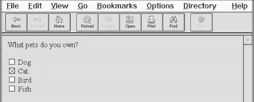
creates a checkbox group as shown in
Figure 10.3.
Figure 10.3: A checkbox group


Although part of the group, each checkbox control appears as a separate choice onscreen. Notice too, with all due respect to dog, bird, and fish lovers, that we've preselected the cat checkbox with the checked attribute in its tag. We've also provided text labels; the similar value attributes don't appear in the browser's window, but are the values included in the form's parameter list if the checkbox is selected and the form is submitted to the server by the user. Also, you need to use paragraph or line-break tags to control the layout of your checkbox group, as you do for other form controls.
In the example, if "Cat" and "Fish" are checked when the form is submitted, the values included in the parameter list sent to the server would be: pets=cat pets=fish
10.5.3 Radio Buttons
Radio-button form controls are similar in behavior to checkboxes, except that only one in the group may be selected by the user.
[3
] Create a radio button by setting the type attribute of the tag to radio. Like checkbox controls, radio buttons each require a name and value attribute. Radio buttons with the same name are members of a group. One of them may be initially checked by including the checked attribute with that element. If no element in the group is checked, the browser automatically checks the first element in the group.
[3] Some of us are old enough, while not yet senile, to recall when automobile radios had mechanical pushbuttons for selecting a station. Pushing in one button popped out the previously depressed one, implementing a mechanical one-of-many choice mechanism.
You should give each radio button element a different value, so that the form-processing server can sort them out after submission of the form.
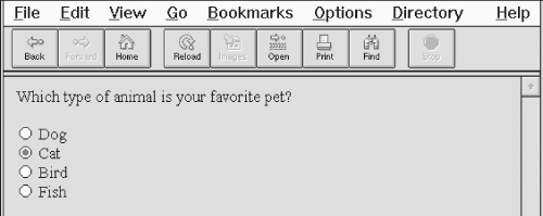
Here's the previous example reworked so that now you get to choose only one animal as a favorite pet (see
Figure 10.4):
Again, like the previous example with checkboxes, we've tipped our hat toward felines, making the "Cat" radio button the default choice. If you select an alternative - "Bird," for instance - the browser automatically deselects "Cat." When the user submits the form to the server, the browser includes only one value with the name "favorite" in the list of form parameters; favorite=bird, if that was your choice.
Since one of the controls in a group of radio buttons is always selected, it makes no sense to create a single radio button; they should appear in your documents as groups of two or more. (Use checkboxes for on/off, yes/no types of form controls.)
Figure 10.4: Radio buttons allow only one selection per group
10.5.4 Action Buttons
Although the terminology is potentially confusing, there is another class of buttons for HTML forms. Unlike the radio buttons and checkboxes described previously, these special types of form controls act immediately, their effects cannot be reversed, and they affect the entire contents of the form, not just the value of a single field. These "action" buttons (for lack of a better term) include submit, reset, regular, and clickable image buttons. When selected by the user, both the submit and image buttons cause the browser to submit all of the form's parameters to the form-processing server. A regular button does not submit the form, but can be used to invoke an applet to manipulate or validate the form. The reset button acts locally to return a partially filled-out form to its original (default) state.
[JavaScript Event Handlers, 13.3.3]
In this section we describe the action buttons that you may create with the standard form element. In the next section, we describe in detail the new HTML 4.0
10.5.4.1 Submission buttons
The submit button () does what its name implies, setting in motion the form's submission to the server from the browser. You may have more than one submit button in a form. You may also include name and value attributes with the submit type of input form button.
With the simplest submit button (that without a name or value attribute), the browser displays a small rectangle or oval with the default label "Submit". Otherwise, the browser labels the button with the text you include with the tag's value attribute. If you provide a name attribute, the value attribute for the submit button is added to the parameter list the browser sends along to the server. That's good, because it gives you a way to identify which button in a form was pressed, letting you process any one of several different forms with a single form-processing application.
The following are all valid submission buttons:
The first one is also the simplest: the browser displays a button, labeled "Submit," which activates the form-processing sequence when clicked by the user. It does not add an element to the parameter list that the browser passes to the form-processing server and application.
The second example button has the value attribute that makes the displayed button label "Order Kumquats," but like the first example does not include the button's value in the form's parameter list.
The last example sets the button label and makes it part of the form's parameter list. When clicked by the user, that last example of the submission button adds the parameter ship_style="Ship Overnight" to the form's parameter list.
10.5.4.2 Reset buttons
The reset type of form button is nearly self-explanatory: it lets the user reset - erase or set to some default value - all elements in the form. Unlike the other buttons, a reset button does not initiate form processing. Instead, the browser does the work of resetting the form elements.
The server never knows (or cares, for that matter) if or when the user might have pressed a reset button.
By default, the browser displays a reset button with the label "Reset." You can change that by specifying a value attribute with your own button label.
Here are two sample reset buttons:
The first one creates a reset button labeled "Reset"; the browser labels the second example reset button with "Use Defaults." They both initiate the same reset response in the browser.
10.5.4.3 Custom image buttons
The image type of form element creates a custom button that is a "clickable" image. It's a special button made out of your specified image that, when clicked by the user, tells the browser to submit the form to the server, and includes the x,y coordinates of the mouse pointer in the form's parameter list, much like the mouse-sensitive image maps we discuss in
Chapter 7, Links and Webs
. Image buttons require a src attribute with the URL of the image file, and you can include a name attribute and a descriptive alt attribute for nongraphical browsers. You may also use align and border (Netscape only) attributes to control image alignment within the current line of text and the width of the frame that Netscape places around the image, respectively, much like the align and border attributes for the tag (Internet Explorer doesn't place a border on form images).