Living by the Book/Living by the Book Workbook Set (29 page)
Read Living by the Book/Living by the Book Workbook Set Online
Authors: Howard G. Hendricks,William D. Hendricks
Tags: #Religion, #Christian Life, #Spiritual Growth, #Biblical Reference, #General

UMMARIZE
Y
OUR
O
BSERVATIONS
O
ne of the most significant developments of our time since the first edition of
Living By the Book
was published is the emergence of the Internet. Today there is probably no topic of interest to human beings for which there is not a website somewhere. A great deal of that on-line information is text-based. But by virtue of its video capabilities, the Internet more or less demands the summarization of information in ways that make for quick reading. Users want to get to the point as quickly as possible, and compelling graphics are a primary means to that end. In fact, the Internet, along with television and film, has more or less redefined the way we communicate nowadays: it’s become more important to show rather than tell.
There’s a lesson here for the student of Scripture. Bible study is information-intensive. If you do the job of Observation as I’ve described it in the previous chapters, you’ll have more data than you can possibly handle. And that’s a problem, because what good is information if you can’t access it? One solution is the strategy of the Internet: Show rather than tell. Summarize your findings in a graphical way. A chart is particularly effective.
HE
V
ALUE OF
C
HARTS
A chart is to the Bible student what a map is to a mariner. It aids him or her in navigating an ocean of words, pages, books, ideas, characters, events, and other information. Without a chart or some similar device, he is liable to founder on the shoals of mental overload. There are just too many details to keep track of.
But a good chart can keep you on course in several ways. First, it uses the power of the picture. This is especially helpful in our visually-oriented culture. Charts can show the relationships between verses, paragraphs, sections, and even books. Using a chart, you can comprehend the purpose and structure of a portion of Scripture at a glance.
A well-constructed chart also tends to be memorable. Again, this is largely a function of its visual appeal. For instance, suppose you’ve never memorized the names of the books of the Bible in order. If I handed you a list of the books, it would probably take you quite a while to memorize that list perfectly. But if I show you a chart of the books arranged by categories, you can memorize their names much more quickly. (See
page 32
.) That’s because a chart gives you some visual landmarks.
One final benefit worth mentioning is the way charts can illustrate your observations. For example, I mentioned the six clues to look for: things emphasized, things repeated, things related, and so on. A chart can show those findings. It can illustrate the parts in light of the whole. It can highlight the important ideas or characters. It can demonstrate contrasts and comparisons. It can point out key terms and phrases. Most importantly, it can sketch out the structure, which is crucial to the author’s purpose.
HE
A
RT OF THE
C
HART
The chart is an incredibly useful tool in Bible study, but keep in mind that it is only a means to an end. Your ultimate goal in studying God’s Word is not to produce a chart, but to produce change in your life. The chart is simply a way to handle the information that you cull from the text.
Let me discuss the examples of charts shown here, and then I’ll list some suggestions for how you can get started in effective charting.
HE
G
OSPEL
OF
M
ARK
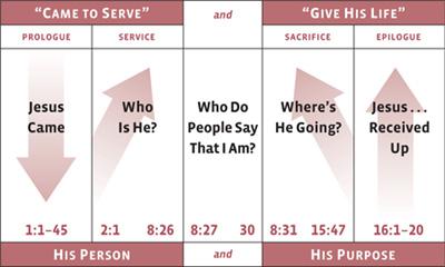
The first chart shows the gospel by Mark, the whole book at a glance, on one piece of paper. The person who made it observed that the key verse, the one that actually summarizes the book’s structure, is 10:45: “For even the Son of Man did not come to be served, but to serve, and to give His life a ransom for many.”
That helped him observe that the book divides into two major sections: the first half dealing with Jesus’ service, and the last half dealing with His sacrifice. You can see how he charted these and other observations, so that both visually and verbally he could understand the book at a glance.
I particularly like this chart because it is simple. If we were to enlarge it to the size of a full page, we could add all kinds of detail. But as it stands, we have the basics. We know immediately what Mark is all about.
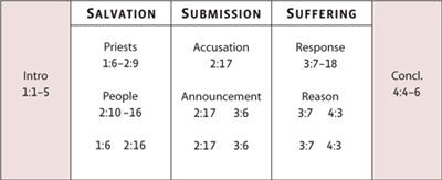
The chart at the top of the next page is one that I developed for 1 Peter, the book I call a “Syllabus for Suffering Saints.” (Second Peter is the “Syllabus for Significant Saints.”)
ETER
S
YLLABUS
FOR
S
UFFERING
S
AINTS
H
OW TO
H
OLD
U
P
—N
OT
F
OLD
U
P
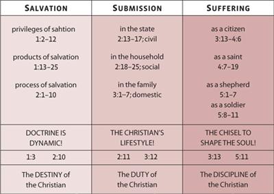
As I’ve studied 1 Peter, I’ve noticed that there are three major divisions to the book, three major issues addressed: salvation, submission, and suffering. It’s interesting to think of them in reverse order: Suffering will never make sense until you have submitted yourself to the Father’s will; and submission will never make sense until you understand what salvation is all about. That’s how the writer unfolds his argument through the five chapters of the book.
The next example shows Malachi. I’ve titled this, “The Wail of Wounded Love.” Do you want to study an Old Testament book? This is it. Remember we talked about using the question-and-answer approach (chapter 11)? Well, Malachi was the prophet with a question mark for a brain. Over and over he asks the question, “Who, me?”
You see, in Malachi God is rebuking the nation for its sins. And every
time He does, the people respond, “Prove it.” They are like a little kid with his hand in the cookie jar and crumbs all down the front of him. His mom says, “Son, I told you not to take the cookies.”
ALACHI
“T
HE
W
AIL OF
W
OUNDED
L
OVE
”
And he says, “What cookies?”
That’s exactly what you have in this book.
You need to think of charts as more than just a final, polished product of your study. They are actually powerful tools to help you investigate the text.

UKE
AW OF
P
ROPORTION
For instance, here’s an overview of the gospel by Luke that shows what I call the law of proportion. We talked about looking for things that are emphasized through the amount of space devoted to them. The law of proportion says that the importance of material to an author’s meaning is in direct proportion to the amount of space he gives to it. A chart like this one illustrates that principle.
Notice the grid chart of Ephesians below. Remember I used a grid chart in the last chapter to study Mark 4–5.
Let’s say I’ve been observing the epistle to the Ephesians, and I notice that there are four themes that keep popping up: the grace of God, the activity of Satan, the believer’s lifestyle, or “walk,” and prayer. So I need to ask: Are there any relationships between these themes? Is one of them more dominant than the others? How much space is devoted to each one? How do they relate to the overall theme and structure of the book?