Uncle John’s 24-Karat Gold Bathroom Reader® (87 page)
Read Uncle John’s 24-Karat Gold Bathroom Reader® Online
Authors: Bathroom Readers’ Institute

Ooh-la-la! Bonobo chimpanzees French-kiss.
DRY-COOKING TECHNIQUES
Baking
is prolonged dry cooking by hot air—in an open or enclosed oven—at temperatures ranging from 270°F to 450°F. It’s used for a variety of foods, including bread, cakes, pastries, pies, potatoes, beans, and lasagna, just to name a few. (Baking can also be done on heated surfaces, such as on hot rocks.)
Roasting
is essentially the same as baking—cooking with heated air in an oven—but the term
roasting
is used when the food is meat. (Or chestnuts. Nobody seems to know why.) Roasted meat is usually set on a wire rack in a pan, so the bottom of the meat doesn’t get soggy, and the juices collected in the pan are often basted onto the meat while cooking. (Roasting can also be done over an open fire, as in roasting a pig on a spit.) Tip: Meats that have been roasted should rest for 10 minutes or so after cooking. That allows the juices to settle and not run out during slicing.
Blackening
is a technique used to cook fish. It’s done on a very hot and very dry cast iron skillet. (If white ash spots appear on the skillet, you’ve gone a little too far.) The fish is dipped in melted butter, rolled in spices, dropped onto the skillet, and cooked for one to two minutes per side. Tip: Don’t do it indoors unless you’ve got
really
good ventilation. Blackening creates a
lot
of smoke.
Broiling
(called
grilling
outside the United States and Canada) is cooking food via heat radiating off a flame or element from above. The food sits on a grill or slotted tray, allowing oils to drip away from the food. It’s sometimes recommended to keep the broiler door open a little, to prevent the thermostat from turning the element or flame off, as you want constant heat. Broiling is best for tender meats—it doesn’t soften meat as much as it adds flavor via
browning
. Barbecuing follows the same basic rules, except that the heat source is under rather than above the food.
Browning
, also called
searing
, is quick-cooking a food’s surface at
high heat. It can be done in a pan, in an oven, or on a barbecue. Browning affects naturally occurring sugars and proteins in food, and can change and greatly enhance its colors, textures, and flavors.
Does a view cost extra? A British website sells land on Mars and Venus for $29 an acre.
Deep frying
is complete submersion of food in oil heated to between 350°F and 375°F. Done correctly, the oil turns the water in the food to steam, which not only prevents the oil from getting into the food (the pressure of the escaping steam keeps it out) but it cooks the food from inside. Deep frying gets a bad rap, but when it’s done properly, it can actually be an economical, safe, and healthy cooking technique.
Sautéing
is pan frying on a very hot pan with just a thin layer of oil. It’s meant to be done quickly, to prevent the food from absorbing the oil. The food, which is cut into similarly sized pieces so they cook uniformly, is turned often, causing a slight browning on all sides of the food. (
Sauté
means “jump” in French, and refers to how the food is moved about in the pan.)
Pan frying
is simple pan cooking (as opposed to more-specialized frying techniques like sautéing). Common examples of pan-fried foods are bacon, eggs, pancakes, and hamburgers.
Stir frying
is frying at a much higher temperature than sautéing. Chinese in origin, it can be done in a wok, in a regular pan, or on a griddle. The food is chopped into bite-sized pieces and cooked for just a short amount of time.
A FEW MORE BITES
•
Velveting chicken
is a stir-fry technique in which chicken is marinated for 30 minutes in a mixture of sherry, salt, egg white, oil, and cornstarch. It’s then fried until it turns white and then finishes cooking with other stir-fry ingredients.
•
Curing
changes the chemistry of food in much the same way that cooking does, but with very little or no heat. This can be achieved by adding salt or sugar to the food, or exposing it to smoke.
• Microwaves cook by
exciting
water molecules in food, causing them to heat up and steam the food. This means that microwaves can only heat food to 212°F—which is why you can’t brown food in a microwave.
Odds that you’ll be killed by your lawn mower: 1 in 5,300.
We see them every day and seldom notice them, but every typeface—from
Gothic
to
Futura
to
Comic Sans
—has a story behind it
.
L
IVING HISTORY
As you sit there reading the letters on this page, you’re actually looking at symbols from the distant past. Take the two oldest letters in our alphabet, “X” and “O”; they were created by the Phoenicians more than 3,000 years ago. Most of the rest of the “modern” alphabet was created by the Greeks and Romans a few centuries after that. (The term
alphabet
is derived from the first two Greek letters,
alpha
and
beta
, which still look like “A” and “B” today.) Even the younger letters, such as “J” and “U,” are hundreds of years old.
What
has
changed a lot over the centuries is how these letters have been chiseled, written, and printed. Yet the desired effect is the same—to convey a specific message. When people speak, their words make up only a portion of what they’re trying to communicate. Additional information is conveyed by their tone, volume, posture, and even the setting. This principle works for reading as well: The font acts as the word’s “body language.” The study and creation of this language is called
typography
, from the Greek
typo
(“impression”) and
graphy
(“writing”).
FONT OR TYPEFACE?
The terms
typeface
and
font
are often used interchangeably, but technically they’re not the same thing. A typeface is a lettering style that was created by a designer (called a typographer), whereas a font is a set of guidelines for how a specific letter, symbol, or number within a specific typeface should appear. Helvetica, for example, is a typeface. An example of a font might be “Helvetica 10-point bold italic,” which looks like
this
. Today, typefaces are primarily created on computers, but their history goes back more than a thousand years. There are an estimated 100,000 typefaces in existence. Here are the stories behind a few of them.
Highest U.S. capital: Santa Fe, NM, at 7,000 ft. #2: Cheyenne, WY, 6,062 ft. (Denver is #3.)
WHOCARESABOUTREADABILITY?
In A.D. 781, a scholar named Alcuin of York was tasked with creating a uniform script to be used throughout Charlemagne’s empire, which covered most of Europe. Lettering had changed very little since the fall of the Roman Empire in the 400s, except that it had become even more difficult to read. There were no lowercase letters, no breaks between words, and no punctuation. Everything was hand-written by scribes, each of whom added his own flair. Alcuin’s style of script, which we now call
carolingian minuscule
, helped put an end to that. Here’s a sample:

This typeface remained the standard long beyond Charlemagne’s rule and into the 1200s, but as time went on, it too became increasingly difficult to read as new scribes added new embellishments. The strokes of the letters got thicker, and the ends of the strokes got spikier. Result: carolingian minuscule went from what you see above to something resembling this:
Gothic Blackletter (1400s)
Variations of this style of lettering, also called Old English and Textura, were used by monks who toiled away with ink and paper in small rooms called
scriptoriums
for months or even years just to make a single book. That was the norm until the mid-1400s when a German goldsmith named Johannes Gutenberg (1398–1468) realized that he could make a lot of money printing Bibles that appeared as if they were lettered by hand, but were made in a fraction of the time. There were a few rudimentary printing methods in use in Europe and the Far East, but the most popular one—block printing—was really only useful for printing pictures, not words. Utilizing his metalworking skills, Gutenberg created the
movable type
system in which individual letters and numbers could be carved out of soft metal, cut out with a punch-cutter, and then placed (in reverse) to form a page of text. Then, using new oil-based inks, these letters could be transferred onto pages.
The space shuttle
Discovery
flew 142 million miles, equal to 309 round trips to the moon.
The impact of Gutenberg’s printing press cannot be underestimated—it effectively ended the Dark Ages and ushered in a new era of literacy in which books became available to the average person. (And his basic method of printing was the norm until the 1970s.) Yet Gutenberg was equally important to the world of typography: The 270 individual letters and numbers he created at different sizes are considered the first true fonts.
Why is his typeface called “gothic”? It was the Italians who gave it the name. In Italy in the 1500s, the word
gothic
was an insult meaning “barbaric.” Because the Italians blamed the fall of the Roman empire on the Germanic tribes—called Goths—who sacked Rome in the 400s, anything resembling Germanic culture, from their spiked architectural building styles to their hard-to-read, spiked letters, was considered “gothic.”
Garamond (1550s)
Claude Garamond (1480–1561) was a French bookmaker who refined Gutenberg’s movable type system to make it even easier to operate. He’s also one of the pioneers of
roman type
, so named during the Renaissance because it harkened back to the letterforms used in ancient Greece and Rome. Back then, because each letter had to be chiseled by hand, the carvers created typefaces that required few strokes. The Latin alphabet (which consisted of only capital letters) mirrored the Greco-Roman ideals of symmetry, proportion, and geometry—thin lines with rounded tops, akin to arches. Garamond brought back a unique feature of roman text:
serifs
, the little notches and hooks at the ends of letters. During his lifetime, Garamond was most famous for his Greek typestyles, which he designed on commission from King Francis I. Today, however, he’s known for the typeface family that bears his name. Garamond has been a favorite font of book printers for nearly 500 years. (
Italic
type, a slanted version of roman type, was created by Italian Francesco Griffo in the early 1500s.)
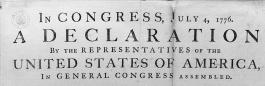
Caslon (1722)
You may not recognize the name, but Caslon—designed by Englishman William Caslon in 1722—is widely considered to be the first typeface created in English. When British foundries started shipping the metal forms of Caslon to presses in the New World, they had no way of knowing that American revolutionaries would one day use this “British national type” to print the first copies of the document that would free America from British rule:
Founded in 1636, Harvard was both the first college and the first corporation in N. America.
After that, Caslon fell out of favor in the United States for decades—mostly because of its ties to England, from which the new nation wanted to distance itself. In the mid-1800s, old type-styles started to become fashionable again and Caslon staged a comeback. (Playwright George Bernard Shaw insisted that all his works be set in the typeface.) By the early 20th century, the mantra among typesetters on both sides of the Atlantic was, “When in doubt, use Caslon.” More-contemporary fonts would soon take over, but in recent years Caslon has been making another comeback.