Building Web Sites All-in-One For Dummies® (31 page)
Read Building Web Sites All-in-One For Dummies® Online
Authors: Claudia Snell

Special Effects with CSS
There are a few tricks that you can do with CSS that you can't do with HTML. You can create custom rollover effects like the ones we show you in the ID selector example (see the preceding section), and you can set custom looks for links on your page. Everyone has seen the default, brightly colored, underlined links of HTML. CSS allows you to style those links in a more aesthetically pleasing way.
Styling your links
You can set a specific color for everything that has an
tag (links are created in HTML by using
), like so:
a{
color: #CC0000;
text-decoration: none; }
This style automatically works on all link tags in your HTML document because it uses a tag selector.
Or, you can spice up the way your links look by creating styles for the different states: link, visited, hover, and active. We go into more detail about these next:
â¢
Link:
The default state of a link. The CSS selector for this is
a:link
.
â¢
Visited:
A link is considered visited when the user has clicked it. The CSS selector for this is
a:visited
.
â¢
Hover:
A link is in the hover state when the user's cursor moves over it. The CSS selector for this is
a:hover
.
â¢
Active:
A link is active at the moment it is clicked. The CSS selector for this is
a:active
.
Here is what the CSS code for these settings looks like:
a:link{
color: #c00;
text-decoration: none; }
a:visited{
color:#FF6600;
text-decoration: none; }
a:hover{
color: #990000;
text-decoration: underline; }
a:active{
color: #990000;
text-decoration: underline; }
Like with other selectors, you can also nest these:
a:hover, a:active{color:#990000; text-decoration: underline;}
Note also that you can have more than one set of these selectors. You can create a default set and then create others for use in different areas of your page, such as in the footer:
#footer{
clear: both;
border: 1px solid #cccccc;
font-size: 75%;
color: #ffcc66;
background-color:#000000; }
#footer a:link{color:#ffcc66; }
#footer a:visited{color:#ff0000; }
#footer a:hover{color:#ffffcc; }
#footer a:active{color:#FF6666; }
Cool headlines
Another interesting thing you can do with CSS is add some style to your heading tags.
h2{font-weight: bold;
color:#333333;
border-bottom: #333 1px solid;
font-size: small;}
Figure 3-4 shows how this code affects the
tags in the HTML document. Note how the underline extends beyond the end of the text, making the heading a nice, page-separating device. Traditional HTML underlining is constrained to the length of the text, but CSS styles stretch across, making them more attractive and useful as page dividers.
Figure 3-4:
These
h2
headlines are styled with an underline.

Custom padding and margins
In CSS, you can set custom padding and margins. With plain HTML, you can set a padding value, but it's the same on all four sides. The same goes for margins. With CSS, though, you can set top, right, bottom, and left independently â you can have four completely different values! The flexibility this allows is a tremendous help to designers and makes
spacer graphics
a thing of the past. The old, spacer graphic technique was to use transparent GIF files or nested tables with tiny spacer cells in them to try to get nice layouts. These techniques create very messy, hard-to-maintain code. And it's a nightmare for anyone trying to visit your Web site with devices other than browsers. (Screen readers for visually impaired users become confused in the sea of weird table structures and unnecessary GIF files.)
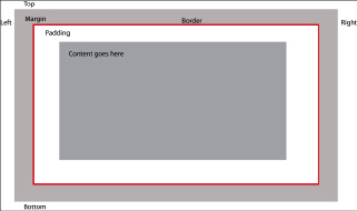
Figure 3-5 shows the CSS box model, which is how browsers and other devices actually see your content.
Padding settings
affect the space between the content and the “box” that contains it.
Margin settings
affect the actual space around the content. For more on padding and margins and how to use them effectively, visit the W3Schools CSS tutorials and reference at
www.w3schools.com/css
.
Figure 3-5:
The box model, showing padding and margins.

Custom borders
Just like padding and margins, in HTML, you either have a border all the way around something or you don't. Also, you're limited to what you can apply a border to.
CSS allows you to put a border in just the place you want it. If you want just a top border, set
border-top
values, and you'll have only a top border. You can also apply borders to many more types of elements, such as heading tags and paragraphs. CSS borders also have more values to choose from. Designers can choose colors, positioning, and thickness; and some browsers support type (solid lines, dotted lines, double lines, and so on).
 Figure 3-5 shows where the borders will be placed in relation to the margins and padding. Keep this in mind because it can affect your layout by placing borders in ways that you didn't intend â too close to the content for instance.
Chapter 4: Introducing Web and Graphics Software
In This Chapter
Getting your graphics software
Looking at Web-design software
Taking a tour of Photoshop
Getting to know the tools of the trade
Many tools are available to help you with the hands-on tasks of Web site design and maintenance. Eventually, choosing the right tools can be a matter of preference, but we do know a few must-have tools for every Web designer. This chapter gives you a brief overview of these must-have tools plus a quick-and-dirty tour of Photoshop CS4.
Choosing Graphics Software
So many graphics software packages are available, and so many manufacturers tout that their product can do everything and anything, that you might be confused when choosing graphics programs. First, figure out what kind of work you want to do; then, buy industry-standard software for that work. If you plan on creating lots of vector graphics, for instance, look for software that specializes in that; if you plan to work with photos, look for software that has tools for that. By sticking to industry-standard software, you can ensure better compatibility with other designers; better resources; better employability as a designer; better toolsets; and with practice, better overall quality of work.
 Another benefit of sticking with industry standards â and especially products from Adobe â is that their interfaces share similar features. They also work together to help users get the job done more efficiently. More about integrated workflows is discussed throughout this book.
Adobe Photoshop
The industry-standard software for working with bitmapped (sometimes called raster) graphics is Adobe Photoshop. (Read about bitmapped images in the sidebar, “Bitmap versus vector images, Part 1.”) Photoshop offers a powerful set of tools that allow you to create and work with any graphics you need for your site, from concept to completion.
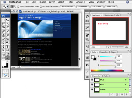
People in many different aspects of working with photos and graphics all use Photoshop. Photographers, designers, editors, and video professionals all use it because of its superior tools and vast number of uses. In Photoshop, you can create all original graphics, draw artwork, adjust or manipulate photos, apply effects, resize, and optimize â virtually anything you might want to do with images is possible with Photoshop. Figure 4-1 gives you a peek at the Photoshop interface. The “Touring Photoshop CS4” section, later in this chapter, introduces you to the Photoshop interface and some of the program's features.
Figure 4-1:
The Adobe Photoshop interface.

Adobe Illustrator
The industry standard for creating vector graphics is Adobe Illustrator. (Read about vector images in the sidebar, “Bitmap versus vector images, Part 2.”) Like Photoshop, Illustrator has a very powerful set of tools; the difference between the two is that Illustrator specializes in creating vector images.
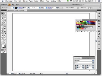
If you plan on creating logos or line art, Illustrator is an important piece of software to have. It's also useful to own if you want to do Flash design. Flash works well with vectors because all the drawing tools in Flash are vector based. When you add Illustrator to your set of tools, you can create Flash-friendly illustrations and other artwork. Figure 4-2 gives you a look at the Adobe Illustrator interface. Notice how very similar it is to the Photoshop interface.
Other professional-grade graphics software
Other graphics software that you might encounter includes Adobe Fireworks, Adobe FreeHand, and Adobe Flash. As we mention earlier, all Adobe products have similar features, enabling designers to move easily from one product to another. A few professionals use Corel products, such as Painter, Paint Shop Pro, and CorelDRAW.
Figure 4-2:
The Adobe Illustrator interface.

Bitmap versus vector images, Part 1
The trick to successful graphics creation is understanding the strengths and weaknesses of the different formats and types of graphics.
Bitmapped images
are made up of
pixels
(px; tiny dots of color) laid out on a grid (or mapped). Think of a bitmap as a screen equivalent of a printed image â lots of dots that, together, make a picture.
Computer monitors display images at 72 or 96 dots per inch (dpi). Sometimes, this is referred to as
ppi
(pixels per inch). When you prepare graphics for a Web page, make sure you save them with 72 dpi. By doing so, you make the file sizes smaller without making the image on-screen look worse.
Printers work with 150â300 dpi. This is why 72-dpi images don't look great when you print them. Although you might be tempted to use higher resolutions to make your images look better, it doesn't work that way. Always remember that larger files download slower, which is bad for your users.
Bitmapped images resize smaller fairly well. For example, a 400-x-600-pixel image downsizes to 200 x 300 pixels fairly well. Scaling up images is another story, though, because the dimensions are made larger, but the amount of information stays the same. The computer has to make its best guess as to what color to make the additional dots needed to enlarge the picture. This is
interpolation,
which creates very jagged-looking images. If you've tried to scale up an image and noticed little stairs appearing along the edges of elements in the image, you've seen the effect of trying to scale up. This figure shows a bitmap image that has been scaled up.

Bitmap versus vector images, Part 2
Vector images
are made up of mathematical statements that define individual objects that are made up of points, lines, and fills. Think geometry class. Because they're created by math, they scale up and down very well. They're also relatively easy to edit because the elements are separate objects as opposed to a series of self-contained dots. Designers can select an element, move points, and change properties of the lines and fills very easily.
Vector art works well for logos and other line art. Because of how they're created, they have very clean lines. The downside is that they don't do well with pictures and other types of images that require lots of tonal changes and soft transitions between those tones.
You will need to convert
(rasterize)
vector graphics into bitmaps before using them on a Web page â with the exception of vector art created in Flash. The Flash Player supports vector graphics where browsers don't. Some plug-ins that are available can support vectors, but not many people download and install them. The main strength of vector art is that you can have very clean logos and line art that can be scaled to any size you need.
If someone sends you a graphic file, you can tell whether it's a vector or bitmap by examining the pieces in your graphics software. Depending on the software you use and the software the graphic was created in, you might get a warning that shapes will be rasterized. This message is telling you that the software is having trouble dealing with vector-based shapes in the graphic, so the software will convert the shape into a bitmap. Another way you can tell the difference between vector and bitmap is by selecting the objects within the graphic. If a series of lines, curves, and dots appears all around the edges of the object, you have a vector. If you get a box that contains the object or no lines at all, you have a bitmap.
Note:
Simply opening a graphic in a vector graphics program, such as Adobe Illustrator, and then saving it as an Illustrator file does not make the graphic a vector. Remember that a vector is a math-based graphic â think geometry class and lines, curves, and points.
Considering Web-Design Software
Although you can code Web pages entirely in Notepad (and some folks do), we advise you to look at Web-design software packages. Some Web developers will tell you that these packages are bloated. The bloat they're referring to is actually a set of helpers and features that, if used properly, can help you be a better Web designer. You might also hear that these packages write bad code. There might be some truth to this, but it's mostly just coder snobbery. Just choose the tools that work best for you.
You shouldn't, however, substitute software helpers for learning HTML (HyperText Markup Language), CSS (Cascading Style Sheets), and the other technologies you intend to use. If you don't learn how it all really works under the hood, you can't fix problems beyond the software's capabilities. You also won't be able to clean up the mistakes that WYSIWYG (what you see is what you get, or
WHIZ-ee-wig
) editors often make, such as leaving tags behind after you deleted the content.
In actuality, most people (even code snobs) can't tell the difference between pages hand-coded in Notepad and those hand-coded with Dreamweaver. In fact, Dreamweaver, GoLive, and Visual Web Developer have many tools that can help you write better code than someone with a stripped-back text editor. For instance, Dreamweaver and other development tools can help keep your code formatted for easy reading. Text editors will not help you in this regard, so you'll have to be very vigilant while coding or you can end up with very messy looking code (usually a tell-tale sign that someone used a text editor). Also, you can set up Dreamweaver to highlight coding errors in bright yellow. Someone using a text editor isn't alerted to even a basic typo in their code, which is a very small problem that can result in a really messed-up-looking page. Dreamweaver shows you exactly where your mistake is and also tells you what the mistake is. Comparatively, with a plain-text editor, you're left to find and figure it out for yourself. See Chapters 5 and 6 of this minibook for more about using Dreamweaver for your Web-design projects.
Although Adobe Dreamweaver is the industry standard and the software most commonly used by professionals, other common, professional-grade, Web-design software packages are available, including Adobe GoLive and Microsoft Visual Web Developer 2008 - Express Edition.
The choice of what tools to use is often personal for Web designers and developers. If Dreamweaver doesn't suit your personal tastes, one of the other two major packages might. Of course, you might not have this luxury of choice if you're working as part of a team or in a corporate environment. You need to be flexible and use those tools to ensure compatibility. You might even need to use a blend of tools in some corporate environments, especially when multiple sites, legacy sites, and content management systems are involved. These situations are beyond the scope of this book, but aspiring professionals should be prepared to be flexible and willing to learn.