CSS: The Definitive Guide, 3rd Edition (55 page)
Read CSS: The Definitive Guide, 3rd Edition Online
Authors: Eric A. Meyer
Tags: #COMPUTERS / Web / Page Design

Now that we've delved into
table formatting and cell border appearance, we have the pieces we need to understand
the sizing of tables and their internal elements. When it comes to determining table
width, there are two different approaches: fixed-width layout and automatic-width
layout. Heights are calculated automatically no matter what width algorithms are used.
Since there are two different ways to figure out the width of
a table,
it's only logical that there be a way to declare which should be used for a given
table. Authors can use the propertytable-layoutto select between the two kinds of table width calculation.
table-layout
- Values:
auto|fixed|inherit- Initial value:
auto- Applies to:
Elements with the
displayvaluetableorinline-table- Inherited:
Yes
- Computed value:
As specified
While the two models can have different results in laying out a specific table,
the more fundamental difference between the two is speed. With a fixed-width table
layout, the user agent can calculate the layout of the table more quickly than is
possible in the automatic-width model.
The main reason the fixed-layout model is so fast is
that its layout does not depend on the contents of table cells. Instead, it's
driven by thewidthvalues of the table,
columns, and cells within that table.
The fixed-layout model works in the following simple steps:
Any column element whose
widthproperty has a value other thanautosets
the width for that column.If a column has an
autowidth, but the
cell in the first row of the table within that column has awidthother thanauto, then the cell sets the width for that column. If the cell
spans multiple columns, the width is divided between the columns.Any columns that are still
auto-sized
are sized so that their widths are as equal as possible.
At that point, the width of the table is set to either the value ofwidthfor the table or the sum of the column widths,
whichever is
greater
. If the table turns out to be wider than
its columns, then the difference is divided by the number of columns and added to
each of them.
This approach is fast because all of the column widths are defined by the first
row of the table. The cells in any rows that come after the first are sized
according to the column widths that were defined by the first row. The cells in
those following rows do not change column widths, which means that anywidthvalue assigned to those cells will be ignored.
In cases where a cell's content does not fit, the cell'soverflowvalue determines whether the cell contents are clipped,
visible, or generate a scrollbar.
Let's consider the following styles and markup, which are illustrated in
Figure 11-11
:
table {table-layout: fixed; width: 400px;
border-collapse: collapse;}
td {border: 1px solid;}
col#c1 {width: 200px;}
#r1c2 {width: 75px;}
#r2c3 {width: 500px;}
| 1-1 | 1-2 | 1-3 | 1-4 |
| 2-1 | 2-2 | 2-3 | 2-4 |
| 3-1 | 3-2 | 3-3 | 3-4 |
| 4-1 | 4-2 | 4-3 | 4-4 |
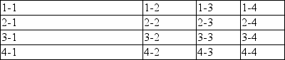
Figure 11-11. Fixed-width table layout
As you can see in
Figure 11-11
,
the first column is 200 pixels wide, which happens to be half the 400-pixel width
of the table. The second column is 75 pixels wide because the first-row cell
within that column has been assigned an explicit width. The third and fourth
columns are each 61 pixels wide. Why? Because the sum of the column widths for the
first and second columns (275px), plus the various borders between columns (3px),
equals 278 pixels. 400 minus 278 is 122, and 122 divided in half is 61, so that's
how many pixels wide the third and fourth columns will be. What about the
500-pixel width for#r2c3? It's ignored because
that cell isn't in the first row of the table.
Note that it is not absolutely necessary for the table to have an explicit
width to make use of the fixed-width layout model, although it definitely helps.
For example, given the following, a user agent could calculate a width for the
table that is 50 pixels narrower than the parent element'swidth. It would then use that calculated width in the
fixed-layout algorithm:
table {table-layout: fixed; margin: 0 25px;
width: auto;}
This is not required, however. User agents are also permitted to lay out any
table with anautovalue forwidthusing the automatic-width layout model.
The automatic-layout model, while not as fast as fixed
layout, is probably much more familiar to you because it's essentially the same
model that HTML tables have used for years. In most current user agents, this
model's use will be triggered by a table having awidthofauto, regardless of the
value oftable-layout, although this is not
assured.
The reason automatic layout is slower is that the table cannot be laid out
until the user agent has looked at all of its content. That is, automatic layout
requires that the user agent lay out the entire table each time it gets a new
cell. This generally requires the user agent to perform some calculations and then
go back through the table to perform a second set of calculations. The cells'
content has to be fully examined because, as with HTML tables, the table's layout
is dependent on it. If there is a 400 pixel-wide image in a cell in the last row,
it will force all of the cells above it (those in the same column) to be 400
pixels wide. Thus, the width of every cell has to be calculated, and adjustments
must be made (possibly triggering another round of content-width calculations)
before the table can be laid out.
The details of the model can be expressed in the following steps:
For each cell in a column, calculate both the minimum and maximum cell
width.Determine the minimum width required to display the content. Keep
in mind that the content can flow to any number of lines, but it may
not stick out of the cell's box. If the cell has awidthvalue that is larger than the
minimum possible width, then the minimum cell width is set to the
value ofwidth. If the cell's width
value isauto, then the minimum
cell width is set to the minimum content width.For the maximum width, determine the width required to display the
content without any line breaking other than that forced explicitly
(e.g., the
That value is the maximum cell width.
For each column, calculate both the minimum and maximum column width.
The column's minimum width is determined by the largest minimum
cell width of the cells within the column. If the column has been
given an explicitwidthvalue that
is larger than any of the minimum cell widths within the column, then
the minimum column width is set to the value ofwidth.For the maximum width, take the largest maximum cell width of the
cells within the column. If the column has been given an explicitwidthvalue that is larger than
any of the maximum cell widths within the column, then the maximum
column width is set to the value ofwidth. These two behaviors recreate the traditional HTML
table behavior of forcibly expanding any column to be as wide as its
widest cell.
In cases where a cell spans more than one column, the sum of the minimum
column widths must be equal to the minimum cell width for the spanning cell.
Similarly, the sum of the maximum column widths must equal the spanning
cell's maximum width. User agents should divide any changes in column widths
equally among the spanned columns.
In addition, the user agent must take into account that when a column width has
a percentage value for itswidth, the
percentage is calculated in relation to the width of the table—even though it
doesn't yet know what that will be! Instead, it must store the percentage value
and use it in the next part of the algorithm.
At this point, the user agent will have determined how wide or narrow each
column can be. With that information in hand, it can then proceed to actually
figuring out the width of the table. This happens as follows:
If the computed width of the table is not
auto, the computed table width is compared to the sum of all the
column widths
plus
any borders and cell spacing.
(Columns with percentage widths are likely calculated at this time.) The
larger of the two is the final width of the table. If the table's computed
width is larger than the sum of the column widths, borders, and cell
spacing, then all columns are increased in width by an equal amount until
they fit into the table.If the computed width of the table is
auto, the final width of the table is determined by adding the
column widths, borders, and cell spacing. This means that the table will be
only as wide as needed to display its content, just as with traditional HTML
tables. Any columns with percentage widths use that percentage as a
constraint—but one that a user agent does not have to satisfy.
Once the last step is completed, then—and only then—can the user agent actually
lay out the table.
The following styles and markup, presented in
Figure 11-12
, help illustrate how this
process works:
table {table-layout: auto; width: auto;
border-collapse: collapse;}
td {border: 1px solid;}
col#c3 {width: 25%;}
#r1c2 {width: 40%;}
#r2c2 {width: 50px;}
#r2c3 {width: 35px;}
#r4c1 {width: 100px;}
#r4c4 {width: 1px;}
| 1-1 | 1-2 | 1-3 | 1-4 |
| 2-1 | 2-2 | 2-3 | 2-4 |
| 3-1 | 3-2 | 3-3 | 3-4 |
| 4-1 | 4-2 | 4-3 | 4-4 |
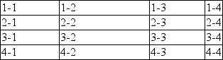
Figure 11-12. Automatic table layout
Let's consider what happened for each of the columns, in turn:
For the first column, the only explicit cell or column width is that of
cell 4–1, which was given awidthof100px. Because the content is so
short, the minimum and maximum column width becomes100px. (If there were a cell in the column with several
sentences of text, it would have increased the maximum column width to
whatever width was necessary to display all of the text without line
breaking.)For the second column, two widths were declared: cell 1–2 was given a
widthof40%, and cell 2–2 was given awidthof50px. The minimum
width of this column is50px, and the
maximum width is 40 percent of the final table width.For the third column, only cell 3–3 had an explicit width (
35px), but the column itself was given awidthof25%. Therefore, the minimum column width is35px, and the maximum width is 25 percent of
the final table width.For the fourth column, only cell 4–4 was given an explicit
width(1px).
This is smaller than the minimum content width, so both the minimum and
maximum column widths are equal to the minimum content width of the cells.
This turns out to be a computed 25 pixels.
The user agent now knows that the four columns have minimum and maximum widths
as follows:
min 100px / max 100px
min 50px / max 40%
min 35px / max 25%
min 25px / max 25px
Thus, the table's minimum width is the sum of all the column minima plus the
borders, which totals 215 pixels. The table's maximum width is 130px + 65 percent,
which works out to 371.42857143 pixels (given that 130px represents 35 percent of
the overall table width). Let's assume this is, after rounding the fractional
number to 371 pixels, the width value user agents will actually use. Thus, the
second column will be 148 pixels wide, and the third column will be 93 pixels
wide. User agents are not required to actually use the maximum value; they may
choose another course of action.
Of course, this was (although it may not seem like it) a very simple and
straightforward example: all of the content was basically the same width, and most
of the declared widths were pixel lengths. In a situation where a table contains
spacer GIFs, paragraphs of text, form elements, and so forth, the process of
figuring out the table's layout will likely be a great deal lengthier.