Building Web Sites All-in-One For Dummies® (10 page)
Read Building Web Sites All-in-One For Dummies® Online
Authors: Claudia Snell

Providing Information
If your client's goal is to provide only information about his services, you'll create a site that provides information about the client's products or services but with (understandably) no option to purchase the product or service online. When you create an information-driven Web site, you use text or brochures supplied by the client to create the content for the site. You might also assimilate information created by others, such as articles or multimedia content. And, of course, you need high-quality images of your client, his services, and his products. As far as accuracy of the material goes, the client is responsible for that. You, however, are responsible for providing the information via your Web design in an easy-to-digest and understand manner.
Handling large amounts of content
If your client has copious amounts of information to dispense through his Web site, you have a challenge on your hands. The attention span of most Web site visitors is less than a New York minute â and we all know how short that is â which means visitors aren't going to read pages with a lot of text. It's your job as a designer to break the information down into easily digestible, bite-size pieces. Here are a few techniques you can use to achieve that goal:
â¢
Break large amounts of text into several pages.
â¢
Intersperse images with the text to break up the content.
â¢
Break up large amounts of text with headlines that visitors can use to ascertain whether they want to read the content.
Savvy Web surfers also use headlines to get the gist of what information is presented on a page.
â¢
Create a newspaper-style page where the information is presented in columns.
Each article has a headline. Instead of including all of the information on a page, include the first paragraph or two and then include a More link at the end of the last sentence. When clicked, the More link opens the full article in another window.
â¢
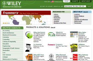
Create a home page that contains links to the information you need to present.
(See Figure 4-4.)
â¢
Create a site map.
The site map has a text description of every page on the site. Each text description doubles as a hyperlink, which, when clicked, reveals the applicable page.
Figure 4-4:
Links enable you to present a large amount of information in a small space.
Presenting information
Presenting information on a Web page is an art unto itself. The information you present depends on the type of site you design and what your client gives you to work with. The typical Web site is a mixture of images and text, with, perhaps, some multimedia content added for grins and giggles.
â¢
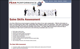
Break major ideas into bullet1 points.
As we mention earlier, bullet1 points make a page look less cluttered and help visitors find information more easily. See Figure 4-5.
Figure 4-5:
Break information into bullet points.
â¢
Arrange the page so that the information has a logical flow.
You can break up big blocks of information using header styles. Readers should be able to sum up the information presented on a page by glancing at the headlines and then deciding what information they want to read.
â¢
Break up text with pictures.
No one wants to read a term paper. If applicable, add a caption to each picture on a page. Busy site visitors can use captions to sum up the information presented on a Web page at a glance.
â¢
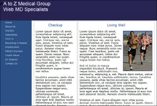
If you're using a newsletter style with multiple columns for your Web page, make the columns different widths.
Also, don't exceed two columns, especially if your audience uses a desktop size smaller than 1024 x 768. (See Figure 4-6.) If you're using a horizontal menu, you can increase the size to three columns.
â¢
Make sure that the structure and the layout of the pages are consistent.
Pages might have to vary, depending on the content, but the look and style need to be consistent.
â¢
Don't use color combinations that are hard to read.
For example, pink text on a dark-colored background is difficult to read. The old tried-and-true black text on a white background is always legible.
â¢
Don't use a busy background for your pages.
The busy-ness makes text hard to read.
If your client insists on a
tiling
background (a small image is repeated on the page, which looks like a single image when the page loads), choose a simple design and lower the opacity in an image-editing application (such as Fireworks or Photoshop).
Figure 4-6:
Create a newsletter-style page that's easy to read.
â¢
Don't use small fonts.
A text size smaller than 10 points (pt; the height of a character) is almost impossible for visitors to read unless they have extremely acute vision. And if your intended audience is on the presbyopic side (um, getting on in years, vision-wise), text shouldn't be smaller than 12 pt.
â¢
Use bold-faced text to direct the viewer's eye to important information.
â¢
Don't use nonstandard font faces when designing your pages.
Your intended audience might not have the font installed on their machines, which causes a browser to use its default system font. This might cause usability issues and make the page difficult to read. When in doubt, stick to the big six: Arial, Times New Roman, Courier New, Courier Mono, Helvetica, and Verdana.
â¢
Don't use too many font faces.
If you use too many font faces, the end result doesn't look professional and is distracting to the viewer. If you need to draw attention to a headline, you can create a style using the same font you use for text: Boldface the text, increase the size and use a harmonious color from the site to draw the viewer's attention to the headline.
â¢
Use hyperlinked text to draw the viewer's attention to pertinent content.
Just make sure you don't disable hyperlink decoration with a Cascading Style Sheet (CSS) setting. Your goal is to make the hyperlink easy to see when the page loads. If you don't like underlined hyperlinks, use the style sheet to modify the color of the hyperlink text.
â¢
If several authors write the Web site content, make sure the style and voice is similar.
A Web site should read like a book. Each page is like a chapter of the book, and if the styles are jarringly different, the visitors may think they're not on the same site. Consistency is important.
â¢
Make sure the terminology and spelling are consistent sitewide.
For example, don't use
Website
(one word) in one section, and
Web site
(two words) in another. At the risk of being redundant, consistency is important.
â¢
When you're designing your site, make sure you view it using the smallest desktop size of your intended audience.
As of this writing, 91 percent of Web site visitors are surfing the Net with a desktop size of 1024 x 768. Make sure your design flows logically and is easy to read.
â¢
If you're using multimedia content (such as movies and sound files), make sure they're all the same file format.
For example, don't use the Windows Media Video (WMV) format for some of your movies, Flash video for other movies, and Apple QuickTime for the rest. Choose a file format that the majority of your client's intended audience can view, and stick with that standard.
 Read the information provided by the client before adding it to the page. If (in your opinion) the client is presenting too much information (also known as stuffing 50 pounds of text into a 30-pound bag), ask the client to condense the text to be more concise. When all else fails, refer your client to a reliable copy editor.
Including e-learning materials
If your client is creating a Web site that instructs end users on how to use a particular application or accomplish a specific task, include material that can get them there. Many methods of accomplishing this are available. In fact, specific software packages are available to create content for e-learning Web sites. The following is a list of some of the items currently used on e-learning Web sites:
â¢
Instructional video:
Nothing gets the point across like video. If the site shows users how to master a software application, a video capture of the application in action is the ideal teaching tool. In conjunction with the teacher's audio instructions, video is a powerful e-learning tool. You can capture a video of an application using Camtasia or HyperCam software. The video you post online can vary depending on the type of Internet connection used by your client's intended audience. You can post streaming video using the Windows Media Video format, Apple QuickTime format, or Flash video.
â¢
Flash interactive content:
Flash is a wonderful tool for creating animations. You can also use Flash to create quizzes, interactive learning exercises, and so on. If you're adept with ActionScript, you can get Flash to do some wonderful things, such as tally the score of a quiz or direct a user to a different part of the Flash movie based on the response to a question.
â¢
PDF documents:
Adobe Acrobat is another wonderful tool that you can use to create tutorials. Many people think that PDF documents can only show text and images. This is not true. You can create a PDF document in Acrobat 8 Professional or later that can include multimedia content, such as audio and video. Acrobat PDF documents can also be interactive. Acrobat has built-in actions that you can use to link to other documents, play video or audio, and so on. An Acrobat document can also use JavaScript to perform tasks.
You include links to your e-learning materials in your HTML documents. You can set the learning material to open in the same browser window or in a new window. You can embed e-learning material, such as video (complete with a player), in the document. This is the preferred method because many people rely on the Back button to recall viewed content. When a document is opened in a new window, this navigation isn't available.