CSS: The Definitive Guide, 3rd Edition (18 page)
Read CSS: The Definitive Guide, 3rd Edition Online
Authors: Eric A. Meyer
Tags: #COMPUTERS / Web / Page Design

There are two font properties that appear in
CSS2, but not in CSS2.1. They've been dropped from CSS2.1 because, despite being in the
specification for years, no browser has bothered to implement either one. The first
allows for the horizontal stretching
of fonts, and the
second allows for intelligent scaling of substituted fonts when the author's first
choice is not available. First, let's look at stretching.
font-stretch
- Values:
normal|wider|narrower|ultra-condensed|extra-condensed|condensed|semi-condensed|semi-expanded|expanded|extra-expanded|ultra-expanded|inherit- Initial value:
normal- Applies to:
All elements
- Inherited:
Yes
As you might expect from the value names, this property is used to make a font's
characters fatter or skinnier. It behaves very much like the absolute-size keywords
(e.g.,xx-large) for thefont-sizeproperty, with a range of absolute values and two values that
let the author alter a font's stretching up or down. For example, an author might decide
to stress the text in a strongly emphasized element by stretching the font characters to
be wider than their parent element's font characters, as shown in
Figure 5-21
:
strong {font-stretch: wider;}
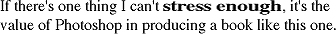
Figure 5-21. Stretching font characters
Figure 5-21
was altered using Photoshop,
since web browsers do not supportfont-stretchas
of this writing.
The similarly unimplemented process of adjusting font size is a little more
complicated.
font-size-adjust
- Values:
| none|inherit- Initial value:
none- Applies to:
All elements
- Inherited:
Yes
The goal of this property is to preserve legibility when the font used is not the
author's first choice. Because of the differences in font appearance, one font may be
legible at a certain size, while another font at the same size is difficult or
impossible to read.
The factors that influence a font's legibility are its size and its x-height. The
number that results from dividing the x-height by thefont-sizeis referred to as the
aspect value
. Fonts with
higher aspect values tend to be legible as the font's size is reduced; conversely, fonts
with low aspect values become illegible more quickly.
A good example is to compare the common fonts Verdana and Times. Consider
Figure 5-22
and the following markup, which
shows both fonts at afont-sizeof10px:
p {font-size: 10px;}
p.cl1 {font-family: Verdana, sans-serif;}
p.cl2 {font-family: Times, serif; }
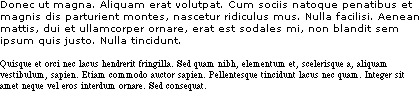
Figure 5-22. Comparing Verdana and Times
The text in Times is much harder to read than the Verdana text. This is partly due to
the limitations of pixel-based display, but it is also because Times simply becomes
harder to read at smaller font sizes.
As it turns out, the ratio of x-height to character size in Verdana is 0.58, whereas
in Times it is 0.46. What you can do in this case is declare the aspect value
of
Verdana, and the user agent will adjust the size of the text that's actually used. This
is accomplished using the formula:
Declaredfont-size× (font-size-adjustvalue ÷ aspect value of available font)= Adjusted font-size |
So, in a situation where Times is used instead of Verdana, the adjustment is as
follows:
10px× (0.58÷0.46) =12.6px |
which leads to the result shown in
Figure
5-23
:
p {font: 10px Verdana, sans-serif; font-size-adjust: 0.58;}
p.cl2 {font-family: Times, serif; }
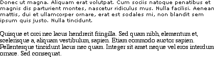
Figure 5-23. Adjusting Times
Figure 5-23
was altered using Photoshop,
since very few web browsers supportfont-size-adjustas of this writing.
Of course, to allow a user agent to intelligently make size adjustments, you have to
know the aspect value of your first-choice font. There is no way in CSS2 to simply get
the value from the font, and many fonts may not have the information available in the
first place.
All of these properties are very sophisticated, of
course, but using them all could get a little tedious:
h1 {font-family: Verdana, Helvetica, Arial, sans-serif; font-size: 30px;
font-weight: 900; font-style: italic; font-variant: small-caps;}
h2 {font-family: Verdana, Helvetica, Arial, sans-serif; font-size: 24px;
font-weight: bold; font-style: italic; font-variant: normal;}
Some of this problem could be solved by grouping selectors, but wouldn't it be easier
to combine everything into a single property? Enterfont, which is the shorthand property for all the other font properties (and
a little more besides).
font
- Values:
[[
|| || ]? [ / ]? ] | caption|icon|menu|message-box|small-caption|status-bar|inherit- Initial value:
Refer to individual properties
- Applies to:
All elements
- Inherited:
Yes
- Percentages:
Calculated with respect to the parent element for
and
with respect to the element'sfor - Computed value:
See individual properties (
font-style,
etc.)
Generally speaking, afontdeclaration can have
any one value from each of the listed font properties, or else a "system font" value
(described in the section "
Using System
Fonts
"). Therefore, the preceding example could be shortened as follows:
h1 {font: italic 900 small-caps 30px Verdana, Helvetica, Arial, sans-serif;}
h2 {font: bold normal italic 24px Verdana, Helvetica, Arial, sans-serif;}
and have exactly the same effect (illustrated by
Figure 5-24
).

Figure 5-24. Typical font rules
I say that the styles "could be" shortened in this way because there are a few other
possibilities, thanks to the relatively loose way in whichfontcan be written. If you look closely at the preceding example, you'll see
that the first three values don't occur in the same order. In theh1rule, the first three values are the values forfont-style,font-weight,
andfont-variant, in that order, whereas in the
second, they're orderedfont-weight,font-variant, andfont-style. There is nothing wrong here because these three can be written in
any order. Furthermore, if any of them has a value ofnormal, that can be left out altogether. Therefore, the following rules are
equivalent to the previous example:
h1 {font: italic 900 small-caps 30px Verdana, Helvetica, Arial, sans-serif;}
h2 {font: bold italic 24px Verdana, Helvetica, Arial, sans-serif;}
In this example, the value ofnormalwas left out
of theh2rule, but the effect is exactly the same as
in the preceding example.
It's important to realize, however, that this free-for-all situation applies only to
the first three values offont. The last two are much
stricter in their behavior. Not only mustfont-sizeandfont-familyappear in that order as the last two
values in the declaration, but both must always be present in afontdeclaration. Period, end of story. If either is left out, then the
entire rule will be invalidated and very likely ignored completely by a user agent.
Thus, the following rules will get you the result shown in
Figure 5-25
:
h1 {font: normal normal italic 30px sans-serif;}   /*no problem here */
h2 {font: 1.5em sans-serif;}   /* also fine; omitted values set to 'normal' */
h3 {font: sans-serif;}   /* INVALID--no 'font-size' provided */
h4 {font: lighter 14px;}   /* INVALID--no 'font-family' provided */
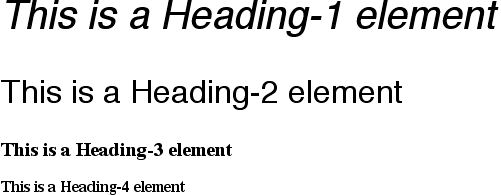
Figure 5-25. The necessity of both size and family
So far, we've treatedfontas though it has only five values, which isn't quite true. It is also
possible to set theline-heightusingfont, despite that fact thatline-heightis a text property, not a font property. It's done as a
sort of addition to thefont-sizevalue, separated
from it by a forward slash (/):
body {font-size: 12px;}
h2 {font: bold italic 200%/1.2 Verdana, Helvetica, Arial, sans-serif;}
These rules, demonstrated in
Figure
5-26
, set allh2elements to be bold and
italic (using face for one of the sans-serif font families), set thefont-sizeto24px(twice thebody's size), and set theline-heightto28.8px.
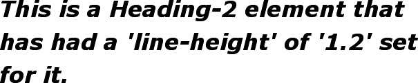
Figure 5-26. Adding line height to the mix
This addition of a value forline-heightis
entirely optional, just as the first threefontvalues are. If you do include aline-height,
remember that thefont-sizealways comes beforeline-height, never after, and the two are
always separated by a slash.
This may seem repetitive, but it's one of the most common errors made by CSS
authors, so I can't say it enough: the required values forfontarefont-sizeandfont-family, in that order. Everything else is strictly
optional.
line-heightis discussed in the next
chapter.
It is important to remember thatfont, being a
shorthand property, can act in unexpected ways if you are careless with its use.
Consider the following rules, which are illustrated in
Figure 5-27
:
h1, h2, h3 {font: italic small-caps 250% sans-serif;}
h2 {font: 200% sans-serif;}
h3 {font-size: 150%;}
This is an h1 element
This is an h2 element
This is an h3 element
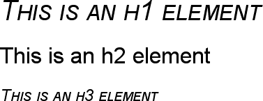
Figure 5-27. Shorthand changes
Did you notice that theh2element is neither
italicized nor small-capped, and that none of the elements are boldfaced? This is the
correct behavior. When the shorthand propertyfontis used, any omitted values are reset to their defaults. Thus, the previous example
could be written as follows and still be exactly equivalent:
h1, h2, h3 {font: italic normal small-caps 250% sans-serif;}
h2 {font: normal normal normal 200% sans-serif;}
h3 {font-size: 150%;}
This sets theh2element's font style and
variant tonormal, and thefont-weightof all three elements tonormal. This is the expected behavior of shorthand
properties. Theh3does not suffer the same fate
as theh2because you used the propertyfont-size, which is not a shorthand property and
therefore affects only its own value.
In situations where you want
to make a web page "blend in" with the user's operating system, the system font
values offontcome in very handy. These are used
to take the font size, family, weight, style, and variant of elements of the
operating system, and apply them to an element. The values are as follows:
captionUsed for captioned controls, such as buttons
iconUsed to label icons
menuUsed in menus—that is, drop-down menus and menu lists
message-boxUsed in dialog boxes
small-captionUsed for labeling small controls
status-barUsed in window status bars
For example, you might want to set the font of a button to be the same as that of
the buttons found in the operating system. For example:
button {font: caption;}
With these values, it is possible to create web-based applications that look very
much like applications native to the user's operating system.
Note that system fonts may only be set as a whole; that is, the font family, size,
weight, style, etc., are all set together. Therefore, the button text from our
previous example will look exactly the same as button text in the operating system,
whether or not the size matches any of the content around the button. You can,
however, alter the individual values once the system font has been set. Thus, the
following rule will make sure the button's font is the same size as its parent
element's font:
button {font: caption; font-size: 1em;}
If you call for a system font and no such font exists on the user's machine, the
user agent may try to find an approximation, such as reducing the size of thecaptionfont to arrive at thesmall-captionfont. If no such approximation is
possible, then the user agent should use a default font of its own. If it can find a
system font but can't read all of its values, then it should use the default value.
For example, a user agent may be able to find astatus-barfont but not get any information about whether the font is
small-caps. In that case, the user agent will use the valuenormalfor thesmall-capsproperty.
User interface styles are discussed in more detail in
Chapter 13
.