Read CSS: The Definitive Guide, 3rd Edition Online
Authors: Eric A. Meyer
Tags: #COMPUTERS / Web / Page Design
CSS: The Definitive Guide, 3rd Edition (51 page)

z-axis
With all of the positioning going on, there will
inevitably be a situation where two elements try to exist in the same place,
visually speaking. Obviously, one of them will have to overlap the other—but how
does one control which element comes out "on top"? This is where the propertyz-indexcomes in.
z-index
- Values:
| auto|inherit- Initial value:
auto- Applies to:
Positioned elements
- Inherited:
No
- Computed value:
As specified
z-indexlets you alter the way in which
elements overlap one another. It takes its name from the coordinate system in
which left-to-right is the
x
-axis and top-to-bottom is the
y
-axis. In such a case, the third axis—that which runs
from front to back, or if you prefer, away from the user—is termed the
z
-axis. Thus, elements are given values along this axis and
represented usingz-index.
Figure 10-52
illustrates this
system.
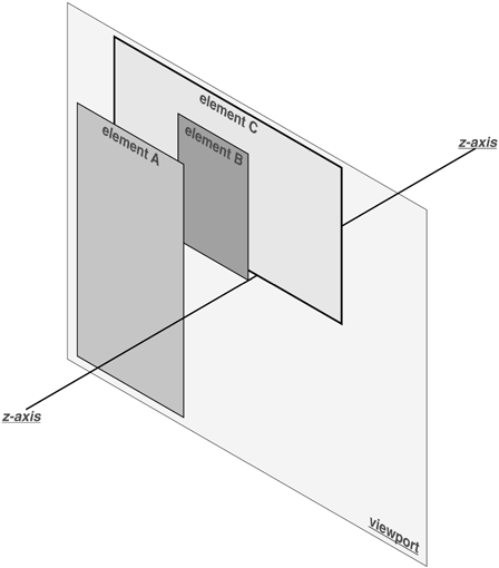
Figure 10-52. A conceptual view of z-index stacking
In this coordinate system, an element with a highz-indexvalue is closer to the reader than those with
lowerz-indexvalues. This will cause the
high-value element to overlap the others, as illustrated in
Figure 10-53
, which is a "head-on" view
of
Figure 10-52
. This is referred to
as
stacking
.
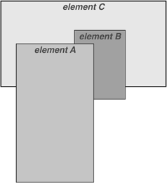
Figure 10-53. How the elements are stacked
Any integer can be used as a value forz-index, including negative numbers. Assigning an element a negativez-indexwill move it further away from the
reader; that is, it will be moved lower in the stack. Consider the following
styles, illustrated in
Figure
10-54
:
p#first {position: absolute; top: 0; left: 0;
width: 20%; height: 10em; z-index: 8;}
p#second {position: absolute; top: 0; left: 10%;
width: 30%; height: 5em; z-index: 4;}
p#third {position: absolute; top: 15%; left: 5%;
width: 15%; height: 10em; z-index: 1;}
p#fourth {position: absolute; top: 10%; left: 15%;
width: 40%; height: 10em; z-index: 0;}
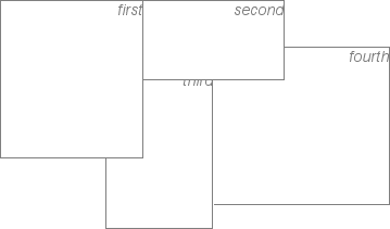
Figure 10-54. Stacked elements can overlap each other
Each of the elements is positioned according to its styles, but the
usual order of stacking is altered by thez-indexvalues. Assuming the paragraphs were in numeric order, a
reasonable stacking order would have been, from lowest to highest,p#first,p#second,p#third,p#fourth. This would have putp#firstbehind the other three elements andp#fourthin front of the others. Now, thanks toz-index, the stacking order is under your
control.
As the previous example demonstrates, there is no particular
need for thez-indexvalues to be contiguous.
You can assign any integer of any size. If you want to be fairly certain that an
element stayed in front of everything else, you might use a rule such asz-index:100000.
This would work as expected in most cases—although if you ever declared another
element'sz-indexto be100001(or higher), it would appear in
front.
Once you assign an element a value forz-index(other thanauto), that
element establishes its own local
stacking context
. This
means that all of the element's descendants have their own stacking order,
relative to the ancestor element. This is very similar to the way that elements
establish new containing blocks. Given the following styles, you would see
something like
Figure
10-55
:
p {border: 1px solid; background: #DDD; margin: 0;}
b {background: #808080;}
em {background: #BBB;}
#one {position: absolute; top: 0; left: 0; width: 50%; height: 10em;
z-index: 10;}
#two {position: absolute; top: 5em; left: 25%; width: 50%; height: 10em;
z-index: 7;}
#three {position: absolute; top: 11em; left: 0; width: 50%; height: 10em;
z-index: 1;}
#one b {position: absolute; right: -5em; top: 4em; width: 20em;
z-index: -404;}
#two b {position: absolute; right: -3em; top: auto;
z-index: 36;}
#two em {position: absolute; bottom: -0.75em; left: 7em; right: -2em;
z-index: -42;}
#three b {position: absolute; left: 3em; top: 3.5em; width: 25em;
z-index: 23;}
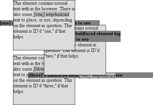
Figure 10-55. Positioned elements establish local stacking contexts
Note where thebandemelements fall in the stacking order. Each of them
is correctly positioned with respect to its parent element, of course. However,
pay close attention to the children ofp#two.
While thebelement is in front of its parent,
and theemis behind, both of them are in front
ofp#three! This is because thez-indexvalues of36and-42are relative top#twobut not to the document in general. In a sense,p#twoand all of its children share az-indexof7, while having their own mini-z-indexwithin the context ofp#two.
Put another way, it's as though thebelement has az-indexof7,36while theem's value is7,-42. These are merely implied conceptual values; they don't conform
to anything in the specification. However, such a system helps to illustrate how
the overall stacking order is determined.
Consider:
p#one        10
p#one b      10,-404
p#two b      7,36
p#two        7
p#two em     7,-42
p#three b    1,23
p#three      1
This
conceptual framework precisely describes the order in which these elements would
be stacked. While the descendants of an element can be above or below that element
in the stacking order, they are all grouped together with their
ancestor.
It is also the case that an element that establishes a
stacking context for its descendants is placed at the0position of that context's
z
-axis. Thus, you
could extend the framework as
follows:
p#one        10,0
p#one b      10,-404
p#two b      7,36
p#two        7,0
p#two em     7,-42
p#three b    1,23
p#three      1,0
There
remains one more value to examine. The specification has this to say about the
default value,auto:
The stack level of the generated box in the current stacking context is the
same as its parent's box. The box does not establish a new local stacking
context. (CSS2.1: 9.9.1)
Thus, any element withz-index:autocan be treated as though it is set toz-index:0. Now, however, you may wonder what happens to elements with a
negativez-indexvalue that are part of the
initial containing block's stacking context. For example, ask yourself what should
happen given the
following:
Where am I?
Given
the rules of stacking, thebodyelement should
be at the same stacking context as its parent's box, so that would be0. It does not establish a new stacking context, so
the absolutely positionedpelement is placed
in the same stacking context as thebodyelement (that of the initial containing block). In other words, the paragraph is
placed
behind
thebodyelement. If thebodyhas a nontransparent
background, the paragraph will disappear.
That was a possible result
in CSS2, at any rate. In CSS2.1, the stacking rules have been changed so that an
element can never be stacked below the background of its stacking context. In
other words, consider the case where thebodyelement establishes a containing block for its descendants (if it were relatively
positioned, for example). An absolutely positioned element that is descended from
thebodyelement can never be stacked below thebody's background, although it can be
stacked below thebody's
content.
As of this writing, Mozilla and related browsers completely
hide the paragraph even if you set both thebodyandhtmlelements to have
transparent backgrounds. This happens in error. Other user agents, like Internet
Explorer, place the paragraph above thebody's
background even if it has one. According to CSS2.1, that's the correct behavior.
The upshot is that negativez-indexvalues can
lead to unpredictable results, so use them with caution.
As implied in the previous section,
fixed
positioning
is just like absolute
positioning, except the containing block of a fixed element is the viewport. In this
case, the element is totally removed from the document's flow and does not have a
position relative to any part of the document.
Fixed positioning can be exploited in a number of interesting ways. First off,
it's possible to create frame-style interfaces using fixed positioning. Consider
Figure 10-56
, which shows a very
common layout scheme.
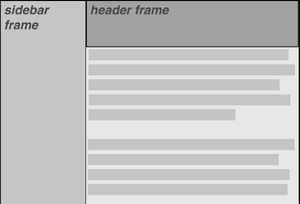
Figure 10-56. Emulating frames with fixed positioning
This could be done using the following styles:
div#header {position: fixed; top: 0; bottom: 80%; left: 20%; right: 0;
background: gray;}
div#sidebar {position: fixed; top: 0; bottom: 0; left: 0; right: 80%;
background: silver;}
This will fix the header and sidebar to the top and side of the viewport, where
they will remain regardless of how the document is scrolled. The drawback here,
though, is that the rest of the document will be overlapped by the fixed elements.
Therefore, the rest of the content should probably be contained in its owndivand employ the following:
div#main {position: absolute; top: 20%; bottom: 0; left: 20%; right: 0;
overflow: scroll; background: white;}
It would even be possible to create small gaps between the three positioneddivs by adding some appropriate margins,
demonstrated in
Figure 10-57
:
body {background: black; color: silver;}  /* colors for safety's sake */
div#header {position: fixed; top: 0; bottom: 80%; left: 20%; right: 0;
background: gray; margin-bottom: 2px; color: yellow;}
div#sidebar {position: fixed; top: 0; bottom: 0; left: 0; right: 80%;
background: silver; margin-right: 2px; color: maroon;}
div#main {position: absolute; top: 20%; bottom: 0; left: 20%; right: 0;
overflow: auto; background: white; color: black;}
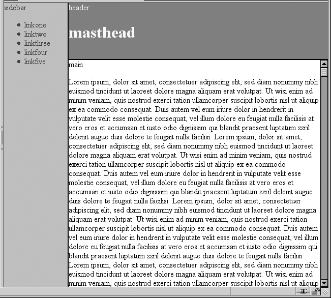
Figure 10-57. Separating the "frames" with margins
Given such a case, a tiled image could be applied to thebodybackground. This image would show through the gaps created by the
margins, which could certainly be widened if the author saw fit to do so.
Another use for fixed positioning is to place a "persistent" element on the
screen, like a short list of links. You could create a persistent footer with
copyright and other information as follows:
div#footer {position: fixed; bottom: 0; width: 100%; height: auto;}
This would place the footer at the bottom of the viewport and leave it there, no
matter how much the document is scrolled.
One drawback of using fixed positioning is that Internet Explorer for Windows
didn't support it prior to IE7. There are workarounds that use JavaScript to
introduce some support in older versions of IE/Win, but they are not always
acceptable to authors because the display is much less smooth than full
fixed-position support should be. Another possibility is to absolutely position the
element in IE/Win but use fixed positioning in more advanced browsers, although this
will not work for all layouts.
You can also read about emulating fixed positioning in older versions of IE/Win
at
http://css-discuss.incutio.com/?page=EmulatingFixedPositoning
.
[
*
]