Presentation Zen: Simple Ideas on Presentation Design and Delivery, 2nd Edition (Ira Katz's Library) (15 page)
Authors: Garr Reynolds

Moxie Software
Many times the best concept doesn’t exist as a ready-to-go stock photo. Some ideas are so unique, you have to create them from scratch—creating a memorable visual.
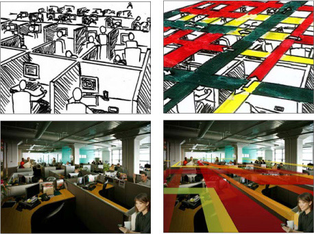
Duarte, Inc. created multiple concepts for Moxie Software. The client picked Concept 2 shown on the opposite page. All of Duarte’s planning and ideating was done by hand so that they would not be restricted by cliché concepts.
Design: Duarte, Inc.
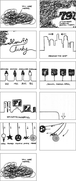
Concept 1
The Illustrations and scenes were made out of yarn. Each slide connects to the next which gives an illusion of panning through a scene when transitioning to the next frame.
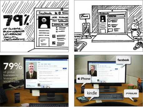
Concept 2
This concept required photography to be taken in-house at Duarte, Inc. and many of the images were custom-designed to create the desk and office scenes as an environment.
If you feel tempted to use a picture of two hands shaking in front of a globe, put the pencil down, step away from the desk, and think about taking a vacation or investigating aromatherapy.
—Nancy Duarte
I am a bit of a
Star Wars
geek. Over the years, as I’ve learned more about the incredible creativity (and hard work) behind Lucas’s films, I realized we mere mortals can learn much about presentations (which are essentially opportunities to tell our story) by listening to the advice of master storytellers such as George Lucas.
As I researched the numerous interviews over the years of Lucas talking about the making of the
Star Wars
films, one key idea often discussed was the importance of editing like mad to get the story down to about two hours. To do this, they scrutinized every scene to make sure that it actually contributed to the story—no matter how cool it was. If, during the editing process, a scene was judged to be superfluous to the story in any way, it was cut (or trimmed if the length was the only problem). They were very keen on keeping to the two-hour format because this was in the best interest of the audience.
We have all seen scenes from movies that left us scratching our heads wondering how they contributed to the story. Perhaps the director felt the scene was so technically cool or difficult to make that he just couldn’t stand the thought of not including it in the film. But that would be a poor reason to include a scene. As far as presentations go, we have all seen people include data, facts, graphics, or a seemingly unrelated anecdote that just did not contribute to the speaker’s overall point (which we were probably at a loss to find anyway). Presenters often include superfluous items because they are proud of their work and want to show it off even when it does not help support the speaker’s particular point.
Moral of the story: Always keep the audience in mind by first keeping your talk as short as you can and still doing an effective job telling your story. Second, after you have prepared your presentation, go back and edit like crazy, eliminating parts that are not absolutely crucial to your overall point or purpose. You must be ruthless. When in doubt, cut it out.
It’s paramount that we be ruthless editors of our own material. We have to make tough choices, choosing even not to do something (because it is not meeting your standards, for example). The hardest thing can be deciding to cut and even abandon material altogether, but it must be done.
Many people are not good at editing their presentations because they are afraid. They figure nobody ever got fired for including too much information. Better safe than sorry, they say. But this leads to lots of material and wasted time. Covering your butt by including everything under the sun is not the right place to be coming from; it’s not the most appropriate motivation. It is, after all, only a presentation, and no matter how much you include, someone will say, “Hey, why didn’t you say _____!” Difficult people are out there, but don’t play to them, and do not let fear guide your decisions.
Designing a tight presentation that has the facts right but does so by giving simple, concrete anecdotes that touch people’s emotions is not easy work, but it’s worth it. Every successful presentation has elements of story to it. Your job is to identify the elements of your content that can be organized in a way that tells a memorable story.
• Make your ideas sticky by keeping things simple, using examples and stories, looking for the unexpected, and tapping into people’s emotions.
• A presentation is never
just
about the facts.
• Brainstorm your topic away from the computer, chunk (group) the most important bits. Identify the underlying theme, and be true to that theme (core message) throughout the creation of the presentation.
• Make a storyboard of your ideas on paper—and then use software to lay out a solid structure that you can see.
• Show restraint at all times, and bring everything back to the core message.


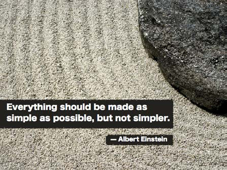
Our lives are frittered away by detail; simplify, simplify.
—Henry David Thoreau

As our daily lives have become more complex, more and more people look to incorporate simplicity into their lives. But finding simplicity in the workplace seems harder these days. Professionally, people are terrified of being simple for fear of being labeled a lightweight. So “when in doubt, add more” is often the guiding principle.
There is a fundamental misunderstanding of simplicity and what it means to be simple today. Many people confuse simple, for example, with simplistic, simplism, or that which is dumbed down to the point of being deceptive or misleading. To some people, simple means a kind of oversimplification of an issue, which ignores complexities and creates obfuscation and outright falsehoods. Politicians are often guilty of this type of oversimplification. But this is not the kind of simplicity I am talking about. The kind of simplicity I mean does not come from a place of laziness or ignorance; rather, it comes from an intelligent desire for clarity that gets to the essence of an issue, which is not easy to do.
Simplicity—along with other precepts such as restraint and naturalness—are key ideas found in Zen and the Zen arts: arts such as the tea ceremony,
haiku
,
ikebana
, and
sumi-e
, which can take many years or, indeed, a lifetime to master. There is nothing easy about them, although when performed by a master, they may seem beautifully simple. It is difficult to give a definition of simplicity, but when I say we need to create messages and design visuals that are simple, I am not talking about taking shortcuts, ignoring complexities, or endorsing meaningless sound bites and shallow content. When I use the word
simple
(or
simplicity
), I am referring to the term as essentially synonymous with clarity, directness, subtlety, essentialness, and minimalism. Designers, such
as interaction designers, are constantly looking for the simplest solution to complex problems. The simple solutions are not necessarily easiest for them, but the results may end up being the “easiest” for the end user.
The best visuals are often ones designed with an eye toward simplicity. Yet this says nothing about the specifics of a visual presentation. That will depend on the content and context. For example, even the best visuals used in support of a presentation for one audience on, say, quantum mechanics may appear complicated and confusing to a different audience. Simplicity is often used as a means to greater clarity. However, simplicity can also be viewed as a consequence of our careful efforts to craft a story and create supporting visuals that focus on our audience’s needs in a clear and meaningful way.
Simplicity is an important design principle, but simplicity itself is not a panacea. Though people usually err on the side of making presentation slides more complicated than they need to be, it is indeed possible to be “too simple.” Simplicity is the goal, but as Albert Einstein said, “Everything should be made as simple as possible, but not simpler.”