Authors: Garr Reynolds
Presentation Zen: Simple Ideas on Presentation Design and Delivery, 2nd Edition (Ira Katz's Library) (16 page)

(Image in slide from iStockphoto.com.)
Steve Jobs was one of the best presenters the world of business has ever seen. When Jobs spoke on stage, he was clear and to the point. While he was CEO of Apple, his presentations generated a lot of positive buzz and released a wave of viral communication about the presentation’s content. This happened in part because the content was easily grasped and remembered by both the media and regular customers. You can’t “spread the word” if you don’t get what the word is. With Jobs’s public presentations, there was both verbal and visual clarity.
Jobs was a student of Zen and was influenced early on by the Japanese aesthetic. “I have always found Buddhism, especially Japanese Zen Buddhism in particular, to be aesthetically sublime,” Jobs told biographer Walter Isaacson, author of the book
Steve Jobs
. “The most sublime thing I’ve ever seen are the gardens around Kyoto. I’m deeply moved by what that culture has produced, and it’s directly from Zen Buddhism.” Jobs’s personal style and approach to presentations certainly embodied an essence of simplicity and clarity that was remarkable and rare among CEOs or leaders of any kind.
Part of his great clarity could be seen in the visuals that accompanied his talks. There was a kind of “Zen aesthetic” to his presentation visuals. In Jobs’s slides, you could see evidence of restraint, simplicity, and a powerful yet subtle use of empty space. Clutter and the nonessential were strictly forbidden.
Bill Gates, one of the most powerful and philanthropic businessmen of our time, always provided a lesson in contrast to Jobs’s visual simplicity—although Gates has gotten much better in the last couple of years, and his presentation visuals for his TED talks and Gates Foundation presentations have been good.
However, the typical style of presentation that Gates became known for over the years was very similar to the style of slide presentation we still see too much of today—presentations with the kind of slides that hurt more than help with audience engagement. Problems with the visuals included too many elements on one slide, overuse of bullet points (including long lines of text), cheesy-looking images, too many colors, overused gradation techniques, weak visual communication priority, and an overall impression of clutter on screen.
Both Jobs and Gates used slides to complement their talks over the years. The biggest difference was that Jobs’s visuals were a big part of his talk. The visuals were a necessary component of the talk, not just ornamentation or notes to remind him what to say. Jobs used the slides to help him tell a story, and he interacted with them in a dynamic yet natural way, rarely turning his
back on the audience. Jobs used the huge backlit screen behind him in the same spirit that a filmmaker uses the screen: to help tell a story. A filmmaker uses actors, visuals, and effects to convey his message. Jobs used visuals and his own words and natural presence to tell his story. Jobs’s slides always flowed smoothly with his talk.
In Bill Gates’s case, however, the slides were often not only of low aesthetic quality, they simply did not really help his narrative. Gates’s slides were often not really necessary; they were more of an ornament or a decoration off to the side. In many instances, Gates would have been better off just pulling up a stool and sharing his ideas and then answering questions that audience members could have submitted before the talk so he could select those he would answer. You don’t have to use slideware for every presentation, but if you do, the visuals should seem a part of the show, not something “over there” off to the side.
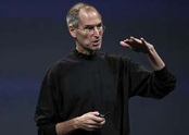
Photo: Justin Sullivan/iStockphoto.com
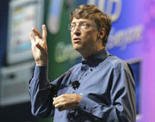
Photo: Ron Wurzer/iStockphoto.com
I have always admired Bill Gates for his work with education and the great work his foundation does today. But when it came to his public keynote presentations back in his Microsoft days—and the visuals that accompanied those talks—there was much he could have learned about “presenting differently” from Steve Jobs. Gates’s keynotes were not terrible; they were just very average and unremarkable. His PowerPoint-driven style was normal and typical, and his presentations were largely unmemorable as a result. Bill Gates is a remarkable man; his presentations should be remarkable too. Happily, he does seem to think differently about his presentation visuals today, and his presentations are better as a result.
The moral of the story for the rest of us is this: If you are going to get up in front of a lot of people and say the design of your strategy matters or the design of your integrated software matters, then at the very least the visuals you use—right here and right now, at this moment, with this particular audience—also need to be the result of thoughtful design, not hurried decoration.
Zen itself is not concerned with judging this design to be good or that design to be bad. Still, we can look to some of the concepts in the Zen aesthetic to help us improve our own visuals with an eye toward simplicity.
A key tenet of the Zen aesthetic is
kanso
or simplicity. In the
kanso
concept, beauty and visual elegance are achieved by elimination and omission. Says artist, designer, and architect Dr. Koichi Kawana, “Simplicity means the achievement of maximum effect with minimum means.” When you examine your visuals, then, can you say that you are getting the maximum impact with a minimum of graphic elements, for example? When you take a look at Jobs’s slides and Gates’s slides of the past, how do they compare for
kanso
?
The aesthetic concept of naturalness or
shizen
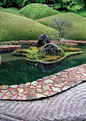
“prohibits the use of elaborate designs and over refinement,” according to Dr. Kawana. Restraint is a beautiful thing. Talented jazz musicians, for example, know never to overplay but instead to be forever mindful of the other musicians and find their own space within the music and the moment they are sharing. Graphic designers show restraint by including only what is necessary to communicate the particular message for the particular audience. Restraint is hard. Complication and elaboration are easy...and common. The suggestive mode of expression is a key Zen aesthetic. Dr. Kawana, commenting on the design of traditional Japanese gardens, says, “The designer must adhere to the concept of
miegakure
since Japanese believe that in expressing the whole, the interest of the viewer is lost.”
Shibumi
is a principle that can be applied to many aspects of life. Concerning visual communication and graphic design,
shibumi
represents elegant simplicity and articulate brevity, an understated elegance. In
Wabi-Sabi Style
(Gibbs Smith Publishers), authors James and Sandra Crowley comment on the Japanese deep appreciation of beauty in this sense:
“Their (Japanese) conceptualization relegates elaborate ornamentation and vivid color usage to the bottom of the taste levels...excess requires no real thought or creativity. The highest level of taste moves beyond the usage of brilliant colors and heavy ornamentation to a simple and subdued refinement that is the beauty of
shibumi
, which represents the ultimate in good taste through conscious reserve. This is the original ‘less is more’ concept. Less color—subdued and elegant usage of color, less clutter.”
In the world of slide presentations, you do not always need to visually spell everything out. You do not need to pound every detail into the head of each member of your audience either visually or verbally. Instead, the combination of your words, along with the visual images you project, should motivate the viewer and arouse his imagination, helping him to empathize with your idea and visualize it beyond what is visible in the ephemeral PowerPoint slide before him. The Zen aesthetic values include (but are not limited to) the following:
• Simplicity
• Subtlety
• Elegance
• Suggestive rather than descriptive or obvious
• Naturalness (i.e., nothing artificial or forced)
• Empty space (or negative space)
• Stillness, tranquility
• Eliminating the nonessential
All of these principles can be applied to slide design, Web design, and so on.
I first learned of
wabi-sabi
while studying
sado
(Japanese tea ceremony) many years ago in the Shimokita Hanto of Aomori, a rural part of northern Japan—a perfect place to experience traditional Japanese values and concepts. While studying
sado
, I began to appreciate the aesthetic simplicity of the ritual, an art that is an expression of fundamental Zen principles such as purity, tranquility, a respect for nature, and the desire to live in harmony with it.

The ideals of
wabi-sabi
come from Japan, and the origins are based on keen observations of nature.
Wabi
means “poverty” or lacking material wealth and all its possessions yet, at the same time, feeling free from dependence on worldly things, including social status. There is an inward feeling of something higher.
Sabi
means “loneliness” or “solitude,” the feeling you might have while walking alone on a deserted beach deep in contemplation. These two concepts come together to give us an appreciation for the grace and beauty of a scene or a work of art while remaining fully aware of its ephemerality and impermanence.
Some Westerners may be familiar with the term
wabisabi
through
wabi-sabi
-inspired design, a kind of earthy interior design that is balanced, organic, free from clutter and chaos, and somehow quite beautiful in its simple presentation, never appearing ostentatious or decorated.
The ideals of
wabi-sabi
are most applicable to disciplines such as architecture, interior design, and the fine arts. But we can apply the principles to the art of digital storytelling (presentations with AV support or integration) as well.
Wabi-sabi
embraces the “less is more” idea that is often talked about—and often ignored—in today’s society. Visuals created with a sense of
wabi-sabi
are never accidental, arbitrary, cluttered, or busy. They may be beautiful, perhaps, but never
superfluous or decorative. They will be harmonious and balanced, whether symmetrical or asymmetrical. The elimination of distraction and noise can certainly help begin to make visuals with greater clarity.