Authors: Garr Reynolds
Presentation Zen: Simple Ideas on Presentation Design and Delivery, 2nd Edition (Ira Katz's Library) (19 page)

With other visuals, however, you may want to consider including or retaining elements that serve to support the message at a more emotional level. This may seem like a contradiction to the idea that “less is more.” However, emotional elements often do matter—sometimes, they matter a lot. Clarity should be your guiding principle. As with all things, balance is important and the use of emotional elements depends on your particular circumstance, audience, and objectives. In the end, SNR is one principle among many to consider when creating visual messages.
ABOVE
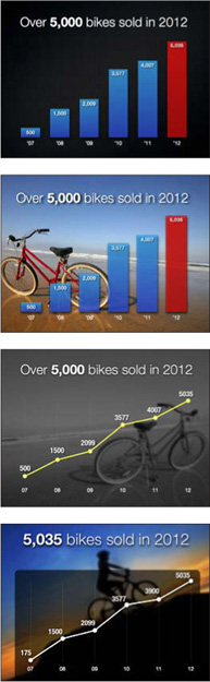
The top slide is simple with its slightly textured background. The last three slides contain more nonessential elements that make them more interesting, but do not necessarily increase the clarity of the data. Any of the designs may be appropriate, however, depending on the situation.
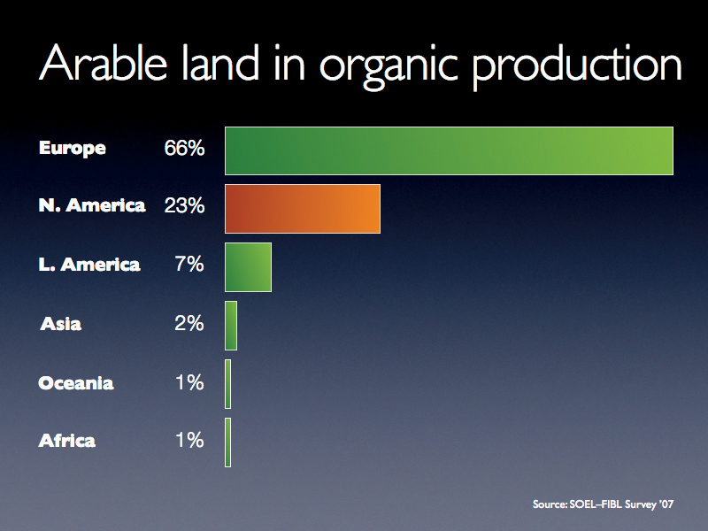
A simple bar chart without an image.
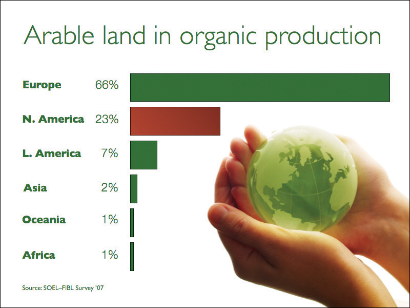
The same simple data with an image added. The image complements the underlining theme—saving the planet—without getting in the way of the chart. (Embedded background images on this page and opposite page from iStockphoto.com.)
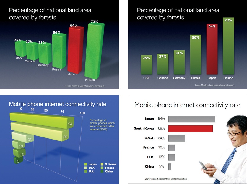
Many design tools in Keynote and PowerPoint are quite useful, but the 3D tool is one I could very well do without. Taking 2D data and creating a 3D chart does not simplify it. The idea is that 3D may add emotion, but when it comes to charts and graphs, you should aim for simple, clean, and 2D (for 2D data). In
The Zen of Creativity
(Ballantine Books), author John Daido Loori says that the Zen aesthetic “reflects a simplicity that allows our attention to be drawn to that which is essential, stripping away the extra.”
What is essential and what is extra is up to you, but stripping away the extra ink that 3D charts introduce seems like a good place to start. A 3D representation of 2D data increases what Edward Tufte calls the “ratio of inkto-data.” While it’s nice to have a choice, 2D charts and graphs are almost always a better solution. Three-dimensional charts appear less accurate and can be difficult to comprehend. In addition, the viewing angle of 3D charts often makes it hard to see where the data points sit on an axis. If you do use 3D charts, avoid extreme perspectives.
The slides on the left are examples of 3D effects that compromise the display of very simple data. The slides on the right are suggested improvements.
“Branding” is one of the most overused and misunderstood terms in use today. Many people confuse the myriad elements of brand identity with brand or branding. The meaning of brand and branding goes far deeper than simply making one’s logo as recognizable as possible. If you are presenting for an organization, try removing its logo from all but the first and last slide. If you want people to learn something and remember you, then make a good, honest presentation. The logo won’t help close a sale or make a point, but it will create clutter and make the presentation visuals look like a commercial. We don’t begin every new sentence in a conversation by restating our names, so why would you bombard people with your company logo on every slide?
Most companies that provide a PowerPoint template insist that employees use their logo on every slide. But is this good advice? Slide real estate is limited as it is, so don’t clutter it with logos, trademarks, footers, and so on.
Tom Grimes, a Kansas State University journalism professor, offers this valuable advice when speaking about his research on the influence of on-screen clutter on understanding or retention.
“[I]f you want people to understand better, then get that stuff off the screen.... Clean it up and get it off because it is simply making it more difficult for people to understand what [you are] saying.”
Grimes is actually talking about the overpowering visual clutter found in TV newscasts, yet his advice is good for our multimedia presentations as well. Over the past several years, many TV news broadcasts have substituted pizzazz and sizzle—not to mention conjecture, speculation, and sensationalism—for clean, clear messages. Perhaps the visual clutter found in most TV news broadcasts has spilled over into corporate slide templates. One thing is for certain: if you want people to understand your visual messages, the answer is not to add more clutter but to remove it all.
A Few Points About Bullet Points
The “traditional way” of doing presentations with slides full of bulleted lists has been going on for so long that it has become part of corporate culture. It is simply “the way things are done.” In Japan, for example, young employees entering a company are taught that when they create presentations with slideware they should put a minimum amount of text in each slide. This sounds like good advice, right? But, a “minimum” means something like six or seven lines of abbreviated text and figures along with several complete sentences. The idea of having one or two words—or (gasp!) no words—would be a sign of someone who did not do their homework. A series of text-filled slides with plenty of charts or tables shows that you are a “serious employee.” Never mind that the audience can’t really see the detail in the slides well (or that the executive board does not really understand your charts). If it looks complicated, it must be “good.”
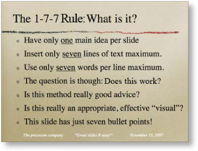
I have a shelf full of presentation books in English and Japanese. All of them say “use a minimum of text.” Most of them define “minimum” as being anywhere from five to eight lines of bullet points. Presenters often learn the “1-7-7 Rule,” which proves that conventional wisdom is out of sync. Here’s the rub: Nobody can do a good presentation with slide after slide of bullet points. Nobody. Bullet points work well when used sparingly in documents to help readers scan content or summarize key points. But bullet points are usually not effective in a live talk.
How Many Bullets Points Per Slide?
A good general guideline is to use bullet points very rarely and only after careful consideration of other options for displaying the information in a way that best supports your message. Do not let the default bulleted lists of the software template dictate your decision. Sometimes bullet points may be the best choice. For example, if you are summarizing key specifications of a new product or reviewing the steps in a process, a clear bulleted or numbered list may be appropriate (depending, as always, on your content, objectives, and audience). People will tire quickly, however, if you show slides of bulleted lists, one after another, so use them with caution. I am not suggesting that you completely abandon the use of bullet points in multimedia presentations, but the usage should be a rare exception.
Top
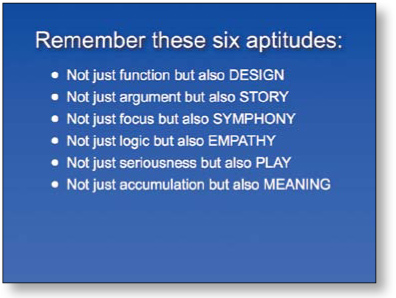
The blue slide was my first attempt to summarize the key points from Dan Pink’s book
A Whole New Mind
in one slide.
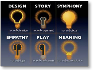
BOTTOM
The second slide uses about half the text to summarize the key points in a more engaging, visual way.
According to the picture superiority effect, pictures are remembered better than words—especially when people are casually exposed to the information and the exposure is for a very limited time. When information recall is measured just after exposure to a series of pictures or a series of words, the recall for pictures and words is about equal. The picture superiority effect, however, applies when the time after exposure is more than 30 seconds, according to research cited in
Universal Principles of Design
(Rockport Publishers). “Use the picture superiority effect to improve the recognition and recall of key information. Use pictures and words together, and ensure that they reinforce the same information for optimal effect,” say authors Lidwell, Holden, and Butler. The effect is strongest when the pictures represent common, concrete things.