Presentation Zen: Simple Ideas on Presentation Design and Delivery, 2nd Edition (Ira Katz's Library) (18 page)
Authors: Garr Reynolds

• As you design slides, keep the following concepts in mind: subtlety, grace, and understated elegance.
• Good designs have plenty of empty space. Think “subtract” not “add.”
• While simplicity is the goal, it is possible to be too simple. Your job is to find the balance most appropriate to your situation.


When I was an employee with Sumitomo in the mid-1990s, I learned that Japanese businesspeople often use the term “case by case” (
keisu bai keisu
) when discussing details of future events or strategy. This frustrated me because I was accustomed to concrete plans, absolutes, and quick decision making. I learned, however, that context, circumstance, and a kind of “particularism” were very important to the Japanese with whom I worked.
Today, I might use Japanese expressions such as
jyoukyou ni yotte
(judgment depends on circumstance) or
toki to baai ni yotte
(depends on time and circumstance) when discussing the techniques and designs to use for a particular presentation, for example. I used to think that “it depends” was a weak statement, a cop-out of sorts. Now I see that it is wise. Without a good knowledge of the place and circumstance, and the content and context of a presentation, it is difficult to say this is “appropriate” and that is “inappropriate,” let alone to judge what is “good” or “bad.” There are no cookie-cutter approaches to design. Graphic design is as much art as science.
Nonetheless, there are some general guidelines that most appropriate and strong slide designs share. A few basic and fundamental concepts and design principles, if properly understood, can indeed help the average person create presentation visuals that are far more effective. One could fill several volumes with design principles and techniques: you can read more on the topic in my book
Presentation Zen Design
(New Riders). In this chapter, I’ll exercise restraint and elaborate on only a few principles plus showcase practical examples and a few techniques. First, let’s look at what is meant by design.
A common misunderstanding about design is that it is something that comes at the end—like the frosting and the “Happy Birthday!” on a cake. But this is not what I mean by design. For me, design does not wait until the end. Rather, it comes at the beginning, right from the start. Design is necessary to organize information in a way that makes things clearer; it can make things easier for the viewer or the user. Design is also a medium for persuasion. It is not decoration.
Design is about people creating solutions that help or improve the lives of other people—often in profound ways, and often in ways that are quite small and unnoticed. When we design, we need to be concerned with how other people interpret our design solutions and messages. Design is not art, although there is art in it. Artists can, more or less, follow their creative impulses and create whatever it is they want to express. But designers work in a business environment. At all times, designers need to be aware of the end user and how best to solve (or prevent) a problem from the user’s point of view. Art is good or bad in and of itself. Good art may move people; it may change their lives in some way. If so, wonderful. But good design
must
necessarily have an impact on people’s lives, no matter how seemingly small. Good design changes things.
Design is much more than aesthetics, yet things that are well-designed, including graphics, often have high aesthetic quality. Well-designed things look good. In the world of design, there is more than one solution to a single problem. You need to explore, but ultimately you need to look for the most appropriate solution for the problem, given the context of your information. Design is about making conscious decisions about inclusion and exclusion.
In the case of presentation visuals, graphics must be free of errors and they must be accurate. But our visuals—like it or not—also touch our audiences at an emotional level. People make instant judgments about whether something is attractive, trustworthy, professional, too slick, and so on. This is a visceral reaction—and it matters.
In the following sections, I’ll take you through seven interconnected design principles that are fundamental to good slide design. The first two—signal-to-noise ratio and picture superiority effect—are broad concepts with practical applications to slide design. The third—empty space—helps us look at slides in a different way and appreciate the power of what is not included to make visual messages stronger. The final four principles are grouped together in what I call “the big four” of basic design principles: contrast, repetition, alignment, and proximity. Designer and author Robin Williams first grouped and applied these four basic principles to the art of document design in her best-selling book
The Non-Designer’s Design Book
(Peachpit Press). I’ll show you how to apply the principles to improving slide design.

The signal-to-noise ratio (SNR) is a principle borrowed from more technical fields such as radio communications and electronic communication in general. The principle itself, however, applies to design and communication problems in virtually any field. For our purposes, the SNR is the ratio of relevant to irrelevant elements and information in a slide or other display. The goal is to have the highest signal-to-noise ratio possible in your slides. People have a hard time coping with too much information. There is simply a limit to a person’s ability to process new information efficiently and effectively. Aiming for a higher SNR attempts to make things easier for people. Understanding can be hard enough without bombarding audience members with excessive and nonessential visuals that are supposed to be playing a supportive role.
Ensuring the highest possible signal-to-noise ratio means communicating (designing) clearly with as little degradation to the message as possible. You can degrade the visual message in many ways, including selecting inappropriate charts, using ambiguous labels and icons, and unnecessarily emphasizing items such as lines, shapes, symbols, and logos that do not play a key role in support of the message. In other words, if the item can be removed without compromising the visual message, then strongly consider minimizing or removing it. For example, lines in grids or tables can often be quite thin or light—or even removed. Footers, logos, and the like can usually be removed with positive results (assuming your company allows you to do this).
In
Visual Explanations: Images and Quantities, Evidence and Narrative
(Graphics Press), Edward Tufte refers to an important principle, called “the smallest effective difference,” that is in harmony with SNR. “Make all visual distinctions as subtle as possible,” says Tufte, “but still clear and effective.” If the message can be designed with fewer elements, then there is no point in using more.
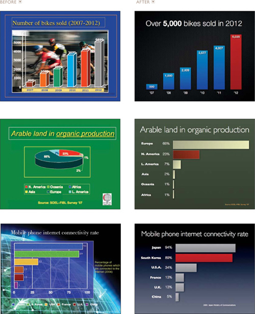
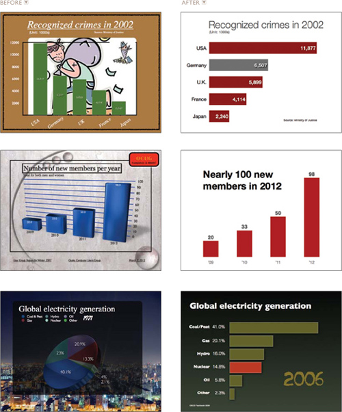
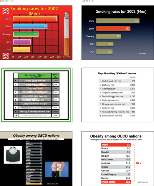
OPPOSITE PAGE
Compare the original slides on the left to those with an improved signal-to-noise ratio on the right. To achieve this, I removed nonessential elements and minimized other elements. Note that in the second example, I converted the pie chart to a bar chart, which makes the differences much easier to see.
It is generally true that unnecessary elements decrease a design’s efficiency and increase the possibility of unintended consequences. But does this mean that we must remove everything that is not absolutely essential to a design? Some say a minimalist approach is the most efficient. But efficiency itself is not necessarily an absolute good and not always the ideal approach.
When it comes to the display of quantitative information using charts, tables, graphs, etc., I strongly favor designs that include the highest SNR possible without adornment. I use a lot of photographs in my presentations, so when I do show a chart or a graph, I usually do not place other elements on the slide. There is nothing wrong with placing a bar chart, for example, over a background image (as long as there is proper contrast or salience), but I think the data itself (with a high SNR) can be a very powerful, memorable graphic on its own.