Authors: Garr Reynolds
Presentation Zen: Simple Ideas on Presentation Design and Delivery, 2nd Edition (Ira Katz's Library) (17 page)

A Zen garden is also a lesson in simplicity: open space without ornamentation, a few rocks carefully selected and placed, raked gravel. Beautiful. Simple. The Zen garden is very different from many gardens in the West that are absolutely filled with beauty, so much beauty, in fact, that we miss much of it. Presentations are a bit like this. Sometimes, we’re presented with so much visual and auditory stimulation in such a short time that we end up understanding very little and remembering even less. We witnessed a large quantity of stuff, but is it not the quality of the evidence and the experience that matters, rather than, say, merely the amount of data or the length of the experience?
Living in Japan all these years, I have had many chances to experience the Zen aesthetic, either while visiting a garden, practicing
zazen
(meditation) in a Kyoto temple, or even while having a traditional Japanese meal out with friends. I am convinced a visual approach that embraces the aesthetic concepts of simplicity and the removal of the nonessential can have practical applications in our professional lives and can lead ultimately to a more enlightened design. I do not suggest you judge a presentation visual the same way you do a work of art. But understanding the essence of Zen simplicity can have practical applications in your creative work, including the design of your presentation visuals.
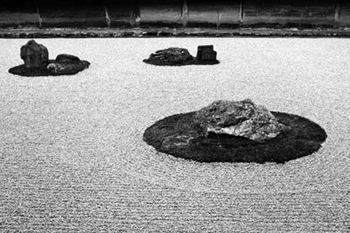
The Ryoan Ji Zen Garden in Kyoto, Japan. A reminder to include only what is essential.
(Photo: iStockphoto.com.)
The “Fish Story”
After I presented for a large tech company in Silicon Valley, I received this note below from Deepak, an engineer in the audience. This little story illustrates the idea of reducing the nonessential.

Dear Garr... When you talked about reducing the text on the slides, I was reminded of a story from my childhood in India. If I remember it right, it goes like this:
When Vijay opened his store, he put up a sign that said: “We Sell Fresh Fish Here.” His father stopped by and said that the word “We” suggests an emphasis on the seller rather than the customer, and is really not needed. So the sign was changed to “Fresh Fish Sold Here.”
His brother came by and suggested that the word “here” could be done away with—it was superfluous. Vijay agreed and changed the sign to “Fresh Fish Sold.”
Next, his sister came along and said the sign should just say “Fresh Fish.” Clearly, it is being sold; what else could you be doing?
Later, his neighbor stopped by to congratulate him. Then he mentioned that all passers-by could easily tell that the fish was really fresh. Mentioning the word fresh actually made it sound defensive as though there was room for doubt about the freshness. Now the sign just read: “FISH.”
As Vijay was walking back to his shop after a break he noticed that one could identify the fish from its smell from very far, at a distance from which one could barely read the sign. He knew there was no need for the word “FISH.”
By stripping down an image to essential meaning, an artist can amplify that meaning...
—Scott McCloud
The Japanese Zen arts teach us that it is possible to express great beauty and convey powerful messages through simplification. Zen may not verbalize “amplification through simplification,” but you can see this idea everywhere in the Zen arts. There is a style of Japanese painting called the “one-corner” style, for example, which goes back some 800 years and is derived from the concepts of
wabi
and
sabi
. Paintings in this style are very simple and contain much empty space. You may have a painting depicting a large ocean scene and empty sky, for example. In the corner, there is a small, old fishing canoe, hardly visible. It’s the smallness and placement of the canoe that give vastness to the ocean and evoke a feeling of calm and an empathy for the aloneness the fisherman faces. Such visuals have few elements yet can be profoundly evocative.
We can learn about simplicity as it relates to presentation visuals from unexpected places, including—and this may surprise you—the art of comics. And the best place to learn this is from Scott McCloud’s
Understanding Comics: The Invisible Art
(Harper Paperbacks). In this popular book, McCloud repeatedly touches on the idea of “amplification through simplification.” McCloud says cartooning is a form of amplification through simplification because the abstract images in comics are not so much the elimination of detail as they are an effort to focus on specific details.
A key feature of many comics is their visual simplicity. Yet as McCloud reminds us, while casting an eye toward the wonderful world of Japanese comics, “simple style does not necessitate simple story.” Many people (outside Japan at least) prejudge comics by their simple lines and forms as being necessarily simplistic and base, perhaps suitable for children and the lazy but not something that could possibly have depth and intelligence. Surely such a simple style found in comics cannot be illustrating a complex story, they say.
However, if you visit coffee shops around Tokyo University—Japan’s most elite university—you will see stacks and stacks of comics (
manga
) on the shelves. There is nothing necessarily stupid about the genre of comics in Japan at all; in fact, you’ll find brainiacs in all shapes and sizes reading comics here and, indeed, around the world.
The situation today is that most people have not been exposed to the idea of making a visual stronger by stripping it down to its essence. Less equals less in most people’s eyes. If we apply this visual illiteracy to the world of presentations, you can imagine the frustration a young, enlightened professional must feel when her boss looks over her presentation visuals the day before her big presentation and says, “No good. Too simple. You haven’t said anything with these slides! Where are your bullet points!? Where’s the company logo!? You’re wasting space—put some data in there!” She tries to explain that the slides are not the presentation but that she is the presentation and that the points will be coming from her mouth. She tries to explain that the slides contain a delicate balance of text and images and data designed to play a supportive yet powerful role in helping amplify her message. She attempts to remind her boss that they also have strong, detailed documentation for the client and that slides and documents are not the same. But her boss will have none of it. The boss is not happy until the PowerPoint deck looks like normal PowerPoints, you know, the kind used by serious people.
We must do what we can to be firm, however, and remain open to the idea of amplification through simplification as much as possible. I am not suggesting you become an artist or that you should draw your own images. Rather, I am suggesting that you can learn a lot about how to present images and words together by exploring the so-called “low art” of comics. In fact, although presentation visuals were surely the farthest thing from McCloud’s mind when he wrote the book, we can learn far more about effective communication for the conceptual age from it than we can from many books on PowerPoint. For example, early in the book, McCloud builds a definition of comics and finally arrives with this, a definition he admits is not written in stone:
“Juxtaposed pictorial and other images in deliberate sequence intended to convey information and/or to produce an aesthetic response in the viewer.”
It is easy to imagine, with some tweaking, how this could be applied to other storytelling media and presentation contexts as well. We do not have a good definition for “live presentation with slides,” but a great presentation may indeed contain slides that are comprised of “juxtaposed pictorial and other images.” And great presentations certainly have elements of sequence designed to “convey information and/or to produce an aesthetic response.”
At the end of the book, McCloud gives us some simple, Zen-like wisdom. He’s talking about writers, artists, and the art of comics, but this is good advice to live by no matter where our creative talents may lie. “All that’s needed,” he says, “...is the desire to be heard. The will to learn. And the ability to see.”
When you get right down to it, it always comes back to desire, a willingness to learn, and the ability to really see. Many of us have the desire; it’s the learning and seeing that’s the hard part. McCloud says that in order for us to understand comics, we need to “clear our minds of all preconceived notions about comics. Only by starting from scratch can we discover the full range of possibilities comics offer.” The same can be said for presentation design. Only by approaching presentations and presentation design with a completely open mind can we see the options before us. It is just a matter of seeing.
Usually, we think about time in terms of “How can I save it?” Time is a constraint for us, but what if, when planning a presentation, we took the notion of saving time and looked at it from the point of view of our audience instead of our own personal desire to do things more quickly? What if it wasn’t just about
our time,
but it was about
their time
? When I am in the audience, I appreciate it very much when I am in the presence of a speaker who is engaged, has done his homework, has prepared compelling visuals which add rather than bore, and generally makes me happy I have attended. What I hate more than anything—and I know you do too—is the feeling I get when I realize I am at the beginning of a wasted hour ahead of me.
Often, the approach I advocate may use more time, not less time, for you to prepare, but the time you are saving for your audience can be huge. Again, is it always about saving time for ourselves? Isn’t it important to save time for others? When I save time for myself, I am pleased. But when I save time for my audience—by
not
wasting their time and instead by sharing something important with them—I feel inspired, energized, and rewarded.
I can save time on the front end, but I may waste more time for others on the back end. For example, if I give a completely worthless, one-hour, death-by-PowerPoint presentation to an audience of 200, that equals 200 hours of wasted time. But if I put in the time, say, 25 to 30 hours or more of planning and designing the message and the media, then I can give the world 200 hours of a worthwhile, memorable experience.
Software companies advertise time-saving features, which may help us believe we have saved time to complete a task such as preparing a presentation and simplified our workday. But if time is not saved for the audience—if the audience wastes its time because we didn’t prepare well, design the visuals well, or perform well—then what does it matter that we saved one hour in preparing our slides? Doing things in less time sometimes does indeed feel simpler, but if it results in wasted time and wasted opportunities later, it is hardly simple.
• Simplicity is powerful and leads to greater clarity, yet it is neither simple nor easy to achieve.
• Simplicity can be obtained through the careful reduction of the nonessential.