Read A Field Guide to Lies: Critical Thinking in the Information Age Online
Authors: Daniel J. Levitin
A Field Guide to Lies: Critical Thinking in the Information Age (10 page)

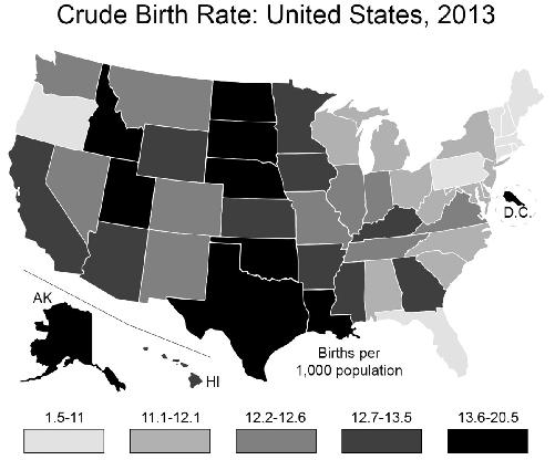
That doesn’t help. Utah looks just like most of the rest of the country. What to do? Change the bins! You can play around with which range of values go into each category, those five gray-to-black
bars at the bottom. By making sure that Utah’s rate is in a category all by itself, you can make it stand out from the rest of the country.

Of course, this only works because Utah does in fact have the highest birth rate in the country—not by much, but it is still the highest. By choosing a bin that puts it all by itself in a color category, you’ve made it stand out. If you were trying to make a case for one of the other states, you’d have to resort to other kinds of flimflam, such as graphing the number of births per square mile, or per Walmart store, as a function of disposable income. Play around
long enough and you might find a metric to make a case for any of the fifty states.
What is the
right
way, the non-lying way to present such a graph? This is a matter of judgment, but one relatively neutral way would be to bin the data so that 20 percent of the states are contained in each of the five bins, that is, an equal number of states per color category:
Another would be to make the bins equal in size:

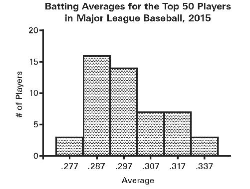
This kind of statistical chicanery—using unequal bin widths in all but the last of these maps—often shows up in histograms, where the bins are typically identified by their midpoint and you have to infer the range yourself. Here are the
batting averages for the 2015 season for the Top 50 qualifying Major League Baseball players (National and American Leagues):

Now, suppose that you’re the player whose batting average is .330, putting you in the second highest category. It’s time for bonus checks and you don’t want to give management any reason to deny you a bonus this year—you’ve already bought a Tesla. So change the bin widths, amalgamating your results with the two players who were batting .337, and now you’re in with the very best players. While you’re at it, close up the ensuing gap (there are no longer any batters in the .327-centered bin), creating a discontinuity in the x-axis that probably few will notice:
Specious Subdividing
The opposite of amalgamating is subdividing, and this can cause people to believe all kinds of things that aren’t so. To claim that
x
is a leading cause of
y,
I simply need to subdivide other causes into smaller and smaller categories.
Suppose you work for a manufacturer of air purifiers, and you’re on a campaign to prove that respiratory disease is the leading cause of death in the United States, overwhelming other causes like heart disease and cancer. As of today, the actual leading cause of death in the United States is heart disease. The U.S. Centers for Disease Control report that these were the
top three causes of death in 2013:
Heart disease: 611,105
Cancer: 584,881
Chronic lower respiratory diseases: 149,205
Now, setting aside the pesky detail that home air purifiers may not form a significant line of defense against chronic respiratory disease, these numbers don’t make a compelling case for your company. Sure, you’d like to save more than 100,000 lives annually, but to say that you’re fighting the
third
largest cause of death doesn’t make for a very impressive ad campaign. But wait! Heart disease isn’t one thing, it’s several:
Acute rheumatic fever and chronic rheumatic heart disease: 3,260
Hypertensive heart disease: 37,144
Acute myocardial infarction: 116,793
Heart failure: 65,120
And so on. Next, break up the cancers into small subtypes. By failing to amalgamate, and creating these fine subdivisions, you’ve done it! Chronic lower respiratory disease becomes the number one killer. You’ve just earned yourself a bonus. Some food companies have used this subdivide strategy to hide the amounts of fats and sugars contained in their product.
H
OW
N
UMBERS
A
RE
C
OLLECTED
Just because there’s a number on it, it doesn’t mean that the number was arrived at properly. Remember, as the opening to this part of the book states,
people
gather statistics. People choose what to count, how to go about counting. There are a host of errors and biases that can enter into the collection process, and these can lead millions of people to draw the wrong conclusions. Although most of us won’t ever participate in the collection process, thinking about it, critically, is easy to learn and within the reach of all of us.
Statistics are obtained in a variety of ways: by looking at records (e.g., birth and death records from a government agency, hospital, or church), by conducting surveys or polls, by observation (e.g., counting the number of electric cars that pass the corner of Main and Third Street), or by inference (if sales of diapers are going up, the birth rate is probably going up). Biases, inaccuracies, and honest mistakes can enter at any stage. Part of evaluating claims includes asking the questions “Can we really know that?” and “How do they know that?”
Sampling
Astrogeologists sample specimens of moon rock; they don’t test the entire moon. Researchers don’t talk to every single voter to find out which candidate is ahead, or tally every person who enters an emergency room to see how long they had to wait to be seen. To do so would be impractical or too costly. Instead, they use samples to estimate the true number. When samples are properly taken, these estimates can be very, very accurate. In public-opinion polls, an estimate of how the entire country feels about an issue (about 234 million adults over the age of twenty-one) can be obtained by interviewing only 1,067 individuals. Biopsies that sample less than one one-thousandth of an organ can be used for accurate cancer staging.
To be any good, a sample has to be representative. A sample is representative if every person or thing in the group you’re studying has an equally likely chance of being chosen. If not, your sample is biased. If the cancer is only in part of an organ and you sample the wrong part, the cancer will go undiagnosed. If it’s in a very small part and you take fifteen samples in that one spot, you may be led to conclude the entire organ is riddled with cancer when it’s not.
We don’t always know ahead of time, with biopsies or public-opinion polls, how much variability there will be. If everyone in a population were identical, we’d only need to sample one of them. If we have a bunch of genetically identical people, with identical personalities and life experience, we can find out anything we want to know about all of them by simply looking at one of them. But every
group contains some heterogeneity, some differences across its members, and so we need to be careful about how we sample to ensure that we have accounted for all the differences that matter. (Not all differences matter.) For example, if we deprive a human of oxygen, we know that human will die. Humans don’t differ along this dimension (although they do differ in terms of how long they can last without oxygen). But if I want to know how many pounds human beings can bench press, there is wide variation—I’d need to measure a large cross-section of different people to obtain a range and a stable average. I’d want to sample large people, small people, fat people, skinny people, men, women, children, body builders and couch potatoes, people taking anabolic steroids, and teetotalers. There are probably other factors that matter, such as how much sleep the person got the night before testing, how long it’s been since they ate, whether they’re angry or calm, and so on. Then there are things that we think don’t matter at all: whether the air-traffic controller at the St. Hubert Airport in Quebec is male or female that day; whether a random customer at a restaurant in Aberdeen was served in a timely fashion or not. These things may make a difference to other things we’re measuring (latent sexism in the air-travel industry; customer satisfaction at Northwestern dining establishments) but not to bench pressing.
The job of the statistician is to formulate an inventory of all those things that matter in order to obtain a representative sample. Researchers have to avoid the tendency to capture variables that are easy to identify or collect data on—sometimes the things that matter are not obvious or are difficult to measure. As Galileo Galilei said, the job of the scientist is to measure what is measurable and to render measurable that which is not. That is, some of the most creative acts in science involve figuring out how to measure something that makes a difference, that no one had figured out how to measure before.
But even measuring and trying to control variables that you know about poses challenges. Suppose you want to study current attitudes about climate change in the United States. You’ve been given a small sum of money to hire helpers and to buy a statistics program to run on your computer. You happen to live in San Francisco, and so you decide to study there. Already you’re in trouble: San Francisco is not representative of the rest of the state of California, let alone the United States. Realizing this, you decide to do your polling in August, because studies show that this is peak tourist season—people from all over the country come to San Francisco then, so (you think) you’ll be able to get a cross-section of Americans after all.