Read A Field Guide to Lies: Critical Thinking in the Information Age Online
Authors: Daniel J. Levitin
A Field Guide to Lies: Critical Thinking in the Information Age (6 page)

The Dreaded Double Y-Axis
The graph maker can get away with all kinds of lies simply armed with the knowledge that most readers will not look at the graph very closely. This can move a great many people to believe all kinds of things that aren’t so. Consider the following graph, showing the
life expectancy of smokers versus nonsmokers at age twenty-five.
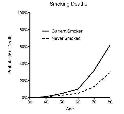
This makes clear two things: The dangers of smoking accumulate over time, and smokers are likely to die earlier than nonsmokers. The difference isn’t big at age forty, but by age eighty the risk more than doubles, from under 30 percent to over 60 percent. This is a
clean and accurate way to present the data. But suppose you’re a young fourteen-year-old smoker who wants to convince your parents that you should be allowed to smoke. This graph is clearly not going to help you. So you dig deep into your bag of tricks and use the double y-axis, adding a y-axis to the right-hand side of the graph frame, with a different scaling factor that applies only to the nonsmokers. Once you do that, your graph looks like this:
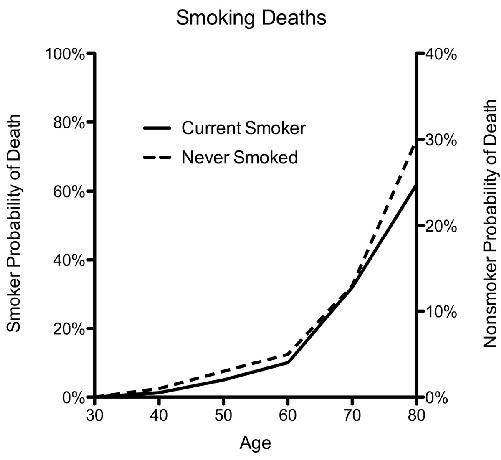
From this, it looks like you’re just as likely to die from smoking as from not smoking. Smoking won’t harm you—old age will! The trouble with double y-axis graphs is that you can always scale the second axis any way that you choose.

Forbes
magazine, a venerable and typically reliable news source, ran a graph very much like this one to show the relation between
expenditures per public school student and those students’ scores on the SAT, a widely used standardized test for college admission in the United States.
From the graph, it looks as though increasing the money spent per student (black line) doesn’t do anything to increase their SAT scores (gray line). The story that some anti–government spending politicos could tell about this is one of wasted taxpayer funds. But you now understand that the choice of scale for the second (right-hand) y-axis is arbitrary. If you were a school administrator, you might simply take the exact same data, change the scale of the right-hand axis, and voilà—increasing spending delivers a better education, as evidenced by the increase in SAT scores!
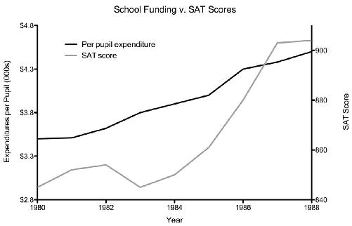
This graph obviously tells a very different story. Which one is true? You’d need to have a measure of how the one variable changes as a function of the other, a statistic known as a correlation. Correlations range from −1 to 1. A correlation of 0 means that one variable is not related to the other at all. A correlation of -1 means that as one variable goes up, the other goes down, in precise synchrony. A correlation of 1 means that as one variable goes up, the other does too, also in precise synchrony. The first graph appears to be illustrating a correlation of 0, the second graph appears to be representing one that is close to 1. The actual correlation for this dataset is .91, a very strong correlation. Spending more on students is, at least in this dataset, associated with better SAT scores.
The correlation also provides a good estimate of how much of the
result can be explained by the variables you’re looking at. The correlation of .91 tells us we can explain 91 percent of students’ SAT scores by looking at the amount of school expenditures per student. That is, it tells us to what extent expenditures explain the diversity in SAT scores.
A controversy about the double y-axis graph erupted in the fall of 2015 during a U.S. congressional committee meeting. Rep. Jason Chaffetz presented a graph that plotted two
services provided by the organization Planned Parenthood: abortions, and cancer screening and prevention:
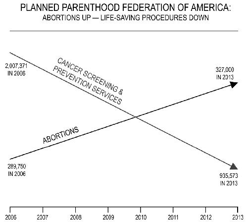
The congressman was attempting to make a political point, that over a seven-year period, Planned Parenthood has increased the number of abortions it performed (something he opposes) and decreased the number of cancer screening and prevention procedures. Planned Parenthood doesn’t deny this, but this distorted graph makes it seem that the number of abortion procedures exceeded those for cancer. Maybe the graph maker was feeling a bit guilty and so included the actual numbers next to the data points. Let’s accept her bread crumbs and look closely. The number of abortions in 2013, the most recent year given, is 327,000. The number of cancer services was nearly three times that, at 935,573. (By the way, it’s a bit suspicious that the abortion numbers are such tidy, round numbers while the cancer numbers are so precise.) This is a particularly sinister example: an implied double y-axis graph with no axes on either side!
Drawn properly, the graph would look like this:
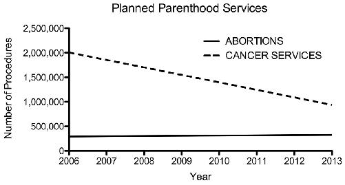
Here, we see that abortions increased modestly, compared to the reduction in cancer services.
There is another thing suspicious about the original graph: Such smooth lines are rarely found in data. It seems more likely that the graph maker simply took numbers for two particular years, 2006 and 2013, and compared them, drawing a smooth connecting line between them. Perhaps these particular years were chosen intentionally to emphasize differences. Perhaps there were great fluctuations in the intervening years of 2007–2012; we don’t know. The smooth lines give the impression of a perfectly linear (straight line) function, which is very unlikely.
Graphs such as this do not always tell the story that people think they do. Is there something that could account for these data, apart from a narrative that Planned Parenthood is on a mission to perform as many abortions as it can (and to let people die of cancer at the same time)? Look at the second graph. In 2006, Planned Parenthood performed 2,007,371 cancer services, and 289,750 abortions, nearly seven times as many cancer services as abortions. By 2013, this gap had narrowed, but the number of cancer services was still nearly three times the number of abortions.
Cecile Richards, the president of Planned Parenthood, had an explanation for this narrowing gap. Changing medical guidelines for some anti-cancer services, like Pap smears, reduced the number of people for whom screening was recommended. Other changes, such as social attitudes about abortion, changing ages of the population, and increased access to health care alternatives, all influence these numbers, and so the data presented do not prove that Planned Parenthood has a pro-abortion agenda. It might—these data are just not the proof.
H
IJINKS
WITH
H
OW
N
UMBERS
A
RE
R
EPORTED
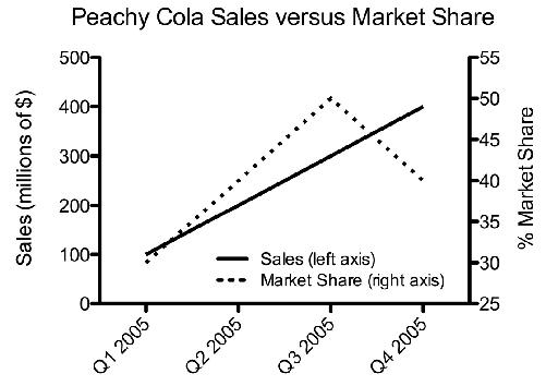
You’re trying to decide whether to buy stock in a new soft drink and you come across this graph of the company’s sales figures in their annual report:
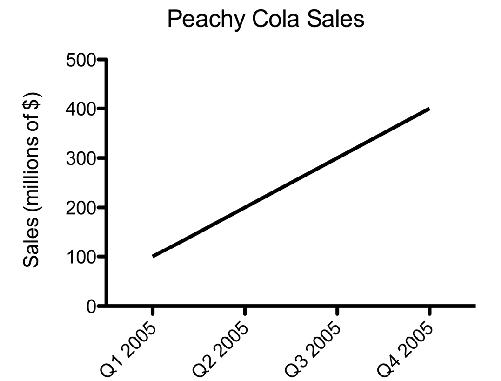
This looks promising—Peachy Cola is steadily increasing its sales. So far, so good. But a little bit of world knowledge can be applied here to good effect. The soft-drink market is very competitive. Peachy Cola’s sales are increasing, but maybe not as quickly as a
competitor’s. As a potential investor, what you really want to see is how Peachy’s sales compare to those of other companies, or to see their sales as a function of market share—Peachy’s sales could go up only slightly while the market is growing enormously, and competitors are benefiting more than Peachy is. And, as this example of a useful double y-axis graph demonstrates, this may not bode well for their future: