Read A Field Guide to Lies: Critical Thinking in the Information Age Online
Authors: Daniel J. Levitin
A Field Guide to Lies: Critical Thinking in the Information Age (8 page)

Interpreting and Framing
Often a statistic will be properly created and reported, but someone—a journalist, an advocate, any non-statistician—will misreport it, either because they’ve misunderstood it or because they didn’t realize that a small change in wording can change the meaning.
Often those who want to use statistics do not have statisticians on their staffs, and so they seek the answers to their questions from people who lack proper training. Corporations, government offices, nonprofits, and mom-and-pop grocery stores all benefit from statistics about such items as sales, customers, trends, and supply chain. Incompetence can enter at any stage, in experimental design, data collection, analysis, or interpretation.
Sometimes the statistic being reported isn’t the relevant one. If you’re trying to convince stockholders that your company is doing well, you might publish statistics on your annual sales, and show steadily rising numbers. But if the market for your product is expanding, sales increases would be expected. What your investors and analysts probably want to know is whether your market share has changed. If your market share is decreasing because competitors are swooping in and taking away your customers, how can you make your report look attractive? Simply fail to report the relevant statistic of market share, and instead report the sales figures. Sales are going up! Everything is fine!
The financial profiles shown on people’s mortgage applications twenty-five years ago would probably not be much help in building a model for risk today.
Any model of consumer behavior on a website may become out of date very quickly. Statistics on the integrity of concrete used for overpasses may not be relevant for concrete on bridges
(where humidity and other factors may have caused divergence, even if both civic projects used the same concrete to begin with).
You’ve probably heard some variant of the claim that “four out of five dentists recommend Colgate toothpaste.” That’s true. What the ad agency behind these decades-old ads wants you to think is that the dentists prefer Colgate above and beyond other brands. But that’s not true. The Advertising Standards Authority in the United Kingdom investigated this claim and ruled it an unfair practice because the survey that was conducted allowed dentists to recommend more than one toothpaste. In fact,
Colgate’s biggest competitor was named nearly as often as Colgate (a detail you won’t see in Colgate’s ads).
Framing came up in the section on averages and implicitly in the discussion of graphs. Manipulating the framing of any message furnishes an endless number of ways people can make you believe something that isn’t so if you don’t stop to think about what they’re saying. The cable network
C-SPAN advertises that it is “available” in 100 million homes. That doesn’t mean that 100 million people are watching C-SPAN. It
doesn’t mean that even one person is watching it.
Framing manipulations can influence public policy. A survey of recycling yield on various streets in metropolitan Los Angeles shows that one street in particular recycles 2.2 times as much as any other street. Before the city council gives the residents of this street an award for their green city efforts, let’s ask what might give rise to such a number. One possibility is that this street has more than twice as many residents as other streets—perhaps because it is longer, perhaps because there are a lot of apartment buildings on it. Measuring recycling at the level of the street is not the relevant statistic unless all streets are otherwise identical. A better statistic would be either the living unit (where you measure the recycling output of each family)
or even better, because larger families probably consume more than smaller families, the individual. That is, we want to adjust the amount of recycling materials collected to take into account the number of people on the street. That is the
true frame
for the statistic.
The
Los Angeles Times
reported in 2014 about
water use in the city of Rancho Santa Fe in drought-plagued California. “On a daily per capita basis, households in this area lapped up an average of nearly five times the water used by coastal Southern California homes in September, earning them the dubious distinction of being the state’s biggest residential water hogs.” “Households” is not the relevant frame for this statistic, and the
LA Times
was correct to report per capita—individuals; perhaps the residents of Rancho Santa Fe have larger families, meaning more showers, dishes, and flushing commodes. Another frame would look at water use per acre. Rancho Santa Fe homes tend to have larger lots. Perhaps it is desirable for fire prevention and other reasons to keep land planted with verdant vegetation, and the large lots in Rancho Santa Fe don’t use more water on a per acre basis than land anywhere else.
In fact, there’s a hint of this in a
New York Times
article on the issue: “State water officials warned against comparing per capita water use between districts; they said they expected use to be highest in wealthy communities with large properties.”
The problem with the newspaper articles is that they frame the data to make it look as though Rancho Santa Fe residents are using more than their share of water, but the data they provide—as in the case of the Los Angeles recycling example above—don’t actually show that.
Calculating proportions rather than actual numbers often helps to provide the true frame. Suppose you are northwest regional sales manager for a company that sells flux capacitors. Your sales have
improved greatly, but are still no match for your nemesis in the company, Jack from the southwest. It’s hardly fair—his territory is not only geographically larger but covers a much larger population. Bonuses in your company depend on you showing the higher-ups that you have the mettle to go out and get sales.
There is a legitimate way to present your case: Report your sales as a function of the area or population of the territory you serve. In other words, instead of graphing total number of flux capacitors sold, look at total number per person in the region, or per square mile. In both, you may well come out ahead.
News reports showed that 2014 was one of the deadliest years for plane crashes: 22 accidents resulted in 992 fatalities. But
flying is actually safer now than it has ever been. Because there are so many more flights today than ever before, the 992 fatalities represent a dramatic decline in the number of deaths per million passengers (or per million miles flown). On any single flight on a major airline, the chances are about 1 in 5 million that you’ll be killed, making it more likely that you’ll be killed doing just about anything else—walking across the street, eating food (death by choking or unintentional poisoning is about 1,000 times more likely). The baseline for comparison is very important here. These statistics are spread out over a year—a year of airline travel, a year of eating and then either choking or being poisoned. We could change the baseline and look at each hour of the activities, and this would change the statistic.
Differences That Don’t Make a Difference
Statistics are often used when we seek to understand whether there is a difference between two treatments: two different fertilizers in a
field, two different pain medications, two different styles of teaching, two different groups of salaries (e.g., men versus women doing the same jobs). There are many ways that two treatments can differ. There can be actual differences between them; there can be confounding factors in your sample that have nothing to do with the actual treatments; there can be errors in your measurement; or there can be random variation—little chance differences that turn up, sometimes on one side of the equation, sometimes on the other, depending on when you’re looking. The researcher’s goal is to find stable, replicable differences, and we try to distinguish those from experimental error.
Be wary, though, of the way news media use the word “significant,” because to statisticians it doesn’t mean “noteworthy.” In statistics, the word “significant” means that the results passed mathematical tests such as t-tests, chi-square tests, regression, and principal components analysis (there are hundreds). Statistical significance tests quantify how easily pure chance can explain the results. With a very large number of observations, even small differences that are trivial in magnitude can be beyond what our models of change and randomness can explain. These tests don’t know what’s noteworthy and what’s not—that’s a human judgment.
The more observations you have in the two groups, the more likely that you will find a difference between them. Suppose I test the annual maintenance costs of two automobiles, a Ford and a Toyota, by looking at the repair records for ten of each car. Let’s say, hypothetically, the mean cost of operating the Ford is eight cents more per year. This will probably fail to meet statistical significance, and clearly a cost difference of eight cents a year is not going to be the deciding factor in which car to buy—it’s just too small an amount to be concerned about. But if I look at the repair records for 500,000 vehicles,
that eight-cent difference will be statistically significant. But it’s a difference that doesn’t matter in any real-world, practical sense. Similarly, a new headache medication may be statistically faster at curing your headache, but if it’s only 2.5 seconds faster, who cares?
Interpolation and Extrapolation
You go out in your garden and see a dandelion that’s four inches high on Tuesday. You look again on Thursday and it’s six inches high. How high was it on Wednesday? We don’t know for sure because we didn’t measure it Wednesday (Wednesday’s the day you got stuck in traffic on the way home from the nursery, where you bought some weed killer). But you can guess: The dandelion was probably five inches high on Wednesday. This is interpolation. Interpolation takes two data points and estimates the value that would have occurred between them if you had taken a measurement there.
How high will the dandelion be after six months? If it’s growing 1 inch per day, you might say that it will grow 180 inches more in six months (roughly 180 days), for a total of 186 inches, or fifteen and a half feet high. You’re using extrapolation. But have you ever seen a dandelion that tall? Probably not. They collapse under their own weight, or die of other natural causes, or get trampled, or the weed killer might get them. Interpolation isn’t a perfect technique, but if the two observations you’re considering are very close together, interpolation usually provides a good estimate. Extrapolation, however, is riskier, because you’re making estimates outside the range of your observations.
The amount of time it takes a cup of coffee to cool to room temperature is governed by
Newton’s law of cooling (and is affected by other factors such as the barometric pressure and the composition of the cup). If your coffee started out at 145 degrees Fahrenheit (F), you’d observe the temperature decreasing over time like this:
Elapsed Time (mins) | Temp °F |
| 0 | 145 |
| 1 | 140 |
| 2 | 135 |
| 3 | 130 |
Your coffee loses five degrees every minute. If you interpolated between two observations—say you want to know what the temperature would have been at the halfway point between measurements—your interpolation is going to be quite accurate. But if you extrapolate from the pattern, you are likely to come up with an absurd answer, such as that the coffee will reach freezing after thirty minutes.
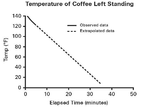
The extrapolation fails to take into account a physical limit: The coffee can’t get cooler than room temperature. It also fails to take into account that the rate at which the coffee cools slows down the closer it gets to room temperature. The rest of the cooling function looks like this:
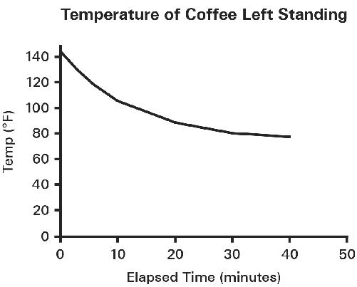
Note that the steepness of the curve in the first ten minutes doesn’t continue—it flattens out. This underscores the importance of two things when you’re extrapolating: having a large number of observations that span a wide range, and having some knowledge of the underlying process.