Read A Field Guide to Lies: Critical Thinking in the Information Age Online
Authors: Daniel J. Levitin
A Field Guide to Lies: Critical Thinking in the Information Age (7 page)

Although unscrupulous graph makers can monkey with the scaling of the right-hand axis to make the graph appear to show anything they want, this kind of double-y-axis graph isn’t scandalous because the two y-axes are representing different things, quantities that
couldn’t
share an axis. This was not the case with the Planned Parenthood graph
here
, which was reporting the same quantity on the two different axes, the number of performed procedures. That graph was distorted by ensuring that the two axes, although they measure the same thing, were scaled differently in order to manipulate perception.
It would also be useful to see Peachy’s profits: Through manufacturing and distribution efficiencies, it may well be that they’re making more money on a lower sales volume. Just because someone quotes you a statistic or shows you a graph, it doesn’t mean it’s relevant to the point they’re trying to make. It’s the job of all of us to make sure we get the information that matters, and to ignore the information that doesn’t.
Let’s say that you work in the public-affairs office for a company that manufactures some kind of device—frabezoids. For the last several years, the public’s appetite for frabezoids has been high, and sales have increased. The company expanded by building new facilities, hiring new employees, and giving everyone a raise. Your boss comes into your cubicle with a somber-looking expression and explains that the newest sales results are in, and frabezoid sales have dropped 12 percent from the previous quarter. Your company’s president is about to hold a big press conference to talk about the future of the company. As is his custom, he’ll display a large graph on the stage behind him showing how frabezoids are doing. If word gets out about the lower sales figures, the public may think that frabezoids are no longer desirable things to have, which could then lead to an even further decline in sales.
What do you do? If you graph the sales figures honestly for the past four years, your graph would look like this:
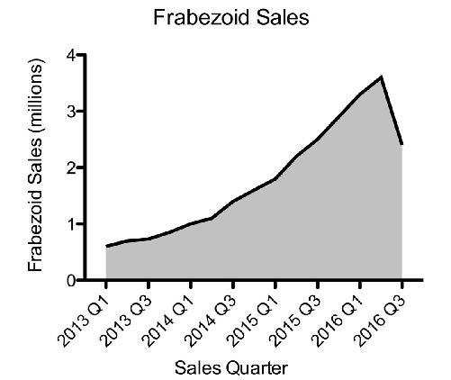
That downward trend in the curve is the problem. If only there were a way to make that curve go up.
Well, there is! The cumulative sales graph. Instead of graphing sales per quarter, graph the cumulative sales per quarter—that is, the total sales to date.
As long as you sold only one frabezoid, your cumulative graph will increase, like this one here:
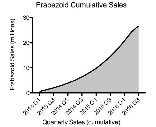
If you look carefully, you can still see a vestige of the poor sales for last quarter: Although the line is still going up for the most recent quarter, it’s going up less steeply. That’s your clue that sales have dropped. But our brains aren’t very good at detecting rates of change such as these (what’s called the first derivative in calculus, a fancy name for the slope of the line). So on casual examination, it seems the company continues to do fabulously well, and you’ve made a whole lot of consumers believe that frabezoids are still the hottest thing to have.
This is exactly what Tim Cook, CEO of Apple, did recently in a
presentation on iPhone sales.
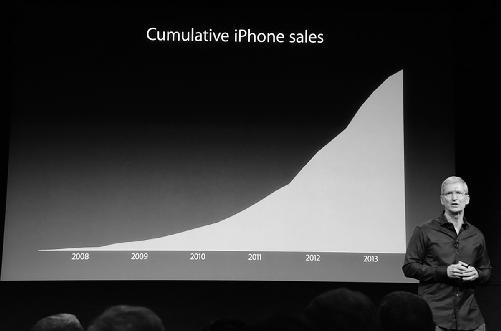
© 2013 The Verge, Vox Media Inc. (live.theverge.com/apple-iphone-5s-liveblog/)
Plotting Things That Are Unrelated
There are so many things going on in the world that some coincidences are bound to happen. The number of green trucks on the road may be increasing at the same time as your salary; when you were a kid, the number of shows on television may have increased with your height. But that doesn’t mean that one is causing the other. When two things are related, whether or not one causes the other, statisticians call it a correlation.
The famous adage is that “correlation does not imply causation.” In formal logic there are two formulations of this rule:
1)
Post hoc, ergo propter hoc
(after this, therefore because of this). This is a logical fallacy that arises from thinking that just because
one thing (Y) occurs after another (X), that X
caused
Y. People typically brush their teeth before going off to work in the morning. But brushing their teeth doesn’t
cause
them to go to work. In this case, it is even possibly the reverse.
2)
Cum hoc, ergo propter hoc
(with this, therefore because of this). This is a logical fallacy that arises from thinking that just because two things co-occur, one must have caused the other. To drive home the point, Harvard Law student Tyler Vigen has written a book and a website that
feature spurious co-occurrences—correlations—such as this one:
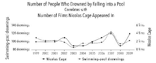
There are four ways to interpret this: (1) drownings cause the release of new Nicolas Cage films; (2) the release of Nicolas Cage films causes drownings; (3) a third (as yet unidentified) factor causes both; or (4) they are simply unrelated and the correlation is a coincidence. If we don’t separate correlation from causation, we can claim that Vigen’s graph “proves” that Nic Cage was helping to prevent pool drownings, and furthermore, our best bet is to encourage
him to make fewer movies so that he can ply his lifesaving skills as he apparently did so effectively in 2003 and 2008.
In some cases, there is no actual connection between items that are correlated—their correlation is simply coincidence. In other cases, one can find a causal link between correlated items, or at least spin a reasonable story that can spur the acquisition of new data.
We can rule out explanation one, because it takes time to produce and release a movie, so a spike in drownings cannot cause a spike in Nic Cage movies in the same year. What about number two? Perhaps people become so wrapped up in the drama of Cage’s films that they lose focus and drown as a consequence. It may be that the same cinematic absorption also increases rates of automobile accidents and injuries from heavy machinery. We don’t know until we analyze more data, because those are not reported here.
What about a third factor that caused both? We might guess that economic trends are driving both: A better economy leads to more investment in leisure activities—more films being made, more people going on vacation and swimming. If this is true, then neither of the two things depicted on the graph—Nic Cage films and drownings—caused the other. Instead, a third factor, the economy, led to changes in both. Statisticians call this the
third factor x
explanation of correlations, and there are many cases of these.
More likely, these two are simply unrelated. If we look long enough, and hard enough, we’re sure to find that two unrelated things vary with each other.
Ice-cream sales increase as the number of people who wear short pants increases. Neither causes the other; the third factor
x
that causes both is the warmer temperatures of summer. The number of television shows aired in a year while you were a child may have
correlated with increases in your height, but what was no doubt driving both was the passage of time during an era when (a) TV was expanding its market and (b) you were growing.
How do you know when a correlation indicates causation? One way is to conduct a controlled experiment. Another is to apply logic. But be careful—it’s easy to get bogged down in semantics. Did the rain outside
cause
people to wear raincoats or was it their desire to avoid getting wet, a consequence of the rain, that caused it?
This idea was cleverly rendered by
Randall Munroe in his Internet cartoon
xkcd
. Two stick figures, apparently college students, are talking. One says that he used to think correlation implied causation. Then he took a statistics class, and now he doesn’t think that anymore. The other student says, “Sounds like the class helped.” The first student replies, “Well, maybe.”
Deceptive Illustrations
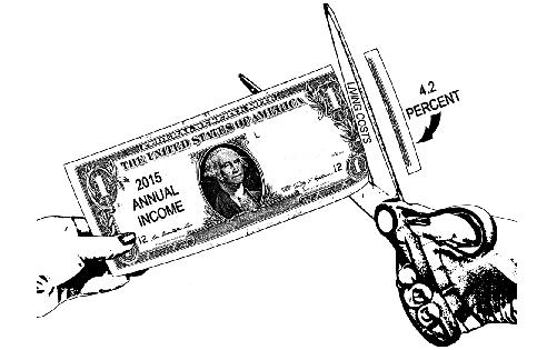
Infographics are often used by lying weasels to shape public opinion, and they rely on the fact that most people won’t study what they’ve done too carefully. Consider this graphic that might be used to scare you into thinking that runaway inflation is eating up your hard-earned money:
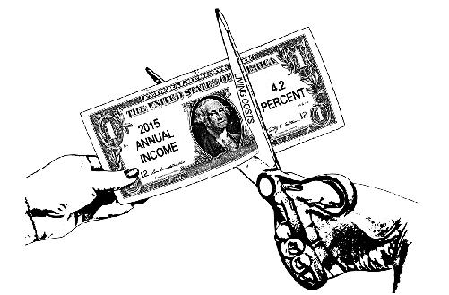
That’s a frightening image. But look closely. The scissors are cutting the bill not at 4.2 percent of its size, but at about 42 percent. When your
visual system is pitted against your logical system, the visual system usually wins, unless you work extra diligently to overcome this visual bias. The accurate infographic would look like this but would have much less emotional impact: