Read A Field Guide to Lies: Critical Thinking in the Information Age Online
Authors: Daniel J. Levitin
A Field Guide to Lies: Critical Thinking in the Information Age (5 page)

Truncated Vertical Axis
A well-designed graph clearly shows you the relevant end points of a continuum. This is especially important if you’re documenting some actual or projected change in a quantity, and you want your readers to draw the right conclusions. If you’re representing crime
rate, deaths, births, income, or any quantity that could take on a value of zero, then zero should be the minimum point on your graph. But if your aim is to create panic or outrage, start your y-axis somewhere near the lowest value you’re plotting—this will emphasize the difference you’re trying to highlight, because the eye is drawn to the size of the difference as shown on the graph, and the actual size of the difference is obscured.
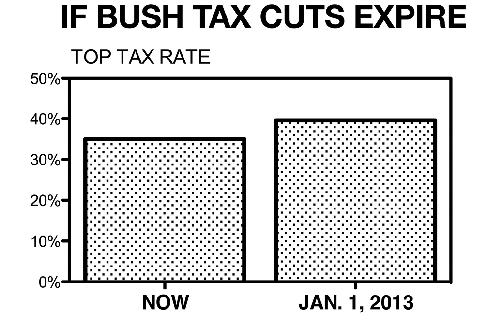
In 2012,
Fox News broadcast the following graph to show what would happen if the Bush tax cuts were allowed to expire:

The graph gives the visual impression that taxes would increase by a large amount: The right-hand bar is six times the height of the left-hand bar. Who wants their taxes to go up by a factor of six? Viewers who are number-phobic, or in a hurry, may not take the time to examine the axis to see that the actual difference is between a tax rate of 35 percent and one of 39.6 percent. That is, if the cuts expire, taxes will only increase 13 percent, not the 600 percent that is pictured (the 4.6 percentage point increase is 13 percent of 35 percent).
If the y-axis started at zero, the 13 percent would be apparent visually:
Discontinuity in Vertical or Horizontal Axis
Imagine a city where crime has been growing at a rate of 5 percent per year for the last ten years. You might graph it this way:
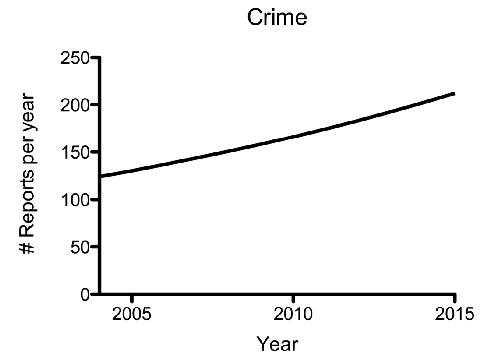
Nothing wrong with that. But suppose that you’re selling home security systems and so you want to scare people into buying your product. Using all the same data, just create a discontinuity in your x-axis. This will distort the truth and deceive the eye marvelously:
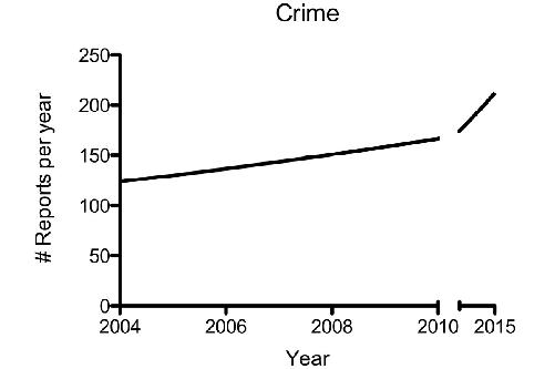
Here, the visual gives the impression that crime has increased dramatically. But you know better. The discontinuity in the x-axis crams five years’ worth of numbers into the same amount of graphic real estate as was used for two years. No wonder there’s an apparent increase. This is a fundamental flaw in graph making, but because most readers don’t bother to look at the axes too closely, this one’s easy to get away with.
And you don’t have to limit your creativity to breaking the x-axis; you can get the effect by creating a discontinuity in the y-axis, and then hiding it by not breaking the line. While we’re at it, we’ll truncate the y-axis:
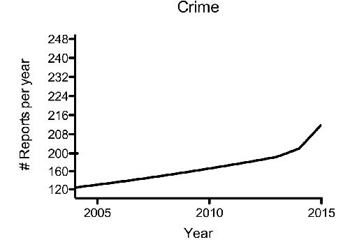
This is a bit mean. Most readers just look at that curve within the plot frame and won’t notice that the tick marks on the vertical axis start out being forty reports between each, and then suddenly, at two hundred, indicate only eight reports between each. Are we having fun yet?
The honorable move is to use the first crime graph presented with the proper continuous axis. Now, to critically evaluate the statistics, you might ask if there are factors in the way the data were collected or presented that could be hiding an underlying truth.
One possibility is that the increases occur in only one particularly bad neighborhood and that, in fact, crime is
decreasing
everywhere else in the city. Maybe the police and the community have simply decided that a particular neighborhood had become unmanageable and so they stopped enforcing laws there. The city as a whole is safe—perhaps even safer than before—and one bad neighborhood is responsible for the increase.
Another possibility is that by amalgamating all the different
sorts of complaints into the catchall bin of
crime
, we are overlooking a serious consideration. Perhaps
violent crime
has dropped to almost zero, and in its place, with so much time on their hands, the police are issuing hundreds more jaywalking tickets.
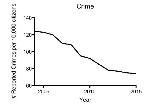
Perhaps the most obvious question to ask next, in your effort to understand what this statistic really means, is “What happened to the
total
population
in this city during that time period?” If the population increased at any rate greater than 5 percent per year, the crime rate has actually gone down on a per-person basis. We could show this by plotting crimes committed per ten thousand people in the city:
Choosing the Proper Scale and Axis
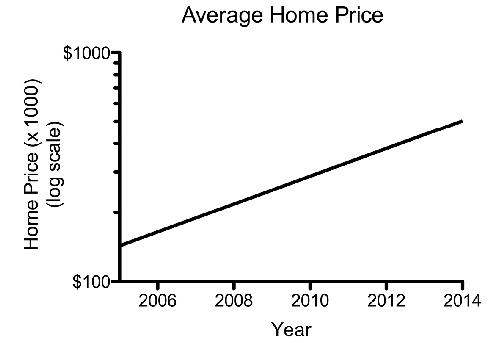
You’ve been hired by your local Realtor to graph the change in home prices in your community over the last decade. The prices have been steadily growing at a rate of 15 percent per year.

If you want to really alarm people, why not change the x-axis to include dates that you don’t have data for? Adding extra dates to the x-axis artificially like this will increase the slope of the curve by compressing the viewable portion like this:
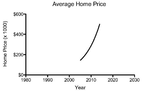
Notice how this graph tricks your eye (well, your brain) into drawing two false conclusions—first, that sometime around 1990 home prices must have been very low, and second, that by 2030 home prices will be so high that few people will be able to afford a home. Better buy one now!
Both of these graphs distort what’s really going on, because they make a steady rate of growth appear, visually, to be an increasing rate of growth. On the first graph, the 15 percent growth seems twice as high on the y-axis in 2014 as it does in 2006.
Many things change at a constant rate: salaries, prices, inflation, population of a species, and victims of diseases. When you have a situation of steady growth (or decline), the most accurate way to represent the data is on a logarithmic scale. The logarithmic scale allows equal percentage changes to be represented by equal distances on the y-axis. A constant annual rate of change then shows up as a straight line, as this: