Read A Field Guide to Lies: Critical Thinking in the Information Age Online
Authors: Daniel J. Levitin
A Field Guide to Lies: Critical Thinking in the Information Age (9 page)

Precision Versus Accuracy
When faced with the precision of numbers, we tend to believe that they are also
accurate,
but this is not the same thing. If I say “a lot
of people are buying electric cars these days,” you assume that I’m making a guess. If I say that “16.39 percent of new car sales are electric vehicles,” you assume that I know what I’m talking about. But you’d be confusing precision for accuracy. I may have made it up. I may have sampled only a small number of people near an electric-car dealership.
Recall the
Time
magazine headline I mentioned earlier, which said that more people have cell phones than have toilets. This isn’t implausible, but it is a distortion because that’s
not
what the U.N. study found at all. The U.N. reported that more people had
access
to cell phones than to toilets, which is, as we know, a different thing. One cell phone might be shared among dozens of people. The lack of sanitation is still distressing, but the headline makes it sound like if you were to count, you’d find there are more cell phones in the world than there are toilets, and that is not supported by the data.
Access
is one of those words that should raise red flags when you encounter them in statistics. People having access to health care might simply mean they live near a medical facility, not that the facility would admit them or that they could pay for it. As you learned above,
C-SPAN is available in 100 million homes, but that doesn’t mean that 100 million people are watching it. I could claim that 90 percent of the world’s population has “access” to
A Field Guide to Lies
by showing that
90 percent of the population is within twenty-five miles of an Internet connection, rail line, road, landing strip, port, or dogsled route.
Comparing Apples and Oranges
One way to lie with statistics is to compare things—datasets, populations, types of products—that are different from one another, and
pretend that they’re not. As the old idiom says, you can’t compare apples with oranges.
Using dubious methods, you could claim that it is safer to be in the military during an active conflict (such as the present war in Afghanistan) than to be stateside in the comfort of your own home. Start with the
3,482 active-duty U.S. military personnel who died in 2010. Out of a
total of 1,431,000 people in the military, this gives a rate of 2.4 deaths per 1,000. Across the United States, the
death rate in 2010 was 8.2 deaths per 1,000. In other words, it is more than three times safer to be in the military, in a war zone, than to live in the United States.
What’s going on here? The two samples are not similar, and so shouldn’t be compared directly. Active military personnel tend to be young and in good health; they are served a nutritious diet and have good health care. The
general population of the United States includes the elderly, people who are sick, gang members, crackheads, motorcycle daredevils, players of mumblety-peg, and many people who have neither a nutritious diet nor good health care; their mortality rate would be high wherever they are. And active military personnel are not all stationed in a war zone—some are stationed in very safe bases in the United States, are sitting behind desks in the Pentagon, or are stationed in recruiting stations in suburban strip malls.
U.S. News & World Report
published an article comparing the proportion of Democrats and Republicans in the country going back to the 1930s. The problem is that sampling methods have changed over the years. In the 1930s and ’40s, sampling was typically done by in-person interviews and mail lists generated by telephone directories; by the 1970s sampling was predominantly just by telephone. Sampling in the early part of the twentieth century skewed toward those who tended to have landlines: wealthier people, who, at least at that time,
tended to vote Republican. By the 2000s, cell phones were being sampled, which skewed toward the young, who tended to vote Democratic. We can’t really know if the proportion of Democrats to Republicans has changed since the 1930s because the samples are incompatible. We think we’re studying one thing but we’re studying another.
A similar problem occurs when reporting a decline in the death rate due to motorcycle accidents now versus three decades ago. The more recent figures might include more three-wheel motorcycles compared to predominantly two-wheeled ones last century; it might compare an era when helmets were not required by law to now, where they are in most states.
Be on the lookout for changing samples before drawing conclusions!
U.S. News & World Report
(yes, them again) wrote of an
increase in the number of doctors over a twelve-year period, accompanied by a significant drop in average salary. What is the takeaway message? You might conclude that now is not a good time to enter the medical profession because there is a glut of doctors, and that supply exceeding demand has lowered every doctor’s salary. This might be true, but there is no evidence in the claim to support this.
An equally plausible argument is that over the twelve-year period, increased specialization and technology growth created more opportunities for doctors and so there were more available positions, accounting for the increase in the total number of doctors. What about the salary decline? Perhaps many older doctors retired, and were replaced by younger ones, who earn a smaller salary just out of medical school. There is no evidence presented either way. An important part of statistical literacy is recognizing that some statistics, as presented, simply cannot be interpreted.
Sometimes, this apples-and-oranges comparison results from
inconsistent subsamples—ignoring a detail that you didn’t realize was important. For example, when sampling corn from a field that received a new fertilizer, you might not notice that some ears of corn get more sun and some get more water. Or when studying how traffic patterns affect street repaving, you might not realize that certain streets have more water runoff than others, influencing the need for asphalt repairs.
Amalgamating is putting things that are different (heterogeneous) into the same bin or category—a form of apples and oranges. If you’re looking at the number of defective sprockets produced by a factory, you might combine two completely different kinds in order to make the numbers come out more favorably for your particular interests.
Take an example from public policy. You might want to survey the sexual behavior of preteens and teens. How you amalgamate (or bin) the data can have a large effect on how people perceive your data. If your agenda is to raise money for educational and counseling centers, what better way to do so than to release a statistic such as “70 percent of schoolchildren ages ten to eighteen are sexually active.” We’re not surprised that seventeen- and eighteen-year-olds are, but ten-year-olds! That will surely cause grandparents to reach for the smelling salts and start writing checks. But obviously, a single category of ten-year-olds to eighteen-year-olds lumps together individuals who are likely to be sexually active with those who are not. More helpful would be separate bins that put together individuals of similar age and likely similar experiences: ten to eleven, twelve to thirteen, fourteen to fifteen, sixteen to eighteen, for example.
But that’s not the only problem. What do they mean by “sexually active”? What question was actually asked of the schoolchildren? Or were the schoolchildren even asked? Perhaps it was their parents who were asked. All kinds of biases can enter into such a number. “Sexually active” is open to interpretation. Responses will vary widely depending on how it is defined. And of course respondants may not tell the truth (reporting bias).
As another example, you might want to talk about unemployment as a general problem, but this risks combining people of very different backgrounds and contributing factors. Some are disabled and can’t work; some are fired with good cause because they were caught stealing or drunk on the job; some want to work but lack the training; some are in jail; some no longer want to work because they’ve gone back to school, joined a monastery, or are living off family money. When statistics are used to influence public policy, or to raise donations for a cause, or to make headlines, often the nuances are left out. And they can make all the difference.
These
nuances often tell a story themselves about patterns in the data. People don’t become unemployed for the same reasons. The likelihood that an alcoholic or a thief will become unemployed may be four times that of someone who is not. These patterns carry information that is lost in amalgamation. Allowing these factors to become part of the data can help you to see who is unemployed and why—it could lead to better training programs for people who need it, or more Alcoholics Anonymous centers in a town that is underserved by them.
If the people and agencies who track behavior use different definitions for things, or different procedures for measuring them, the data that go into the statistic can be very dissimilar, or heterogeneous. If you’re trying to pin down the number of couples who live together but are not married, you might rely on data that have already been
collected by various county and state agencies. But varying definitions can yield a categorization problem: What constitutes living together? Is it determined by how many nights a week they are together? By where their possessions are, where they get mail? Some jurisdictions recognize same-sex couples and some don’t. If you take the data from different places using different schemes, the final statistic carries very little meaning. If the recording, collection, and measurement practices vary widely across collection points, the statistic that results may not mean what you think it means.
A recent report found that the youth unemployment rate in Spain was an astonishing 60 percent. The report amalgamated into the same category people who normally would appear in separate categories: Students who were not seeking work were counted as unemployed, alongside workers who had just been laid off and workers who were seeking jobs.
In the United States,
there are
six
different indexes (numbered U1 through U6) to track unemployment (as measured by the Bureau of Labor Statistics), and they reflect different interpretations of what “unemployed” actually means. It can include people looking for a job, people who are in school but not looking, people who are seeking full-time assignments in a company where they work only part-time, and so on.
USA Today
reported in
July 2015 that the unemployment rate dropped to 5.3 percent, “its lowest level since April 2008.” More comprehensive sources, including the AP,
Forbes
, and the
New York Times
,
reported the reason for the apparent drop: Many people who were out of work gave up looking and so technically had left the workforce.
Amalgamating isn’t always wrong. You might choose to combine the test scores of boys and girls in a school, especially if there is no evidence that their scores differ—in fact, it’s a good idea to, in order
to increase your sample size (which provides you with a more stable estimate of what you’re studying). Overly broad definitions of a category (as with the sexual-activity survey mentioned earlier) or inconsistent definitions (as with the couples-living-together statistic) present problems for interpretation. When performed properly, amalgamating helps us come up with a valid analysis of data.
Suppose that you work for the state of Utah and a large national manufacturer of baby clothes is thinking about moving to your state. You’re thinking that if you can show that Utah has a lot of births, you’re in a better position to attract the company, so you go to the Census.gov website, and graph the results for number of births by state:
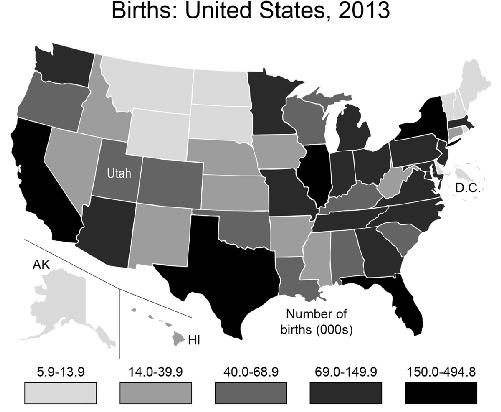
Utah looks better than Alaska, D.C., Montana, Wyoming, the Dakotas, and the small states of the Northeast. But it is hardly a booming baby state compared to California, Texas, Florida, and New York. But wait, this map you’ve made shows the
raw
number
of births and so will be weighted heavily toward states with larger populations. Instead, you could graph the birth
rate
per thousand people in the population:
