Building Web Sites All-in-One For Dummies® (79 page)
Read Building Web Sites All-in-One For Dummies® Online
Authors: Claudia Snell

2.
Switch to Design view and position your cursor where you want the form to begin.
3.
Choose Insert
â
Form
â
Form.
Dreamweaver designates the form area with a dotted, red line.
4.
In the Property inspector, enter the action that will take place when users submit the form.
The action can be another Web page with a script or a script at a Web server. In the case of this form, the action executes a mail-forwarding script on a Web server.
Book III, Chapter 5 has more detailed information on using the Property inspector.
5.
In the Action field of the Property inspector, specify the method by which the form data will be submitted.
You have three options:
â¢
Default:
Uses the browser's default method of submitting form data â which is usually
GET
â¢
GET:
Appends the information to a URL
â¢
POST:
Sends the data as a body of data
6.
Choose the target from the Target drop-down menu (if applicable).
This option is applicable only if the action calls another Web page that will display in the browser. The
target
is the window in which the page will be displayed. By default, the page will open in the same window. Your choices are
â¢
_blank:
Displays the document in a new and unnamed browser window.
â¢
_parent:
Displays the document in the parent window currently displaying the form.
â¢
_self:
Displays the document in the same window as the one in which the form is submitted.
â¢
_top:
Displays the document in the body of the current window. This option ensures the document that is called by the form action displays in the full browser window, even if the form were originally displayed in a frame.
7.
If applicable, specify the MIME encoding type of the data from the Enctype drop-down menu.
The default encoding type of Application/x-www-form-urlencoded is generally used with the
POST
method. If you're creating a file-upload field, choose the Multipart/form-www encoding type.
8.
Insert the desired form object. For the purpose of this demonstration, choose Insert
â
Form
â
Text Field to begin creating a text field.
 A
A
text field
is the same thing as a
text box
â where users type information.
9.
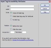
In the Input Tag Accessibility Attributes dialog box that appears, enter the desired information.
See Figure 1-5. This information is designed to aid disabled people who visit the Web site.
Figure 1-5:
Enter the attributes, please.

Even if your client's site won't have disabled visitors, the dialog box still has one useful attribute: namely, Label. For more information on usability and accessibility, see Book II, Chapter 2.
10.
In the Label text box, type the desired label for the text field you're creating; then click OK.
This is the label â the text field name, to the left of the field â that visitors see. If you're creating a text field that asks for an account number, your label would probably be something like
Account Number
. Go figure.
11.
In the workspace, select the text input field you just created and fill in the parameters in the Property inspector. (See Figure 1-6.)
Figure 1-6:
Every form element has properties.

12.
In the Property inspector, type a name in the name text field.
The default name for a form object is its actual name, which is appended by a number if there is more than one in a document. In this case, you're renaming a text field, which has a default name of textfield. Each form element must have a unique name. Names cannot contain spaces. Choose a logical name that reflects the type of information users will enter in the field. For example, if the text field requires the user to enter his first name, a logical name for the text field is
firstName
or
first_name
.
13.
Enter the other parameters for the text field you're creating.
â¢
Type:
Sets the type of text field that will be displayed on the Web page. Choose Single Line to display the text field as a single line in the document, or choose Multi Line to display a text box in which users can type more than one line of text. Or, you can choose Password, which displays each character as an asterisk or a bullet (filled-in circle) to preserve the anonymity of the user's password. (Read how to set this in the upcoming section, “Password fields.”)
â¢
Char Width:
Sets the maximum number of characters that can be displayed in the field. This number can be less than Max Chars, which specifies the maximum number of characters that can be entered in the field. The default value is
20
.
â¢
Max Chars:
Specifies the maximum number of characters that can be entered in the field. You can use this parameter to limit the number of characters for a ZIP code field to five. In some browsers, an alert sounds if a user enters more than the Max Chars value.
â¢
Num Lines:
Becomes available if you specify Multi Line as the Type. This value determines the height of the text box, in lines.
â¢
Init Val:
Displays an initial value in the text field when the form loads. This parameter is useful for displaying instructions to the user. The user then selects the text and types the desired information into the field.
â¢
Class:
Lets you stylize the text entered in the text field by using a style from the document or an attached CSS.
â¢
Disabled:
The text field cannot be filled in. Use this option when a field is Read Only.
â¢
Read Only:
The information in the Init Value parameter is displayed. The field cannot be filled in, but the text can be selected. If you use this option and don't want the text to be selectable, enable the Disabled option as well.
14.
Add other form fields as needed.
 If you have a complex form with multiple fields, create a table and then add each element to the desired cell. This creates a good-looking form that's easy to use.
15.
For the purpose of this demonstration, choose Insert
â
Form
â
Button to begin creating a button.
The Input Tag Accessibility Attributes dialog box, which you use in Step 9 of this list, appears again.
16.
Enter the desired information in the Input Tag Accessibility Attributes dialog box and then click OK.
Dreamweaver adds the button to the document.
17.
In the Property inspector, click the Submit Form radio button to select an Action.
While you're in the Property inspector, you can modify other attributes of the button. (See Figure 1-7.) For example, you can change the text displayed on the button by entering new text in the Value field. You can also apply a style to the button by choosing an option from the Class drop-down menu. The items on the Class menu are from styles defined within the document or within an attached style sheet.
Figure 1-7:
Setting properties for a Submit button.

18.
Accept the default name for the button (Submit). Or, in the Property inspector, enter a different name.
Select the default name in the Value field, and type the desired name.
19.
Repeat Step 16, only this time use the Property inspector to define a Reset button. In the Action area, select the Reset Form radio button.
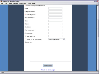
Figure 1-8 shows a form with several text fields and a Submit button, as displayed in the Firefox Web browser.
Figure 1-8:
Previewing the completed form.
