Building Web Sites All-in-One For Dummies® (46 page)
Read Building Web Sites All-in-One For Dummies® Online
Authors: Claudia Snell

2.
Select the type of adjustment you'd like to apply.
Several options control setting, such as brightness, color, and contrast. The best way to learn about them is to experiment. One that you will most likely find helpful is Hue/Saturation. You can change how the colors in your document look, or you can click Colorize and tint everything to the color you select.
You can constrain an adjustment layer to only one layer, the same way you constrain an image to the banner area. For example, choose the Hue/Saturation adjustment layer. Make sure the Preview check box is selected. Click and drag the saturation slider. If you slide to the left, the colors in your image
desaturate
(become less intense). Sliding to the right makes them more intense. Experiment with the other sliders to see how they affect the image. For a different effect, select the Colorize check box.
To use a blend mode, follow these steps:
1.
Select the layer you would like to affect.
2.
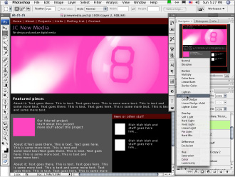
From the drop-down menu at the top of the Layers panel, choose a blend mode.
This is another feature that's easiest to understand after you experiment a little. Basically, it affects how the chosen layer interacts with the layers below it. You can further augment the effect by changing the transparency of the layer
(opacity).
3.
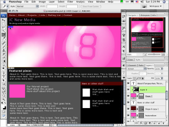
For an interesting experiment, apply different transfer modes to different layers, modify the transparencies, and then reorder the layers.
The effects are different, depending on the images and transfer modes you select and any other adjustments you make. Have fun. If anything looks bad, you can step backwards in the History panel or just change the layer order for a different effect. Figure 7-8 shows the use of transfer modes to create effects.
Figure 7-8:
Use transfer modes to change the effects of layers on each other.

Slicing a Photoshop Document
After you create a Web page design in Photoshop, you're ready to turn it into an actual Web page. That involves creating graphics for the page and the HTML/CSS so that visitors can view your pages online. The process of creating graphics is
slicing, optimizing, and exporting.
When you slice a Photoshop document, you're telling Photoshop where to create areas that will become a series of graphics and HTML files.
 It is necessary to create slices only in areas that need to be graphics on the finished page. Content areas that will be filled with text shouldn't be graphics, so you don't need to create slices for them. Large areas of continuous color also don't need to be sliced because you can tell the browser to display colors via code. Use code as much as possible to generate your design because it's faster to download and also easier for more people to use.
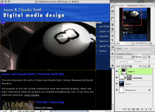
Figure 7-9 shows you which areas of a document should be sliced and which will be generated with code.
1.
Open the Photoshop document you created while designing your page.
Figure 7-9:
Slice only those areas that need to be graphics. Text and large areas of solid color are taken care of in the HTML.

2.
Click the Slice tool â it's the one in the Tools panel that looks like a little knife.
Notice the second option under the Slice tool, called the Slice Select tool. That will be important after you create a few slices. For now, select the Slice tool. (See Figure 7-10.)
Figure 7-10:
The Slice tool looks like a little knife.

3.
Create your slices by clicking and dragging with the Slice tool over an area that needs to be a graphic. Repeat the click and drag over each area.
Be careful to get the slices as accurate as possible. If you're off, it can create undesirable results, like weird lines of color in your finished page that shouldn't be there. You can adjust your slices as necessary. If you are unsure about the accuracy, zoom in to get a better look.
4.
If necessary, click the Slice Select tool, click the slice, and then move or edit the slice.
As you create your slices, you see numbered boxes appear over your document; these represent the borders of the graphics you're creating. Make sure the lines of those boxes are aligned with the edges of your graphics areas. Figure 7-11 shows you what a sliced document looks like.
Figure 7-11:
A sliced Photoshop document.

Extra, slice tool tricks
The Slice and Slice Select tools have additional tools to help you work with your graphics. As we recommend with all the tools in Photoshop, experiment with the options to see what works best for you. The basics in the following list are simple, but you can explore many options after you get more comfortable:
With the Slice Select tool active, double-click the small box next to the slice number (the one that looks like a rectangle with a jagged line in it). A dialog box opens that allows you to make some settings on the slice, such as a URL for a link, a target window, ALT text, and a message.
In the context-sensitive menu bar, you'll also find a button that allows you to subdivide a slice. Click the button to see the dialog box with options for number of slices, orientation, and sizes.
The Slice tool has options in its context-sensitive menu bar that allow you to specify a size or aspect ratio for your images.
Optimizing Graphics for the Web
After you have a Web page designed in Photoshop and you slice the document, the next step is to prepare your graphics for export, which is also called
optimizing and exporting
your graphics. This is the process that actually creates the graphics for your Web page. The Photoshop document will stay intact and will be ready for you to use if you need to make changes to the graphics or design. Keep the Photoshop document with the rest of your production files in the Production Files folder of your Web site. See Chapter 3 of Book II about Web site structure and how to organize your files.
To optimize and export your graphics, follow these steps:
1.
Choose File
â
Save for Web & Devices.
Notice that your slices still have the lines and numbers but now look like semi-opaque white boxes over your document. Don't worry; the finished graphics don't have that appearance. Selected slices become transparent, so you can see what the graphics will really look like.
The Save for Web & Devices dialog box launches. Tabs along the upper left allow you to choose among different ways of working in this window.
â¢
Original:
Shows you the original document.
â¢
Optimized:
Shows you the optimized version.
â¢
2-Up:
Shows you the original document in the left window and the optimized version in the right.
â¢
4-Up:
Shows you the original document and three versions with different optimization settings, which is useful if you need to compare several possibilities.
2.
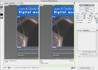
For these steps, select 2-Up (shown in Figure 7-12) because it lets you see what you're doing to your image while you compress it, but doesn't overwhelm you with too many things to look at.
Figure 7-12:
The Save for Web & Devices dialog box in 2-Up mode.

You can select each slice individually or select groups of them for optimization.
3.
Click the Slice Select tool.
It's located in the left margin of the Save for Web & Devices dialog box.
4.
Click a slice to select it; shift-click to select multiple slices.
Slices become transparent when they're selected.
5.
After you select a slice or slices, make your settings for file format and compression amounts.
See the upper-right area of the Save for Web & Devices dialog box, as shown in Figure 7-13. JPEGs have presets for low, medium, and high quality. A slider gives you more control. In general, the higher the number, the less the image is compressed, the better it will look, and the larger the file size will be. The file size and approximate download time are displayed at the lower left of the Optimized preview window. You want to adjust the optimization settings until you get the lowest file size while still keeping the best quality in your image. Although there are general guidelines to get you started, optimizing properly will take some experimentation because each graphic will have its own unique needs.