Read A Field Guide to Lies: Critical Thinking in the Information Age Online
Authors: Daniel J. Levitin
A Field Guide to Lies: Critical Thinking in the Information Age (4 page)

Now that you’re an expert on averages, you shouldn’t fall for the famous misunderstanding that people tended not to live as long a hundred years ago as they do today. You’ve probably read that life expectancy has steadily increased in modern times. For those born in 1850,
the average life expectancy for males and females was thirty-eight and forty years respectively, and for those born in 1990 it is seventy-two and seventy-nine. There’s a tendency to think, then, that in the 1800s there just weren’t that many fifty- and sixty-year-olds walking around because people didn’t live that long. But in fact, people did live that long—it’s just that infant and childhood mortality was so high that it skewed the average. If you could make it past twenty, you could live a long life back then. Indeed, in 1850 a fifty-year-old white female could expect to live to be 73.5, and a sixty-year-old could expect to live to be seventy-seven. Life expectancy has certainly increased for fifty- and sixty-year-olds today, by about ten years compared to 1850, largely due to better health care.
But as with the examples above of a room full of people with wildly different incomes, the changing averages for life expectancy at birth over the last 175 years reflect significant differences in the two samples: There were many more infant deaths back then pulling down the average.
Here is a brain-twister: The average child usually doesn’t come from
the average family. Why? Because of shifting baselines. (I’m using “average” in this discussion instead of “mean” out of respect for a wonderful paper on this topic by James Jenkins and Terrell Tuten, who used it in their title.)
Now, suppose you read that the average number of children per family in a suburban community is three. You might conclude then that the average child must have two siblings. But this would be wrong. This same logical problem applies if we ask whether the average college student attends the average-sized college, if the average employee earns the average salary, or if the average tree comes from the average forest. What?
All these cases involve a shift of the baseline, or sample group we’re studying. When we calculate the average number of children per family, we’re sampling families. A very large family and a small family each count as one family, of course. When we calculate the average (mean) number of siblings, we’re sampling children. Each child in the large family gets counted once, so that the number of siblings each of them has weighs heavily on the average for sibling number. In other words, a family with ten children counts only one time in the average
family
statistic, but counts ten times in
the average
number of siblings
statistic.
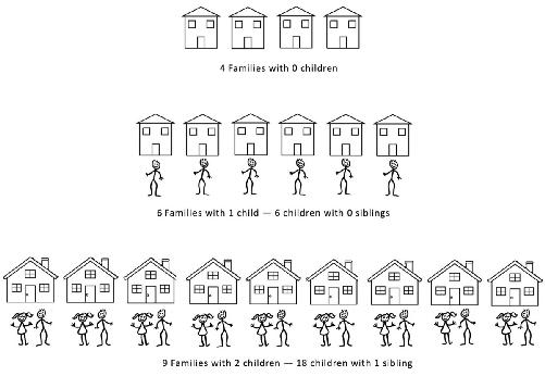
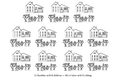
Suppose in one neighborhood of this hypothetical community
there are thirty families. Four families have no children, six families have one child, nine families have two children, and eleven families have six children. The average number of children per family is three, because ninety (the total number of children) gets divided by thirty (the total number of families).
But let’s look at the average number of siblings. The mistake people make is thinking that if the average family has three children, then each child must have two siblings on average. But in the one-child families, each of the six children has zero siblings. In the two-child families, each of the eighteen children has one sibling. In the six-child families each of the sixty-six children has five siblings. Among the 90 children, there are 348 siblings. So although the average
child
comes from a family with three children, there are 348 siblings divided among 90 children, or an average of nearly four siblings per child.
| | Families | # Children/ | Total # | Siblings |
| | 4 | 0 | 0 | 0 |
| | 6 | 1 | 6 | 0 |
| | 9 | 2 | 18 | 18 |
| | 11 | 6 | 66 | 330 |
| Totals | 30 | | 90 | 348 |
| Average children per family: 3.0 Average siblings per child: 3.9 |
Consider now college size. There are many very large colleges in the United States (such as Ohio State and Arizona State) with student enrollment of more than 50,000. There are also many small colleges, with student enrollment under 3,000 (such as Kenyon College and Williams College). If we count up
schools
, we might find that the average-sized college has 10,000 students. But if we count up students, we’ll find that the average student goes to a college with greater than 30,000 students. This is because, when counting students, we’ll get many more data points from the large schools. Similarly, the average person doesn’t live in the average city, and the average golfer doesn’t shoot the average round (the total strokes over eighteen holes).
These examples involve a shift of baseline, or denominator. Consider another involving the kind of skewed distribution we looked at earlier with child mortality: The
average investor does not earn the average return. In one study, the average return on a $100 investment held for thirty years was $760, or 7 percent per year. But 9 percent of the investors lost money, and a whopping 69 percent failed to reach the average return. This is because the average was skewed by a few people who made much greater than the average—in the figure below, the
mean
is pulled to the right by those lucky investors who made a fortune.

Payoff outcomes for return on a $100 investment over thirty years. Note that most people make less than the mean return, and a lucky few make more than five times the mean return.
A
XIS
S
HENANIGANS
The human brain did not evolve to process large amounts of numerical data presented as text; instead, our eyes look for patterns in data that are visually displayed. The most accurate but least interpretable form of data presentation is to make a table, showing every single value. But it is difficult or impossible for most people to detect patterns and trends in such data, and so we rely on graphs and charts. Graphs come in two broad types: Either they represent every data point visually (as in a scatter plot) or they implement a form of data reduction in which we summarize the data, looking, for example, only at means or medians.
There are many ways that graphs can be used to manipulate, distort, and misrepresent data. The careful consumer of information will avoid being drawn in by them.
Unlabeled Axes
The most fundamental way to lie with a statistical graph is to not label the axes. If your axes aren’t labeled, you can draw or plot anything you want! Here is an example from a
poster presented at a conference by a student researcher, which looked like this (I’ve redrawn it here):
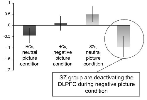
What does all that mean? From the text on the poster itself (though not on this graph), we know that the researchers are studying brain activations in patients with schizophrenia (SZ). What are HCs? We aren’t told, but from the context—they’re being compared with SZ—we might assume that it means “healthy controls.” Now, there do appear to be differences between the HCs and the SZs, but, hmmm . . . the y-axis has numbers, but . . . the units could be anything! What are we looking at? Scores on a test, levels of brain activations, number of brain regions activated? Number of Jell-O brand pudding cups they’ve eaten, or number of Johnny Depp movies they’ve seen in the last six weeks? (To be fair, the researchers subsequently published their findings in a peer-reviewed journal, and corrected this error after a website pointed out the oversight.)
In the next example,
gross sales of a publishing company are plotted, excluding data from Kickstarter campaigns.
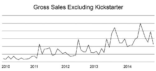
As in the previous example, but this time with the x-axis, we have numbers but we’re not told what they are. In this case, it’s probably self-evident: We assume that the 2010, 2011, etc., refer to calendar or fiscal years of operation, and the fact that the lines are jagged between the years suggests that the data are being tracked monthly (but without proper labeling we can only assume). The y-axis is completely missing, so we don’t know what is being measured (is it units sold or dollars?), and we don’t know what each horizontal line represents. The graph could be depicting an increase of sales from 50 cents a year to $5 a year, or from 50 million to 500 million units. Not to worry—a helpful narrative accompanied this graph: “It’s been another great year.” I guess we’ll have to take their word for it.