OS X Mountain Lion Pocket Guide (8 page)
Read OS X Mountain Lion Pocket Guide Online
Authors: Chris Seibold
Tags: #COMPUTERS / Operating Systems / Macintosh

As you probably know, the big area under the menu bar is
called the desktop. Open application windows float over the desktop and,
depending on how you have it configured, the desktop will also show you
all the attached and internal drives (iPods, flash drives, and so on),
any optical disks (CDs, DVDs), and any files you’ve stored here for easy
access. You can change your desktop’s background either by
Control-clicking or right-clicking the desktop and then choosing Change
Desktop Background, or by heading to the Desktop & Screen Saver
preference pane (see
Desktop & Screen Saver
).
To control how items are displayed on the desktop, choose
Show View Options from the Finder’s View menu, or press ⌘-J. The Desktop
window shown in
Figure 3-8
appears, which
lets you control the size of desktop icons (from 16×16 pixels all the
way to 128×128 pixels), how they’re spaced (by tweaking the invisible
grid that OS X uses when arranging desktop icons), and the size and
location of their labels.
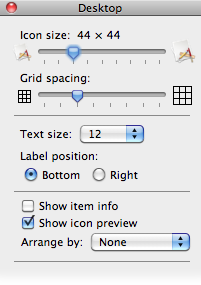
Figure 3-8. Customize how things appear on your desktop
If you check the “Show item info” box, you’ll see extra
information when looking at items on your desktop. Drives show the name
of the drive and the amount of free space left, folders list the name of
the folder and the number of items contained in them, and DVDs show the
amount of data stored on them. The extra information displayed for files
depends on their type; image files, for example, display their size in
pixels. The “Show icon preview” checkbox lets you toggle between generic
icons and icons that display the file’s contents. The “Sort by” menu
lets you choose how desktop icons are arranged. You can have them snap
to the (invisible) grid or be arranged according to some criteria (name,
date created, and so on).
To navigate around the desktop without using the mouse,
you can use the arrow keys. Another option is to start typing an item’s
name; the item will automatically get highlighted, and you can open it
by pressing ⌘-O; press the Return key instead to rename the item.
To control what kind of items appear on the desktop, you use the
Finder’s preferences (switch to the Finder and then choose Finder
→
Preferences or hit ⌘-,). Under the General tab,
you’ll find options to display (or hide) hard disks; external disks;
CDs, DVDs, and iPods; and connected servers.
Understanding the Finder is key to successfully getting
around in OS X. It lets you move files, copy files, and launch
applications, among other things. The most common way users interact
with the Finder is through a Finder window.
To bring the Finder to the front, click some empty space on the
desktop, click the Finder’s Dock icon, or hit ⌘-Tab until you select its
icon. Once the Finder is frontmost, hit ⌘-N to open a Finder window.
Figure 3-9
shows a typical one.
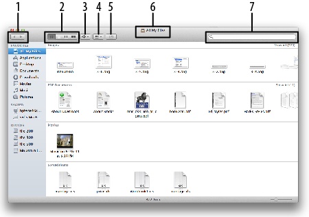
Figure 3-9. A standard Finder window
Your Finder window might not look exactly like the one in
Figure 3-9
. If, for example, you’ve
upgraded from an older version of OS X, you’ll likely have a Quick
View button not shown in
Figure 3-9
.
Don’t worry—the Finder’s toolbar is highly customizable, as explained
in the next section.
The Finder window includes several
components:
- 1. Back and Forward buttons
These buttons cycle through directories you’ve been using.
For example, say you start in your Home directory and then drill
down into your Documents folder. After you find the document you
were looking for, clicking the Back button returns you to your
Home directory.- 2. View controls
These buttons control how the Finder displays information.
You have four options: Icon View (the default), List View, Column
View, and Cover Flow View; see
Finder views
.- 3. Action menu
Clicking this button reveals a drop-down menu that
varies depending on the item that’s selected. Generally, it
contains the same options you’d get if you right-clicked or
Control-clicked that item.- 4. Arrange menu
This button lets you change the order in which the
items in a folder are displayed. It gives you nine different
sorting options (plus the option to not sort at all).- 5. Share Sheet
Clicking this button allows you to send the selected
file via email, Messages, Twitter, or Flickr.- 6. Proxy icon and title
This item is a graphical representation of your
current location (for example, the drawer icon in
Figure 3-9
shows that you’re in All My
Files). Right-click or Control-click it to bring up a list of
common destinations; select one to hop to that spot or drag a
folder onto the list to create a copy of it in that
location.- 7. Search box
Enter text in this box and hit Return to tell the Finder to
search for matching items. New in Mountain Lion, when you start
typing a search term, it displays a drop-down menu with
suggestions to help refine your search. The search is powered by
Spotlight, but unlike a Spotlight search, it won’t include Mail
messages or web pages in your results.
To remove items from the Finder’s toolbar, simply ⌘-drag
them off the toolbar. Doing this tidies things up, but it doesn’t give
you what most people want:
more
options. To add
things to the toolbar, either right-click or Control-click a blank
space in the toolbar and then select Customize Toolbar, or go to
View
→
Customize Toolbar. Either way,
the dialog box in
Figure 3-10
opens, showing
all the items you can add.
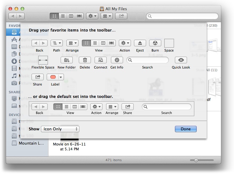
Figure 3-10. You can customize the Finder’s toolbar to match your
workflow
The Show menu at the bottom of
Figure 3-10
lets you
change
how
items in the Finder’s toolbar are
displayed. You get three options: Icon and Text, Icon Only (the
default), and Text Only.
Most of the items you can add are self-explanatory, but a few
are worthy of a closer look:
- Path
This button gives you a menu that shows the path
up from the current directory to the top level of your computer.
For example, suppose you have the Finder open to your Pictures
folder. Clicking this button will reveal the following
list:Pictures
[Your Home folder]
Users
[Your Boot Drive]
[Your Computer]
You can choose any item in the list to jump to that
directory.- Burn
Burn a lot of disks? This button can save you a
lot of time. Select an item (or folder) and then click this
button, and the Finder will tell you to insert a disk to burn
to.- Get Info
This brings up the Info window for the selected
item—very useful if you adjust permissions often.
The sidebar occupies the left-hand side of a Finder
window and is reminiscent of iTunes’s sidebar; it’s divided into three
sections:
- Favorites
This section lists the most common things you’ll
use: All My Files, AirDrop, Applications, Desktop, Documents,
Downloads, Movies, Music, and Pictures. Some of these items
point to actual folders (like Applications, for example), but
not all of them do. All My Files points to all the files you’ve
created; it’s a Smart folder (see
Smart Folders
) that contains files you’re most
likely to be interested in.NoteAirDrop, which made its debut in Lion, provides
a zero-configuration way of sharing files with other users
nearby. When you click the AirDrop icon, your computer starts
looking for nearby Macs. When it finds one, just drag the file
you want to send onto the icon for that user in the AirDrop
window. The recipient will get a notice that you want to
transfer the file, and once he grants the request, the file
will speedily move to his Mac. It’s a slick system that
doesn’t rely on your WiFi network connection (AirDrop uses the
WiFi built into your Mac instead), so you can share files with
someone nearby even when you’re not connected to a network.
Not all Macs that can run Mountain Lion can use AirDrop (it
depends on the WiFi chipset in your machine) so if you don’t
see the AirDrop icon in your sidebar, don’t panic—your Mac
just can’t use the feature.- Shared
This section lists any shared devices available to
your Mac. Computers shared via Bonjour, shared drives, Time
Capsule, Back to My Mac, and the like show up here.- Devices
This is where you find the devices connected to
your Mac, including internal drives, external drives, USB
sticks, iPods, CDs, and DVDs.
If your sidebar looks nothing like the one described here,
don’t panic. The sidebar can look different depending on how your
Mac was set up previously, what you have plugged into your Mac, and
other factors.
The sidebar is more than just a speedy way to hop to these
locations. Want to install an application you just downloaded? Instead
of opening a Finder window to the Applications folder, just drag the
application to the Applications folder in the sidebar. To reorder
items in the sidebar, simply drag them around; to remove items, just
drag them off the sidebar. (Dragging an item out of the sidebar
doesn’t delete the item, it only deletes the reference to it from the
sidebar.) You can do even more by right-clicking or Control-clicking
an entry in the sidebar—a menu will pop up allowing you to do some
common and useful tasks tailored to the item you clicked. Finally, if
you want quick access to a folder, application, or document, you can
drag it onto the sidebar and an alias will be created pointing to the
item.
Like every application, the Finder has a set of
preferences you can customize. To access them, go to Finder
→
Preferences, or type ⌘-, while the Finder is
the active application. The window that appears has four tabs:
- General
Here’s where you determine what items show up on
your desktop. Your options are hard disks; external disks; CDs,
DVDs, and iPods; and connected servers. You can also specify
what directory a new Finder window opens to. The default is All
My Files, but you can change that to any folder by choosing it
from the “New Finder windows show” menu. You also get a checkbox
(that’s unchecked by default) where you can choose to open
folders in a new window. Finally, you can fine-tune (or turn
off) spring-loaded folders, which automatically pop open if you
drag an item over them, allowing you to quickly access nested
folders.- Labels
If you’re big on organization, you can label
folders with colors. By default, the labels’ names match their
colors—for example, if you label something with the color red,
the text label is Red. That isn’t very descriptive, so if you
want to have the red label read “En Fuego” instead, this is
where you can change the label’s name. (Note that changing a
label’s name won’t affect how labeled folders are displayed.) To
add a label to a folder, right-click or Control-click the folder
and then choose the label you want to use from the menu that
pops up.- Sidebar
This tab lets you specify which items are
displayed in the sidebar. If you’ve deleted a built-in item from
the sidebar, a trip to this tab can restore it. If you uncheck
all the items in a category, that category will no longer appear
in the sidebar. (If you’ve added any items to a section of the
sidebar, that category won’t vanish until you also remove those
items by dragging them out of the sidebar.)- Advanced
The Advanced tab gives you checkboxes to control
whether filename extensions are displayed (if you check this
box, Safari will be displayed as Safari.app, for example),
whether the Finder should warn you before changing an extension,
whether you should be warned before emptying the Trash, and
whether the Trash should be emptied securely (see
Trash
for more info).
You can change how items are displayed in the Finder by
clicking the toolbar buttons (see
Figure 3-9
) or using the keyboard shortcuts
listed below. Here are your options:
- Icon View (⌘-1)
This is the default view. Items are displayed as
file icons, application icons, or folder icons (
Figure 3-11
).
Single-clicking an item in Icon View selects it; double-clicking
launches the application, opens the file (inside its associated
application), or opens the folder. You can use the arrow keys to
move from item to item. Holding the Shift key while using the
arrow keys selects multiple items.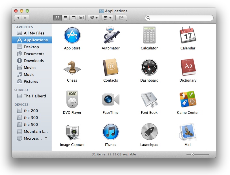
Figure 3-11. Icon View of the Applications folder
- List View (⌘-2)
This view presents the contents of a folder as a
list. You can open subfolders by clicking their disclosure
triangles (see
Figure 3-12
). List
View offers more information than Icon View but feels more
cluttered. As with Icon View, you can navigate through List View
using the arrow keys: ↑ and ↓ change what’s selected;
→
and
←
open and close (respectively) a subfolder’s disclosure triangle.
To open all subfolders under the one that’s selected, press
Option-
→
; to close all
subfolders after you’ve opened them, use Option-
←
. To sort files, click a row heading;
the triangle in the heading indicates the sort order.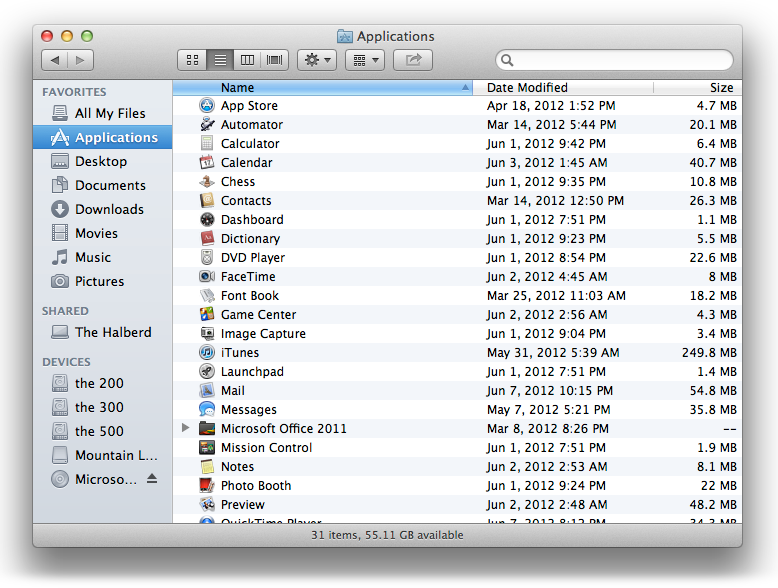
Figure 3-12. The useful List View
- Column View (⌘-3)
Column View (
Figure 3-13
) is the
favorite of a lot of users. While it looks a little like List
View, it doesn’t include any disclosure triangles. Clicking a
folder in this view reveals the contents of that folder. If you
continue all the way to a file, the last column will show a
Quick Look preview of the file and some key information about
it. For example, if you drill down to a movie, the film’s
preview will appear in the last column, and you can even play it
right there. If you select an application, the last column will
display a huge version of the program’s icon and information
about the application.In Column View, the arrow keys work exactly as you’d
expect, moving the selection either up, down, left, or right.
Holding Shift while pressing ↑ or ↓ allows you to select
multiple items in the same directory. To change the width of the
columns, drag the two tiny vertical lines at the bottom of the
dividers between columns; hold Option as you drag to resize all
the columns at once.
Figure 3-13. Column View is particularly useful for drilling down
through stacks of folders- Cover Flow View (⌘-4)
Cover Flow View is very slick. If you use iTunes,
an iPod Touch, or an iPhone, you’re familiar with this view,
shown in
Figure 3-14
. It
displays the items in a directory as large icons. You can adjust
the size of the Cover Flow area by dragging the three tiny
horizontal bars below the previews; Mountain Lion will resize
the icons accordingly.In this view, the
↑
and
←
keys move the selection up in
the list below the Cover Flow area, whereas the
→
and
↓
keys move your selection down the list.
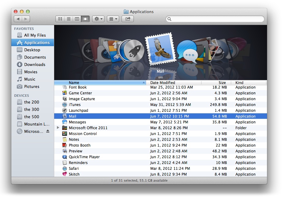
Figure 3-14. Cover Flow View—the go-to option if you want eye
candy